tidoco2222
Active member
Hi guys,
back to Lotr for me again but then I have never made a secret of loving the theme and the models.
This time it is Beregond of the citadel guard, the character never actually appeared in the film but was a key character in the book and the siege of Minas Tirith, I wanted to just a little bit different from the GW paint scheme so I gave him a lighter coloured hair than the GW theme.
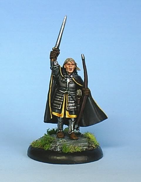
I also tried to do freehand but after several messed up attempts on the trim of the skirt I gave up feeling that when not going well it is best to leave well alone.
Cheers for looking and voting in advance.
http://www.coolminiornot.com/155126
back to Lotr for me again but then I have never made a secret of loving the theme and the models.
This time it is Beregond of the citadel guard, the character never actually appeared in the film but was a key character in the book and the siege of Minas Tirith, I wanted to just a little bit different from the GW paint scheme so I gave him a lighter coloured hair than the GW theme.
I also tried to do freehand but after several messed up attempts on the trim of the skirt I gave up feeling that when not going well it is best to leave well alone.
Cheers for looking and voting in advance.
http://www.coolminiornot.com/155126
