SaxonAngel
nada
I\'m trying to get back into the full swing of things by clearing some of my old projects off my desk.
My painting has developed some real kinks in the technique since I sort of took a hiatus from the brush a few years back.
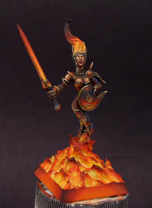
So... today\'s subject is lighting effects and fire. I have an old Rackham Alhalan chick that I\'m trying to paint up as a firey minion. It was started some years ago and is pretty rough in spots and probably should have been stripped (see here) , but hey it\'s unfinished and being done for practice and my own games table.
Anyhow, I\'m a bit stuck on how to do the trim on the armor.
Should I leave it black?
Or should I continue on with the gold as it is on the shield and part of her abdomen and chest.
I thought I could get away with the gold and blacklining until I hit her tiara and then I stopped and the foul language began.
Any experienced opinions and suggestion on either the trim or anythings else (especially from any of the \"masters\"") ) would be most welcome and very appreciated.
) would be most welcome and very appreciated.
Thanks!
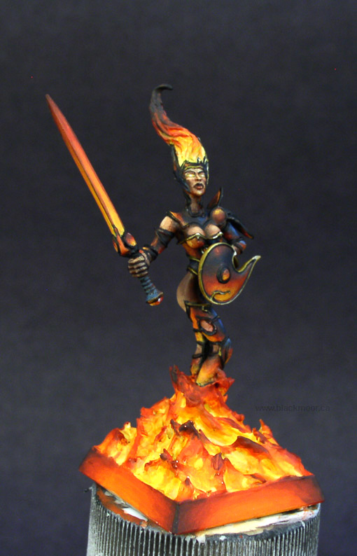
My painting has developed some real kinks in the technique since I sort of took a hiatus from the brush a few years back.
So... today\'s subject is lighting effects and fire. I have an old Rackham Alhalan chick that I\'m trying to paint up as a firey minion. It was started some years ago and is pretty rough in spots and probably should have been stripped (see here) , but hey it\'s unfinished and being done for practice and my own games table.
Anyhow, I\'m a bit stuck on how to do the trim on the armor.
Should I leave it black?
Or should I continue on with the gold as it is on the shield and part of her abdomen and chest.
I thought I could get away with the gold and blacklining until I hit her tiara and then I stopped and the foul language began.
Any experienced opinions and suggestion on either the trim or anythings else (especially from any of the \"masters\"
) would be most welcome and very appreciated.
Thanks!