Lathiem, Oak Leaf

automaton

New member
hello friends! :)

Here is the secret mini I prepared for World Expo 2008 in Girona haha...not so secret anymore though, I know!

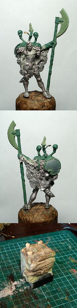
I finished this mini at the last possible moment: after completing the figure in the hotel room the night before the expo, I had to finish the base in a park outside the convention centre haha. Here is a funny photo to show you what I mean!! :duh:

girona05.jpg


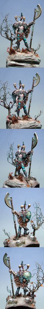
Deciding which figure to paint for WE was difficult, but once I had decided I was going to paint Lathiem, I knew that I wanted to try to make mine a bit different from the usual. There are many versions of this fantastic figure out there, so I wanted to try to capture something a little original. I had not seen any conversions of Lathiem yet, so I thought that this might be one way to make mine look a little different.

I was lucky enough to see a photo of the green for Lathiem before the sculpting was complete, and in this pic the weapon had not yet been added. When I saw this pic, I immediately assumed that the weapon would be in this position, held upright by the outretched arm...so when I saw the final version with the weapon resting across the shoulders I laughed at my mistake. But then when I was thinking about a conversion for Lathiem, I remembered my original thought, and decided to give it a try.

The new weapon - a sort of slightly fantasy bardiche - was made with milliput and green stuff (duro). Then I sculpted a few little extra details to add to the top of his back/shoulders, which looked a little bare and flat once the original weapon was removed.

The other, more important way that I tried to make my Lathiem a little different from the other versions was with the colour scheme. Most of the previous Lathiem minis I had seen had quite a warm, earthy sort of colour scheme. So to be different, I tried a colder version of Lathiem...very \'fantasy\' type colours rather than natural earth tones, with which I tried to create a slightly more eerie, almost \'otherworld-ly\' feeling scene.

Many of the colours were inspired by some beautiful artwork by Frank Frazetta.

Anyway I hope you like it! :)

Here\'s a CMON link if you would like to vote:

http://www.coolminiornot.com/196614


And the pics!

lathiem_forum.jpg


lathiem_WIP.jpg
 

phreak0

New member
what did you use for the grassy stuff on the base? i would really appreciate if you could tell us.

this mini is awesome in so many ways....great job.
 

automaton

New member
yeah no problem! I use different kinds of moss, things like that...I don\'t buy any of it, I jsut find it on the ground hehehe (the ultimate cheapskate!) :D

Seriously though, I am lucky because I live near some national park, and there is a lot of these sorts of moss around.

I\'ll jsut take a photo for you, hang on:

base_moss.jpg


These are the main kinds I use. I just pull of a little bit, and then drill a little hole into the base, and poke some of the moss fronds into it with some white glue (PVA).

You can use grasses and things too, or little flowers, sticks...whatever you find in the park. Even the hair off a coconut haha, I have used that a few times in the past!

Whatever you use, it\'s important to try to paint it once attached - it can be tricky, because the moss is often quite fragile, but you need to try. In this case, on lathiem, I added msot of the colour with pigment powders, which meant I could be quite gentle with it. More like sprinkling the colour over the top that direct painting.
 

automaton

New member
Thanks anders - I missed you while I was typing hehe. :) Your minis aint too bad either you know! The look on your face while we were up on stage was very funny you know haha :D
 

Manus

New member
To be honest I really don\'t like the blue on his trousers - as for the rest of the mini I think the colors are very fitting. The white hair takes a bit to ajust to, but I guess that\'s because, as you say, we are used to see him in warmer colors - but I think it looks great. I really like what you have done with different colors in the skin tones, having just read through an answer of yours in a nother thread, I see what you mean and have done.
The paintjob it self I guess it\'s no use commenting on anyway.
a 10 from me.
 

Avelorn

Sven Jonsson
Fantastic painting! :) The atmosphere is great and as usual so is your technique. The contrast is very eyecatching. The only thing I don\'t fully like is the design of the blade, something with how it goes all the way into the handle perhaps.

Originally posted by automaton
Seriously though, I am lucky because I live near some national park, and there is a lot of these sorts of moss around.

Haha... yeah and half of them are nearly extinct or what? Better catch them while you can!
 
I\'m commenting in every forum this masterpiece, i adore it and you\'re always the best! :beer:
Wow, i\'m also finding time to rewrite and dedicate time to this beautiful mini world! :beer:
Cheers! Sebastian!
 

demonherald

New member
Beautiful Job Mr Archer sir..Always tricky with this kind of piece to do something different from the norm but I think you\'ve succeeded pretty damn well..

.. I\'m just wondering do you ever have any kind of prob with Oz Customs using natural materials on the base?? just wondered as my last trip to Cairns the buggers pulled me for a piece I was taking to my sister that was based using a few moss type plants??

mind you my previous trip I\'d forgot I had some dunki doughnuts from singapore still in my bag and the buggers had me then as well.
 

generulpoleaxe

New member
treat the moss by spraying a ten parts water to one part glycerine mix on it. (best done on some old newspaper)
once dry it will last forever them as the glycerine replaces the water content witnin it.

loves this one mate, absoloutley fantastic piece of work and the weapon/pose change realy does finish this mini better than the origional imo. :cool:
 

Onis Lair

New member
Beautifully perfect paint work and wonderful sculpting. The only flaw for me is the mini itself, as it\'s just not calling to me. However that\'s not your fault, it\'s mine. :D
 

Celthulhu

New member
I am striving to paint my fleshtones like this. Is there a formula or rule you follow as far as one color in the shadow areas, another in the medium areas, etc?
 

automaton

New member
Thanks for the great comments everyone, I really appreciate it :)

manus - yes the bright coloured pants were the big risk haha, and I guess therefore destined to be one of those things that some people like and some people don\'t. But that\'s ok - I\'m trying to be more brave with my painting and make some slightly stranger colour choices lately, so it\'s fun to hear the different opinions.

sven - hehe the blade shape, it\'s not my faaaauuultttt :duh: I wanted to make a bardiche, that is, a pole arm rather than an axe...google image search bardiche and you will see why I made the blade like this. ;)

celthulhu - I suppose the whole point is that there really is no formula...I always use different colours on flesh from mini to mini. It\'s more important to make sure that you maintain some harmony in the colour scheme throughout the figure. That\'s not helpful for you though, I know, so to say something more practical: you could try to think about contrast between warm and cool tones within the flesh areas of a mini. I often like to use a cold tone in the shadows, then warm midtones, and going slightly cold again for the lightest highlights.

For this one, I painted the flesh in fairly neutral pink-grey tones, then added a lot of the extra nuances with thin glazes of much brighter colours. I tried to keep with the overall colour scheme, by using glazes of GW scaly green on some of the flesh areas, concentrating mainly on the darker shadows, and then using GW dark flesh and bestial brown, and also brighter reds in some of the lighter parts for extra contrast within the flesh. And for the most extreme highlights, I went back to a slightly blue-ish, very light colour.

The aim was to echo the rest of the colour scheme...all the colours on the figure are based around a dark blue-green colour, in oppostion to orange-red and purple-red colours. These 3 colours formed the basis of what I hoped would be a balanced colour scheme.

I hope that makes sense...it can be difficult to explain!
 

Celthulhu

New member
This was very helpful since it is similar to the way I paint already. I\'ve been experimenting with complementary colors lately. I guess I\'ll just stick with it. :)
 

Infidel Castro

New member
Originally posted by Avelorn
The only thing I don\'t fully like is the design of the blade, something with how it goes all the way into the handle perhaps.

My God, do you have to find something you don\'t like in EVERYTHING? You\'ll never get a long-term lady-friend :rolleyes:

I think this is as good as anything I have ever seen, and the way the haft enters the blade-mount is quite normal, simple and clean. 10, 10 and 10 again :D
 

Avelorn

Sven Jonsson
@Seb: Yeahyeah blame reality! :p And congrats on yet another Gold! :D I wished we could have met again.. and I wished I\'d seen Anders expression as well! ;)

Originally posted by reverend
Originally posted by Avelorn
The only thing I don\'t fully like is the design of the blade, something with how it goes all the way into the handle perhaps.

My God, do you have to find something you don\'t like in EVERYTHING? You\'ll never get a long-term lady-friend :rolleyes:

You seem to be under the misconception that I am critical towards people. I am not. I don\'t really fancy the design of the blade, that\'s why I said it. I don\'t try to spot mistakes or something like that. As for the comment about longterm lady-friend.. that hurt, I\'m not overly sensitive but you tend to find sore-spots at time. That maybe explains why I don\'t take your comment as light-hearted as you might have expected.
 
Back To Top
Top