Pirate Sophie

olliekickflip

New member
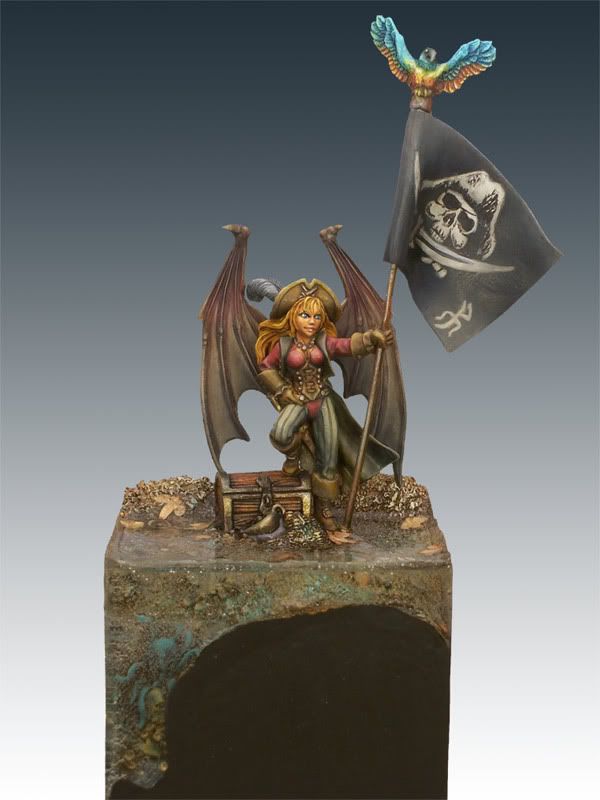
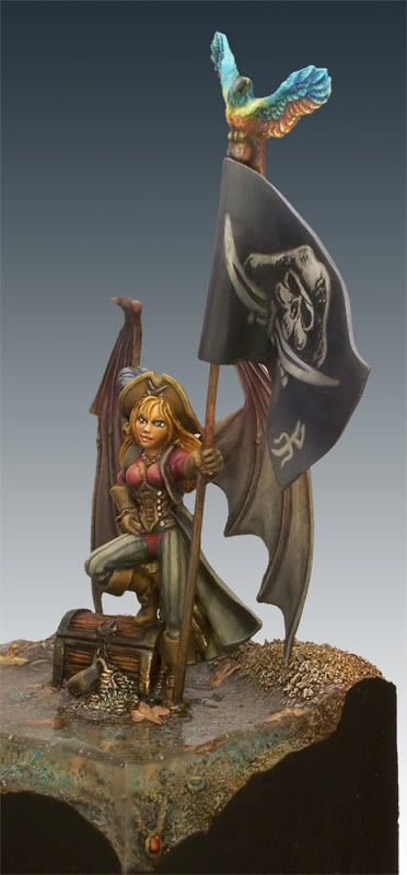
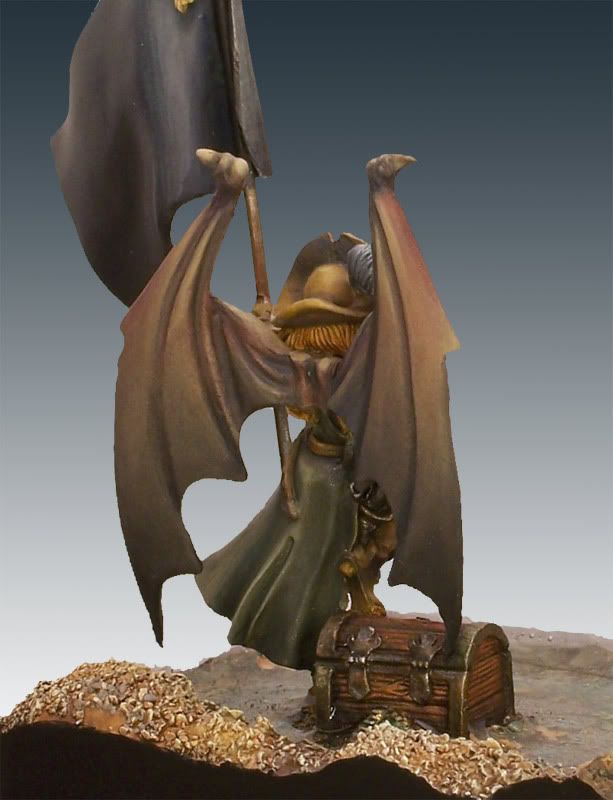
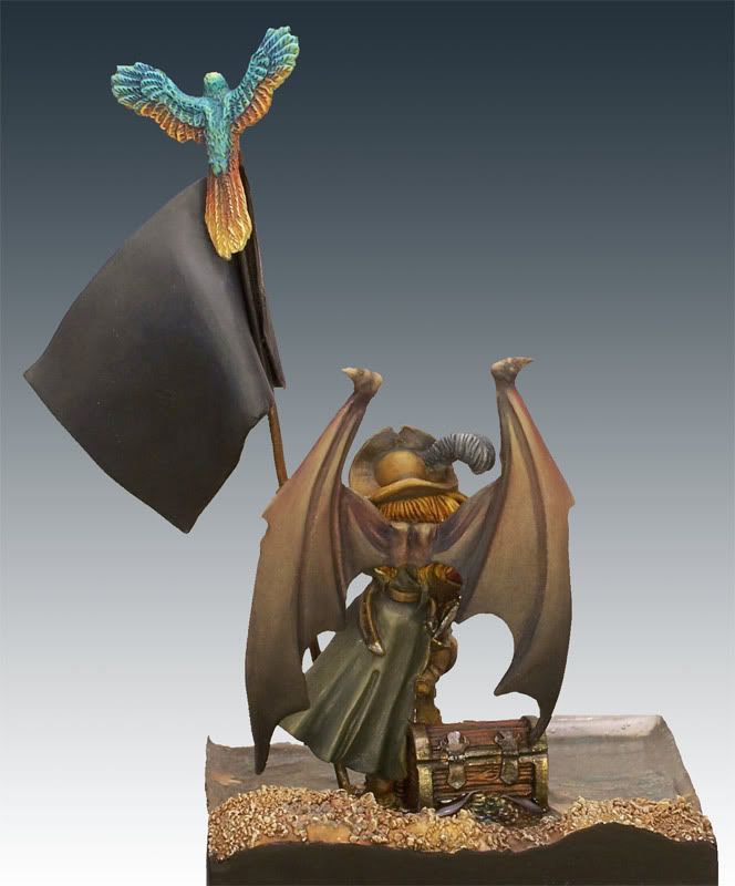
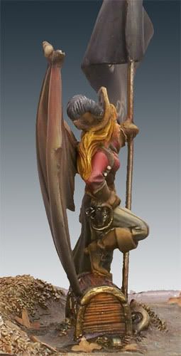
I am running a painting contest here in San Diego and although I can\'t enter, I desided to do a model anyways. The only rule was that the model had to be a standard bearer of some sort. I saw the Pirate Sophie model from Reaper and thought it was a perfect fit as I am a member of the Pacific Marauders and they are all pirate themed and blah blah blah. I really enjoyed painting this lovely gal. I used a mix of paints, GW Foundations, regular GW paints, P3\'s and some Reaper Master Series colors. The Flagpole was an old paper clip and the flag was done from Milliput. The Skull and crossbones was taken from a real pirate flag that I found off the internet...the PM logo at the bottom right of the flat is the Pacific Marauders symbol.
Anyways, comments are always welcome. So don\'t feel bad telling me you hate it or something is really wrong...can\'t be sure I wont shed a tear though:D Anyways, here she is in all her glory...
Oh and shameless votey link: http://www.coolminiornot.com/175343

SF2.jpg


SF5.jpg


SF7.jpg


SF6.jpg


SF8.jpg


SF4.jpg
 

lono

New member
Overall it\'s a really well painted mini with a nice natural and realistic looking colour palette. If I had to pick out particular things I\'m not so keen on, the painting of the parrot doesn\'t look quite as smooth as the rest, and the funny squiggle on the bottom right of the banner looks like... well, a funny squiggle! But overall it\'s really competently done.

And of course it\'s a pirate, so instant bonus points there!

Cool base too.
 

Target

New member
The face and the shirt both look absolutely gorgeous and my hearty congratulations on these.The remainder of the figure does not come accross as quite on the same par, but this may mostly be connected to your colour palette.

Excellent work, well done.
 

olliekickflip

New member
Thanks for the comments guys! The funny squiggle is the P and the M from the Pacific Marauders game club logo. (which I am a member, and they are sponsoring the contest) Here is the logo so you can see what I mean.

Backup_of_t-shirt-logo.jpg
 

olliekickflip

New member
Hey Brice, yes this has been the project the last couple of weeks. Gotta practice what I learned last summer. Oh, and we both made the latest White Dwarf as well...so it has been a good month!:bouncy:
 

Jericho

Consummate Brushlicker
Nice work man. Really like the model, the base, and the paintjob. My only suggestions for improvement would be sharpening the freehand a little bit, and maybe having a slightly darker color for the whites of the eyes, they are almost too white for the model. The realistic tones of the model don\'t fit with the Disney eyes too well.

Bonus points for putting stripes on a pirate, I\'m sure Glyn would agree!
 

olliekickflip

New member
Great comment about the eyes Jericho. I will try that next time. As for the logo on the pirate flag, believe it or not I did it that way on purpose. My thought was that the pirates would probably have painted the design onto the black flag and it would not have been perfect. It also gives a contrast between the smooth blends and a not so smooth logo on the flag. Anyways, it may not have worked the way I intended it but I am really just experimenting with new techniques and to see what works. Thanks again for all the comments...they really do help!

a
 

demonherald

New member
Not a lot to add to what has been said...
maybe trim the resin at the top to get rid of the meniscus line.....and when it\'s drying use a pin to take out air bubbles..pain in the ass but works well..That way it dries clearer and you would be able to see the underwater detaill..
The only other thing that would really round it off for me is something on the back of the flag....nice job on the front and te dlending on the back is nice but the large plain flag and the large plain wings sort of spoil it a touch..still a 10 for me though as I have just got this model and seeing what you\'ve done is ery inspirational...
 

generulpoleaxe

New member
for eyes add a teeny weeny bit of the skin tone to the white (i use ivory instead of pure white as it\'s softer).

the idea is not to change the colour, but to change the tone and help them fit in with the rest of the model.
 

Jericho

Consummate Brushlicker
Good advice generul, I wouldn\'t have known what color to use instead of pure white :D All I know is that I suck at doing eyes...
 
Back To Top
Top