You are using an out of date browser. It may not display this or other websites correctly.
You should upgrade or use an alternative browser.
You should upgrade or use an alternative browser.
Warrior Priest in Lustria
- Thread starter Bill
- Start date
Herb the bitter
New member
Excellent work. The flesh tones and the NMM look very nice.
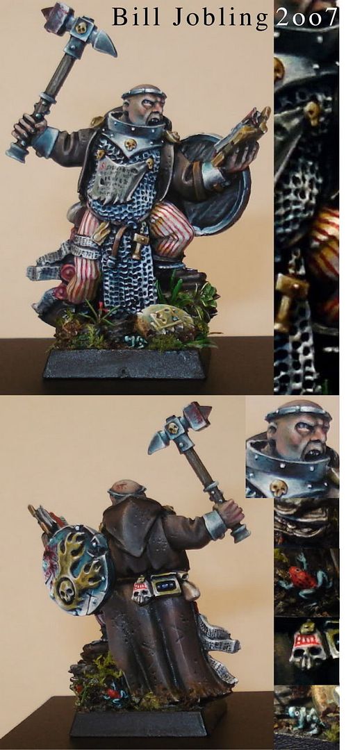
I think the photo could be a bit brighter(for example for all I can tell the inside of his shield is black.), and I think the red striped pants clash too much with the muted colors of the rest of the model, (but then again I suck when it comes to color selection)
I think the photo could be a bit brighter(for example for all I can tell the inside of his shield is black.), and I think the red striped pants clash too much with the muted colors of the rest of the model, (but then again I suck when it comes to color selection)
electrolito 77
New member
Nice job Bill! V&C! Keep up the quality work!
AinuLainour
New member
I really like how you\'ve painted the NMM, it\'s original and looks realistic to me.
The cloak is pretty cool too, did you use freehand painting?
The cloak is pretty cool too, did you use freehand painting?
MathewBaich
New member
great job bill! it was worth waiting for. voted and commented.
Very nice work! The attention to detail is impressive, especially considering the daunting amount of those on the miniature. And I love the base, really cool. The chainmail shows good intentions but it could have used more contrast between areas IMO (I realise you had a thought behind keeping the metal bright, but the chainmail looks unrealistic).
Youve got some awesome work there. The battle damage the NMM the skin tones. I think the pant spoit it tho. The lines arent even and dont seem to be painted in the same standard as the rest of the mini.
Its easy to see why you won a GD tho. I think you will become one of the best painters on this site at this rate. I am only voting an 8 cause of the pants but its very close to a 10. By the way these are just my opinions so take em for what they are worth. (Them and $5 will by you a coffe at the airport)
Its easy to see why you won a GD tho. I think you will become one of the best painters on this site at this rate. I am only voting an 8 cause of the pants but its very close to a 10. By the way these are just my opinions so take em for what they are worth. (Them and $5 will by you a coffe at the airport)
Thanks for the votes and comment guys, I\'m glad you like him ") I have to say I agree with the points about the chainmail (I\'m still a novice at NMM!) and the stripes, but I guess they\'re just part of the process lol
I have to say I agree with the points about the chainmail (I\'m still a novice at NMM!) and the stripes, but I guess they\'re just part of the process lol
I decided to do a Lustrian theme because I needed to do something interesting with the base and pack it full of stuff.... I had a few lizardmen bits lying around, so what better to do than a Lustrian base? The whole thing just developed, no planning involved in the mini or the base, and it\'s turned out a whole lot better (apart from the stripey trousers) than my other minis because of that I think
Cheers folks!
~Bill
I have to say I agree with the points about the chainmail (I\'m still a novice at NMM!) and the stripes, but I guess they\'re just part of the process lolI decided to do a Lustrian theme because I needed to do something interesting with the base and pack it full of stuff.... I had a few lizardmen bits lying around, so what better to do than a Lustrian base? The whole thing just developed, no planning involved in the mini or the base, and it\'s turned out a whole lot better (apart from the stripey trousers
) than my other minis because of that I think Cheers folks!
~Bill
I\'m a little torn on this one. Before I get into it I\'ll say it\'s obviously very good, and you do indeed show scary ability for someone your age.
The thing that\'s giving me an issue though is that whilst the individual bits are very well painted, it just doesn\'t work as a complete piece so well for me any more. I think a big part of that is the base.
The feel of the paint job on the mini is very cold, particularly because of the style of the NMM. He looks like he should be standing in a field of snow or something, yet the base is warm and exotic. It puts it at odds for me and despite loving all the detail you have packed into it I don\'t think it compliments the paint job on the priest. Perhaps I am alone in this, who knows, but I figure some potentially constructive criticism is more useful than just saying it\'s pretty good!
Also, although the cloak is great (the front of the arms are a little more ragged looking than anything else on the mini mind you) it doesn\'t quite fit with the NMM again for me. It\'s because the way light is hitting the metal is so strong (due to your fine painting ability I must add), with the point highlights and shading, yet the cloak doesn\'t quite seem to have the same sort of level of light working for it, so the two don\'t quite tie together.
Much as I like the NMM here I hope you make a return to real metallics soon. Utilise some of the NMM techniques you have learned to make the real metallics really pop, then you will have a model that you can enter in GD and get a win with!
Thank you Lono, insightful and helpful as per frikkin\' usual lol
I think I have to agree with most of your points. The weird thing was that he was originally planned to go on a snowy base, but if I entered him into YB then it would be really similar to my last entry, and would probably be a bit boring :redface: I\'m pleased with the idiosyncratic result anyway lol I think you\'re right, I\'ll try and use metallics again for my next mini.
Cheers
~Bill
I tend to pay a lot more critical attention to the minis of people who are very good, so take it as a complement. I can see you being one of the best in the world in a few years if you keep on at this rate, and as I haven\'t got enough mad skills for that myself, I might as well try and get my name in your \'my thanks go to\' speech when you win your first Slayer Sword!
It\'s still a fine looking mini, and it wouldn\'t struggle making final cut in the Warhammer Single category, so for someone still young enough to enter Young Bloods you are doing great.
It\'s still a fine looking mini, and it wouldn\'t struggle making final cut in the Warhammer Single category, so for someone still young enough to enter Young Bloods you are doing great.
darkartminiatures
New member
Nice! You really do have some talent Bill. *grumbles*
demonherald
New member
love it Bill although I think Iono has nailed the light thing.....
love the colours in the NMM really evocative of a dude in the jungle reflectig the foliage colours..
Love the base also the frog is cool...(dendrobates pumilio???) but I\'m not sure wether it\'s the colour of the trousers or the comparitive cleanliness but from the front the model doesn\'t seem to quite tie in with the base but from the rear looks awesome..
cannot wait to see how much more you improve by GD time.
fantastic
Edit....just noticed you mentioned the frog species in the submission...still good guess though you must have done a good job of the colours....(I believe here now in the group Oophaga...
