Anima Tactics Janus Faith

ScottRadom

Shogun of Saskatchewan
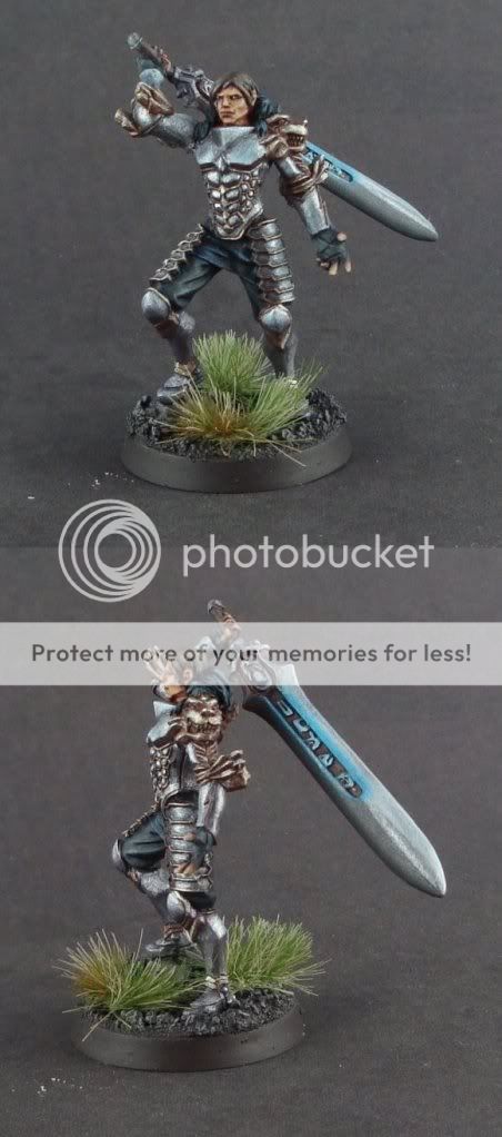
Man these figs are goofy. I posted this as it was my most effort put into metal on the armor, and I wanted to get some feedback into wether or not it translated well at all. I can\'t even tell if the fig is good or bad anymore as I \'ve gone back and re-done so much on it.

The wierd blue effect is at the customers request and was added very late. Don\'t think it looks that hot, but the customer was happy. Thanks for having a look! All super harsh comments welcomed and adored!

http://www.coolminiornot.com/230288

JanusFaithmontage-1.jpg
 

alextheartist

New member
Looks good, the metals could prehaps do with a little bit brighter highlight just to make it \"pop\" to use such a crappy word..

You got everything else down though so its cool :D
 

Ritual

New member
I think you can go darker with the shading of the metals... And the face could do with a bit more contrast to bring out the facial features a bit more.

But, it\'s good work, and your metallics are getting better.

Oh, and the sword hilt looks a bit bent...
 

slah

New member
Looks good, but I think it could do with a bit more contrast, and maybe some coloured glazes to give the armor a bit of \"life\" - se automatons \"real metallics\" article which is great.
 

Donga

Active member
Originally posted by Ritual
I think you can go darker with the shading of the metals...

I agree, if you get the shading right it will give you the contrast it neads. It\'s all about light/dark transition, with metals the transition is alot more extreme than say cloth. You could get away with black to white tone range, in fact I often do!

Does that make sense?

Edit: Vallejo Model Colour- Metallic medium, is great for \'hot spots.\'
 

ScottRadom

Shogun of Saskatchewan
Originally posted by Donga
Originally posted by Ritual
I think you can go darker with the shading of the metals...

I agree, if you get the shading right it will give you the contrast it neads. It\'s all about light/dark transition, with metals the transition is alot more extreme than say cloth. You could get away with black to white tone range, in fact I often do!

Does that make sense?

Edit: Vallejo Model Colour- Metallic medium, is great for \'hot spots.\'

Right now I am using Vallejo metal medium. I am even mixing it about 50/50 with white paint to try and help out the bright spot thingy.

Overall I agree with the contrast. I like what I see in my mini, until I go compare it against the paint job I was sort of emulating often times then I feel a little let down.

I purposefully don\'t compare my mini\'s until I am all finished (more or less) with them for fear I would never finish anythign for all the re-starts etc.

Freak: Hey, I\'ll take mediocre vs. poor any day! Is it just the metal paint that makes it mediocre, or could you point out other areas I need to stress more? Or maybe it\'s just a general quality paint thingy. Still appreciate the honesty!

Thanks again guys!
 

Amazon warrior

New member
freak might be talking about the actual sculpt rather than your painting of it. At least, that\'s how I read him.

I think it\'s fair to say that it\'s not your best work to date, but that\'s understandable if the sculpt didn\'t really inspire you to any extent - I personally could never do commissions for this very reason. I still think you\'ve done a good job on what looks like a pig of a mini, and I can\'t really add anything to what everyone else has suggested, improvements-wise. We know you can do better, go on and do it! ;)
 

freakinacage

Well-known member
oh yeah i meant the sculpt. very \'meh\'

your painting lifts it but you\'d have to be a master to get anything above a 7 from me on that mini
 

Dragonsreach

Super Moderator
Staff member
Originally posted by freakinacage
oh yeah i meant the sculpt. very \'meh\'

your painting lifts it but you\'d have to be a master to get anything above a 7 from me on that mini
Yeah have to agre with Tim here. Anima Tactics either are spot on sculpts or below mediocre.
You\'ve done a good job on a Pigs Ear.

I echo what has been said about the metallics, more contrast from dark to light would make this fella stand out.
 

ScottRadom

Shogun of Saskatchewan
Really wasn\'t a fan of the fig, TBH, but I puyt as much effort into the metal as possible. I think I have to just plain ole\' go for some black in the metal shading. The highlights are done with 1/2 vallejo metal medium and 1/2 white.

Appreciate the comments and encouragement guys. I really enjoy comparing my newer models vs. the older stuff. I\'ve been getting some rockin\' advice!
 
Back To Top
Top