AoW Goblin King

ScottRadom

Shogun of Saskatchewan
Well here goes....

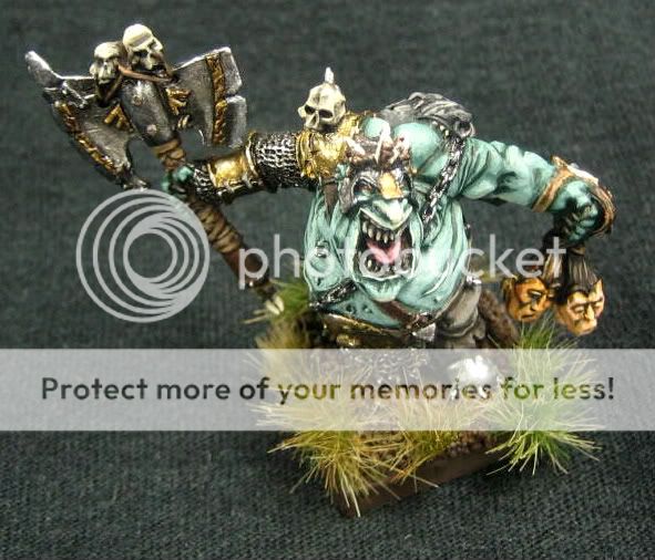
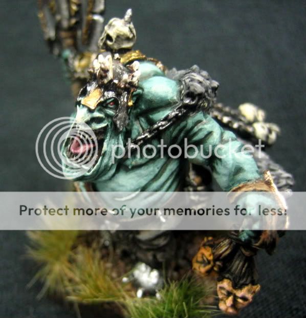
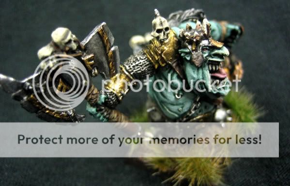
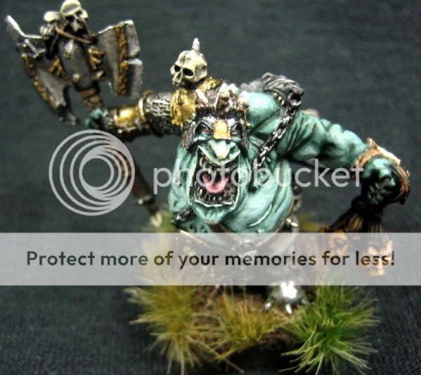
I did this mini up and really tried to achieve a \"7\" on this one. I tried to focus a little more on the metals and tried to spend more time on the flesh. Please let me know how I did, good or bad! I\'ll post the votey link once the photo is approved. Thanks for the help from everyone, regardless of the score this model is a VAST improvement from anything I\'ve ever done. I\'m quite proud of it. But don\'t let that scare you away from ripping in to my fig, criticize away!
IMG_0498.jpg

IMG_0497.jpg

IMG_0496.jpg

IMG_0494.jpg

Thanks again!
Here\'s the link...
http://www.coolminiornot.com/205804
 

Monkeysplitters

New member
Im no expert on the matter (just learning to use metallics myself) but one thing that would def bring it up past a 7 id say would be giving the metallics some contrast. the axe seems to have some but the armor and helmet either totally lack it or it doesnt show through in the photo.

Overall id say its def worth above a 7 especially if you gave the metal some contrast. The skin is quite good, I like the color choice for it because its not typical but not all that far from the normal snot greenish color. I like the base as well kinda reminds me of a swamp or a bog.
 

ScottRadom

Shogun of Saskatchewan
I tried to put some contrats into the Axe and the armor. There is a little but I will work it further next time. Thanks Monkeyspitters!

I still struggle with metalic\'s, and I am trying to unlearn about 20 years of bad \"Basecoat \'n Drybrush\" metalic habbits!

Much Appreciated!
 

Logan

New member
Like it a lot mate.
Photo looks a bit bright to make a proper judgement but looks a quality job.

Metals are great.

Got that figure myself waiting to be painted... (along with another load)
 

boristfrog

New member
The fact that you know it\'s your best is the whole point. You really pushed yourself on this model and it shows and it\'s turned out nice. The close ups show that the skin isn\'t as chalky as I thought they might be - it was just the pale colour. The progression on your metal work in the WIP shows how much you put into this - I hope you\'re proud. Hopefully you\'ll feel more confident on the next model you tackle.

I think you may have gone a bit overboard with the grasses and I would have liked to see the purple tints on the skin. My fav part is his eyes and face. The contrast of colours between the red eyes and the pale green skin draws the eye.

:)
 

ScottRadom

Shogun of Saskatchewan
Thanks guys!

I am proud of it and I do know it\'s my best work. I actually have a model in my gallery that scored a 7.6 and I couldn\'t begin to tell you why. There was half the time and effort into that fig (A forge World great unclean one. WAY BIG!) that went into this smaller character.

Boris-I appreciate the comments about the skin and metal. I thought long and hard about trying the purple out, but I chickened out. I was happy with it where it ended up and couldn\'t bear the thought of potentially becoming unhappy with the finish. I WILL try the same recipe on another model and post it up. I am curious. As for the base.... totally agree it\'s overdone. I had originally thought to put down some clumps of statis grass and actually DID put it on the model. I HATED the look, and it made the model look much worse then I felt it deserved. I scraped with a brush as much of the grass off as I could (I use whit glue instead of super glue) but was still left with little strands. I put the silfor tufts on over top. I like the look, but would put about 1/2 as much on if I could do it over.

Thanks to all for the comments, much appreciated. It\'s IMPOSSIBLE to improve without a nice amount of CC. Though I am partial to Kesters post as well....
 

darklord

New member
Looks good mate. there are i feel areas that need improvement .
I like the different colour to the flesh but i think further shading would help, at the moment the recesses change abruptly to the rest and there is no real transition between the two. as suggested a series of shading washes of purple would help, real thin washes starting on a wide area and succesivly smaller aiming towards the darkest areas of skin.
Further highlighting on the metal areas would help create some definition as would a purple/brown wash on the gold.
i suspect that some of the problem is the photo the light looks quite harsh on top.
I actually like the grass it helps the mini i think.
Hope this all doesnt sound too hard, but i find critique more helpful than simply \'i dont like it\'!!

your great unclean does actually look nicer to me, maybe because its more forgiving on paintjobs. you probably gained points for it been forgeworld and GW - fanboys always vote their stuff higher. i think the score as it stand (6.7) is about fair
 

ScottRadom

Shogun of Saskatchewan
Never too harsh! Thanks for taking the time to post these critiques Darklord. Much appreciated.

Will defo work the transitions oon the flesh more subtley next time. I washed the gold areas with a fleshy/green mix, I will try something else. And I WILL give the Purple wash a chance on the next fig I do.

All this advice has been great, and the score of 6.7 is short of where I was aiming for but I\'m not that worried about it. It\'s a full point over above my last submission and the next one will likely be a continueed improvement. Plus I got a positive comment from Felix Pangua himself, and that\'s not nothin\'

Thanks to Darklord et all for the help, tips and ecouragement. I gotta hammer out some RnF models for a while but this was a treat to paint. I\'ll get that 7 next time!
 

darklord

New member
no worries mate. scores are tough these days mate, i have stuff scoring less than i thought they would,!
 

EldinTux

New member
These days 6.7 is a great score. My latest has only managed 6.3, and it won in a local competition. CMoN is a tough crowd, but with people like DL giving out critique & advise we all benefit. Great figure by the way, really like the different skin tones, and I agree with DL some of the transitions need smoothing.
 
Back To Top
Top