Bailey03
Well-known member
Thanks, Foxtail.
In other news, I just uploaded an old project, Sorondil, to the gallery here and at P&P.
View attachment 55069
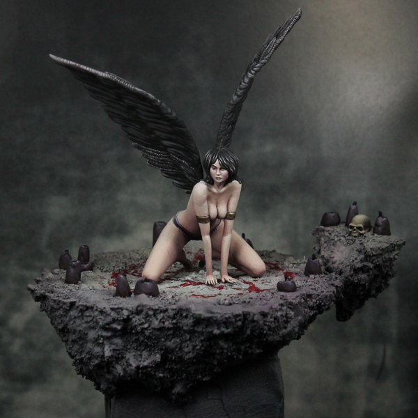
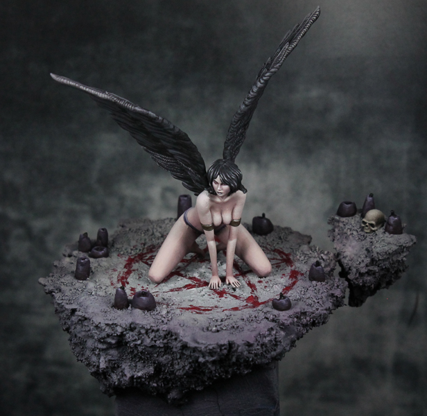
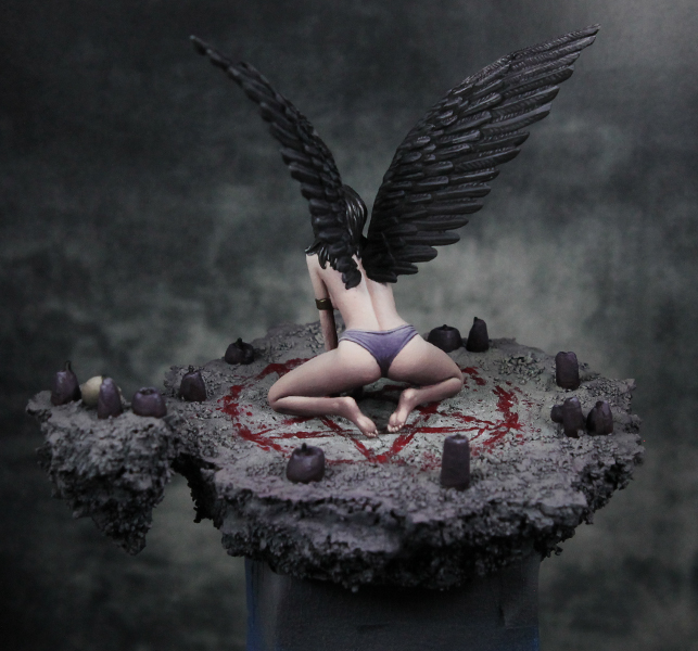
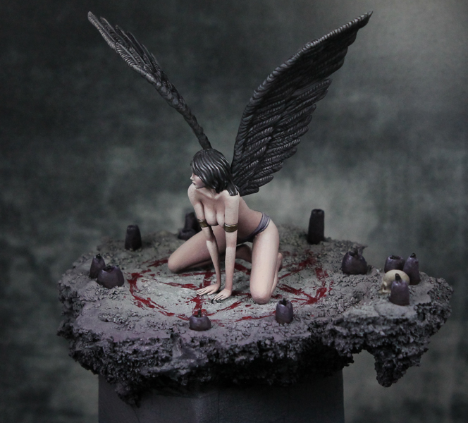
Since I've had some recent posting looking at how I've improved over the years, I was taking a critical look at this piece from maybe a year and a half ago. The parts I really like are the contrast on the sash around his waist, the contrast/blend on the stone spear, and the texturing on the piece hanging down between his legs. Other spots, like the skin, are fine but could do with more focused highlights (right now they're a bit too diffuse, not like how they are on my more recent Celt project or Redghar). And there are plenty of other parts where the contrast is more muted. That's not to say I don't like the result, just thinking about how I might try to do things differently a year and a half later. Here are the links in case anyone would like to vote.
http://www.coolminiornot.com/409341
http://www.puttyandpaint.com/projects/12051
In other news, registration for this years NOVA Open just started. It's a gaming convention in DC Aug 31-Sept 3 along with a painting competition and painting workshops. I went a few years ago, but haven't been back since moving to the west coast. For the last year or two Roman and Raffa from MassiveVoodoo have been guest judges and taught seminars. This year just Roman will be attending, but he's offering several long workshops (8 hrs) plus some short classes. Space is limited, so if you're in the general area and want to check it out, sign up soon! I plan on going out there this year. Just signed up for Roman's classes on painting a bust in atmosphere, building a display base, and painting OSL. Should be very informative. Maybe I'll see some of you there!
In other news, I just uploaded an old project, Sorondil, to the gallery here and at P&P.
View attachment 55069
Since I've had some recent posting looking at how I've improved over the years, I was taking a critical look at this piece from maybe a year and a half ago. The parts I really like are the contrast on the sash around his waist, the contrast/blend on the stone spear, and the texturing on the piece hanging down between his legs. Other spots, like the skin, are fine but could do with more focused highlights (right now they're a bit too diffuse, not like how they are on my more recent Celt project or Redghar). And there are plenty of other parts where the contrast is more muted. That's not to say I don't like the result, just thinking about how I might try to do things differently a year and a half later. Here are the links in case anyone would like to vote.
http://www.coolminiornot.com/409341
http://www.puttyandpaint.com/projects/12051
In other news, registration for this years NOVA Open just started. It's a gaming convention in DC Aug 31-Sept 3 along with a painting competition and painting workshops. I went a few years ago, but haven't been back since moving to the west coast. For the last year or two Roman and Raffa from MassiveVoodoo have been guest judges and taught seminars. This year just Roman will be attending, but he's offering several long workshops (8 hrs) plus some short classes. Space is limited, so if you're in the general area and want to check it out, sign up soon! I plan on going out there this year. Just signed up for Roman's classes on painting a bust in atmosphere, building a display base, and painting OSL. Should be very informative. Maybe I'll see some of you there!
") ?
?