Bailey03's WIP

Bailey03

Well-known member
Yeah, the Scale75 black/white paint set is a good place to start. There's also the Andrea white paint set. Here's an image I grabbed from the web, I wouldn't call any of these paints grey
andrea-white-paint-set.jpg


Pale browns, creams, and bone colors are good places to start. Put some thought into what material you're painting. With historical figures I do a lot of white cloth. It's natural fibers, so brown shades make sense to me. If you're doing something modern or futuristic, then grey can be appropriate. That's what I used on the goalie
hg18__sized_l.jpg

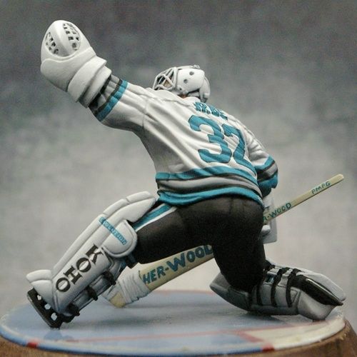
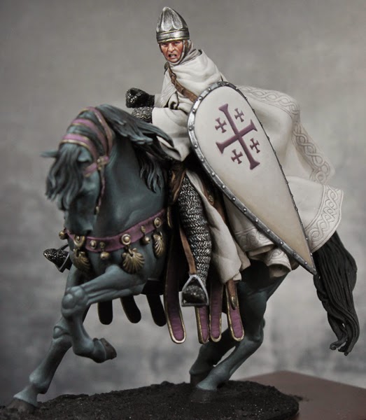
So it's not that you can't use grey, it works here but I don't think this would like right for the knight. Of course, if you're doing something futuristic or magical, no reason it can't go into the blues, purples, or greens for the shadows. Unless you had a strong reason I'd avoid red as that can make things look pink real quick. If you don't have pale versions of the color you want, try mixing a bit of the pure shade with a light grey to tint it.

What we see as white (or black) is relative. I'm not sure if I have any pure white on the knight and yet it looks white. As long as it's the lightest color (and close enough to white) it will appear white to our eyes. It's the same in real life, that t-shirt or pair of sneakers might look white. But put them next to a sheet of white printer paper and all of a sudden you can tell it's off white.
 

Sigmar3

Member
Have to agree with Andy and Bloodfather here, was going to compliment you on the lovely 'soft' whites you create only to find the others just have too lol. Absolutely amazing, as with everything you do.
 

Bailey03

Well-known member
Thanks, Sigmar!

I wrapped up the rest of the border around the cape and thought I'd do a quick step by step. Obviously the first step is to come up with whatever design you want to paint. For a repetitive pattern like this it's important to keep everything as even and consistent as possible. When you do it by hand (as opposed to with a template) it's easy for spacings to drift and get longer or shorter as you go. To help stop this I used a ruler and marked out the spots where the lines get closest to the border. Below you can see the dots running up and down the right edge of the cape. The curving surface makes this a bit of a challenge, but do your best.
HS47.jpg


Next I start to fill in the lines. Break down the pattern to simpler parts. In this case I began with the portion crossing over the other line. Note that if the line cross through the right dot, it will be slightly offset from the left dot.
HS48.jpg


Next I put in the other side of the line, following the original one and trying to keep the distance between lines consistent.
HS49.jpg


Now it was a simple matter of connecting the lines going under to fill in the rest of the pattern. Where necessary I adjusted the original marks so that they looked like they meet. It's a bit rough here and that's okay.
HS50.jpg


So with the design sketched on, now it was time to go in and clean it up. Taking the background color I carefully went along the sides of the design lines. You don't need to go everywhere, just where the lines are too thick or not smooth enough. I also did some glazes of the cape colors to blend it all together and add a bit more shading/highlighting.
HS51.jpg


And here's the whole thing
HS52.jpg
 

Demihuman

Active member
You're a machine! This guy is going to be a show stopper when you finish him. I love how all the soft lines contrast his super pinched and intense expression. Your transitions on the white are so smooth. You should make a video showing how you thin your paint and load your brush. Or you should just drive up and give us a workshop!
 

ten ball

Active member
Smooth as usual mate. Im very impressed with the shield design, anything that involves painting a straight line is impressive :)
 
I have to agree that it looks great. In fact, when I originally scrolled down and saw the freehand I thought it was sculpted lines, not painted on. This means you're doing your job. Also appreciate the subtlety. You could have easily got lost in some ornate cross or religious depiction, but instead went with a powerfully subtle approach. Here here!!!!
 

Bailey03

Well-known member
Thanks, everyone. BFK, yeah, I tried to keep it simple. It would be cool to go crazy with the freehand work, but I wanted something that could be historically accurate (or at least historically plausible). I've got two 75mm knights in my collection with big standards, cloth covering their armor, and shields for tons of freehand that would be historically accurate. I hadn't started either because I wasn't happy with my white metals, but after doing the dark elf I think I feel ready to give them a try. I still need to wrap up my Crystal Brush projects and a few others (like the dark elf, my 90mm Roman from back in July, and Gokan), but maybe I'll start one of those big knights in the next few months and drive myself crazy with the design work.

Speaking of design work, I put some time in on the other side of the knight's banner. I'd done the left side a while back. At that time I wasn't sure how it would turn out, so I figured I'd just do one side to see how it looked before working on the other. I liked it, but never got around to painting the reverse. So up until a few days ago the right side looked like this. Just the basic highlights and shadows sketched on.

HS58.jpg


The first step was to blend highlights and shadows for the background. Just like the cape and shield, I used bone shadow, weathered stone, and leather white. Because I planned on putting a white pattern on top of a white background, I kept the highlights a bit darker and never went up to pure leather white. Next I painted on the cross pattern, trying to keep the location the same as the other side. This looked pretty rough at first, but I used the background color to clean up the edges, straighten lines, and thin down some of the finer details. Now we get to the complicated part, that subtle pattern. As with the first side, I began by measuring out the spacing and placing a small white dot at the top and bottom four lines apart. Then by eye I could place a dot right in the middle of any two, and then subdivide it again. This gave me all the places where the diagonal lines should hit the top and bottom of the banner. From there it was just the slow careful task of painting in the lines. When I finished a big enough section I went in and added the small dashes along the sides of each diamond.
HS59.jpg

I'm still working on the bottom section. My spacing got a bit off, so I'm going to paint over a bit and redo it before continuing on with the rest. Then I'll use some glazes to help shade the pattern and tie it all together.

I also did some more detail work on the horse and rider. With the cape finished I could attach the flowing cloth to the back of the knight's head (it would have been in my way as I did the pattern up the shoulder). I also attached and painted the horse's reins. If you haven't done a mounted figure (other than gaming ones), the kit doesn't come with the full reins. All that is sculpted is the section that attaches to the horses mouth and the part with the buckle and flap. The rest you have to make yourself from foil. You measure and cut it to the correct length and width, then bend it into place. It's rather delicate, fine for a display figure but much too fragile for a gaming piece. I still have to do the horses hooves and tail (plus some tweaks here and there), but the main figure is almost complete. After I do that and finish the banner, it's just the base and then weathering. If all goes well, I may get this wrapped up this weekend. A mere 15 months after I began the project!
HS54.jpg
HS55.jpg
HS56.jpg
HS57.jpg
 

Bailey03

Well-known member
Thanks! Well, I used some of the Scale75 Anthracite Grey in my purple mix, so it's not all Reaper. But you can take a look at Reaper's website, their paint page shows a square of each color so you can use that to find the closest version in whatever paint range you like to use. And if you need to fill in some gaps (like with skin tones or off whites) they're based in the US, so shipping is quick (and free if you plan on buying 11 or more colors).

If I had to pick a short list of Reaper colors I couldn't do without it'd probably be their off whites: Weathered Stone and Leather White, reds: Burgundy Wine (I use this in so many of my shadows - purples, reds, blues, and greens) and Violet Red (pure for reds or mixed with medium grey for that purple), and my skin colors: Mahogany Brown, Chestnut Brown, Rosy Shadow, Fair Skin, and Fair Highlight (the fair skin shades can double as highlights for red, black, and browns). That's 9, so not quite enough for free shipping. If you like my reds, add in Fire Red (for the red on my recent napoleonics) and Pale Violet Red (mixed with a light grey for the purple). Or pick up the Dusky Skin triad (Dusky Skin Shadow, Dusky Skin, and Dusky Skin Highlight). I used them extensively in the Dark Elf Assassin, they're nice for highlighting black (sort of a brown black as opposed to the blue black of the horse) or for the shadows on white (used cloth around the knight's head). There are a lot of other colors (blues, greens, more browns, etc), but if I had to switch them out for some other brand I wouldn't be too upset.

So if you want to try and match my colors then there's 9 to 14 paints you should add to your collection.
 

djlose

New member
I saw this on your painting white wip and was hoping to see the finished product. Now with this progress, I'm dying to see it done. Your skills are legend-wait for it-ary.... absolutely beautiful, sir.
 
Excellent. I think it's your use of Burgundy Wine that I am really after. I think you've used it in the past to shade green, and also to get that beautiful purplish color. I really love the work of Sebastien Archer, or Automaton, for his skills with color. He just has a unique way of using some unexpected colors for great results on his fantasy figs. He has a blog, is the owner and chief sculptor and painter for Guild of Harmony. He uses mostly P3 paints though, so really brand isn't as important as simply finding the right tone. Then again, I collect paints as a hobby in and of itself, so methinks I'll go after some of the colors you've mentioned.

Im sure you've heard of Mr Archer and are familiar with his work. However, you may not know that he just started an incredible Steampunk range, and rather than Kickstart it off the bat, he is selling very limited runs. The name of the company escapes me, but I found out about them from his Facebook. Here is his GoH blog: http://www.guildofharmony.com
 

Demihuman

Active member
Whoa that is super cool taht you did the other side of the banner. I think you could have gotten away with leaving it white. Very nice touch. Are you going to enter your dark elf into the CMON Shades of grey contest? Would that disqualify him for other stuff? Just curious. I was kind of thinking about doing a mono chrome Harlequin and your banner got me thinking about it again. Too many projects too little time :)
 

Bailey03

Well-known member
BFK, is that part of the Twisted game?
https://www.facebook.com/pages/Twisted-Game/613395575359309
They're some cool looking figures, I'll have to keep an eye out for his pre-releases.

Demi, good call! I hadn't thought about it, but the dark elf would be a perfect project for that contest. Once I get my Crystal Brush projects wrapped up I'll have to buckle down and finish off a base for the elf. I think a monochrome harlequin would be cool. The studio schemes for the Solitaire and Death Jester are already pretty close to black and white, wouldn't be too tough to go monochrome with them. Though any of that line could work well in the contest.

I wrapped up the other side of the banner and applied some glazes to blend everything together and shade the pattern. Now the last piece is finally glued on to the knight. I might add a few more bits as I do the base, perhaps a broken shield and some arrow shafts. I've got some thin rod for the arrows. Anyone have a good suggestion on what to use for the feathers?
 
Those MV guys might be onto something.

Also, why not use the foil that comes with the kit for the horse? They could work if you cut it to shape and then cut a series of notches in each "feather."

and yes, the Twisted game is right. Reminds me a lot of the Infamy range.
 

Bailey03

Well-known member
Wow, we've seen people use real spider webs and even real spiders, so real feathers makes sense. Too bad I didn't know about this back when I owned a bird. Not sure where to get feathers, I guess find them outside or maybe an arts and crafts store.

BFK, yeah, that's what I was thinking. Either some of the metal foil or, if that's too thick for the arrow shaft, paper. I'll give that a try and, if I don't like how it looks, I'll see if I can find some real feathers.
 
Back To Top
Top