Bailey03
Well-known member
Thank you for the well wishes!
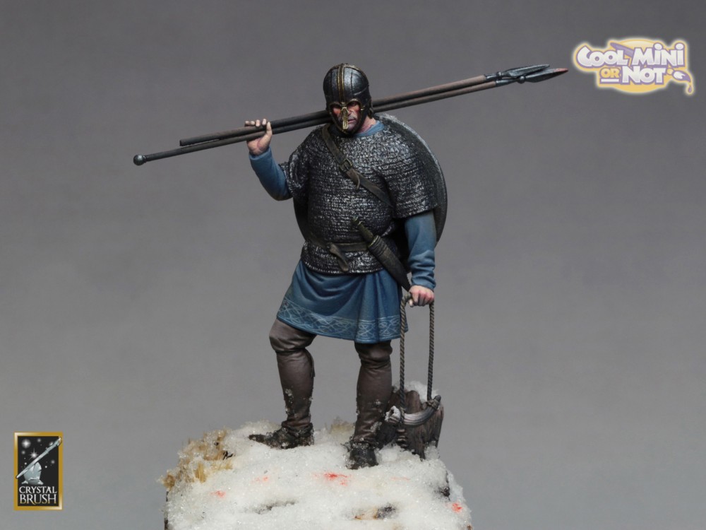
Good news, the samurai is finally COMPLETE!!!!!!! I was getting nervous this past week, but my 2 entries are both ready to go to the Crystal Brush. Of course I'm sure I'll be staring at him plenty over the next few days to see if there's anything I want to touch up or change... but he's done enough for entry. Lucky too, since I still have prep to do for my classes!
Since I've already shared most of the figure, I'm going to hang on to the final photos until this weekend. I know, I'm an @$$. In fitting with that description, I thought I'd share one small look at the figure... his shoe. No, I'm not just trying to be a bigger @$$, I've actually got a point here! I wanted to talk a bit about texturing here. While most of the samurai is painted with the hopes of creating smooth blends, I wanted something different for the underside of the shoe. When I'm painting leather straps/belts, I use a lot of short parallel strokes to create the texture. For other surfaces, like a pouch or, in this case, the sole of a shoe, I use stippling to create the texture I want. I paint from dark to light and start with solid coats of the darker shades. As I get into the mid tones, I still have some solid areas. But, as I get to the transition regions (from shadow to midtone), I start to paint small dots. As I get lighter and move into the highlights, I'm painting almost entirely by stippling. I still apply many layers and only gradually change the color from one layer to the next, but I rely on the stippling to break up the border between successive layers of color and create the illusion of a blend. Here's a close up of the bottom of his show so you can see what I've done.
View attachment 47599
The top is in shadow from the armor plates. I did give it a stippled edge highlight, but the cast shadow drowns it out. Okay, so up close you can see the texture but if we move away, it just looks like a blend. Here's the same image again, but the size it'd be if I were showing the full figure.
View attachment 47600
Just looks like a smooth blend. It's worth noting that, as I was painting the shoe, I kept moving the figure away from me to see how it looked from a distance. There were some areas where the transitions were too harsh. It was hard to see up close, but from far away it was obvious. So I went back in with the colors and used stippling to spread out the transition and create a smoother looking blend. By the way, I'm just using the technique to do my lighting and shading, but if I was doing a pouch, I'd use the same approach to show wear and tear.