You are using an out of date browser. It may not display this or other websites correctly.
You should upgrade or use an alternative browser.
You should upgrade or use an alternative browser.
Bailey03's WIP
- Thread starter Bailey03
- Start date
Bailey03
Well-known member
I'd like to but the internet at our place is so freaking slow. I've done some google hangouts while painting, but the resolution people can see from me sucks. So recording offline and then uploading seemed like the best way to get a decent looking video. We're planning to move in about 6 months, so hopefully our next place will have a decent enough connection to allow that.
Bailey03
Well-known member
Thanks! Yeah, just Reaper + water for everything but the metallics. I think a bit of water gets added to the paint through the wet palette. Then I just add some more as I feel necessary. I'm not putting in a ton, but as I apply a layer I can see how it's covering. Is it too opaque or can I see some of the color beneath it? If it's too opaque add a bit more water until I'm happy. Well, that and working gradually from one shade to the next. The bigger the step the harder it is to blend.
There's something to be said for not letting smooth transitions govern all of your painting. There's areas where smooth transitions are appropriate and there are areas where it's not as critical. If you're going for dramatic contrast, then that effect can supersede the desire for smooth blends. I just posted some of the raw pictures I took of Redghar here, here, and here where you can get a much closer look at how the color was applied. There are certainly areas on the skin and cloth where I'm striving for smooth transitions. But there are other areas, especially on the face and leather sections, where I worry less about the transitions and more about the overall effect I'm trying to create. Hopefully that is helpful.
On a related topic, I was playing around with my video camera last night and took some shots of the nearly finished Redghar and the knight. No sound or tutorial, just rotating the figures so you can get a look at them from various angles (and so I could test out the video from the camera). It's not exactly like seeing them in person, but maybe it's a bit closer than the normal images I post.
Looks like the size is limited here, but there's a bigger version hosted over on my painting blog: https://powellminipainting.blogspot.com/2018/01/brushstrokes-and-video.html
Bailey03
Well-known member
Thanks!
Well, I'm taking trip down memory lane with a new project. I'm doing a commission version of the 28mm White Speaker. Back when I'd just started this thread, I began painting the 54mm White Speaker (you can see a post of her on the very first page of this WIP thread). It's been about 5 years since then and now I'll see how I can do on the smaller version! It's been a while since I've painted a 28mm figure, so I am a bit nervous about that. We'll see how it goes!
Here's my start on the scene. If anyone has been following Kingdom Death for a while, you might notice that I used an image from their old logo to inspire a bit of the base.
View attachment 63621View attachment 63622View attachment 63623
I'll see if I can get some video while painting this piece. Since it's a commission work, my priority is to get her done quickly. So I'm not going to worry about making some tutorials on this project unless there's a place where it seems especially well suited. If I get anything worth while, I'll be sure to share it here!
Bailey03
Well-known member
I've got an update on the White Speaker to share. So far I've focused on the skin (with the exception of the hands and feet). Pretty happy with the results, though there are a few spots I know I want to fix. It's nice to do a 28mm after such a long time working on the larger scales... but I will be happy to go back to 54's and up once she's done. ;P
I'm working with Reaper Master Series paints. Darkest shadows are Chestnut Brown + Rosy Shadow (4:1), then Rosy Shadow + Bronzed Shadow (2:1), Rosy Skin + Bronzed Skin (3:1), and finally Fair Highlight. I like their skin tones, but frequently mix and match rather than just using the sets as they come. In this case I didn't want the darker tones to be quite as pink, so that's why I adjusted the Rosy Skin and Shadow with a bit of the Bronzed Skin set. I'll also be doing a bit of OSL down near the ground, so I wanted to keep the shadows in more areas to help when it comes time to add the secondary light source.
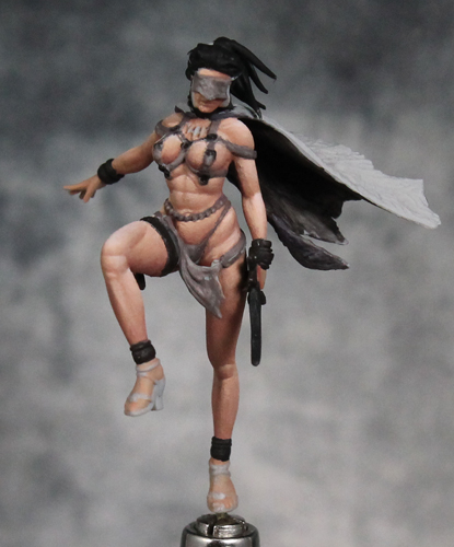
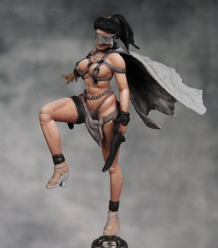
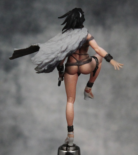

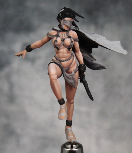
I'm working with Reaper Master Series paints. Darkest shadows are Chestnut Brown + Rosy Shadow (4:1), then Rosy Shadow + Bronzed Shadow (2:1), Rosy Skin + Bronzed Skin (3:1), and finally Fair Highlight. I like their skin tones, but frequently mix and match rather than just using the sets as they come. In this case I didn't want the darker tones to be quite as pink, so that's why I adjusted the Rosy Skin and Shadow with a bit of the Bronzed Skin set. I'll also be doing a bit of OSL down near the ground, so I wanted to keep the shadows in more areas to help when it comes time to add the secondary light source.
AndyG
Active member
Er hmm sorry pall you know I normally go bonkers over your work so I hope you don’t take this amiss but for me the contrast is way too high for a female figure. You mentioned that your keeping the shadow areas so as to help with the underlit osl, I can appreciate that but still it’s coming across as too much. The raised knee for me just looks plain wrong much too muscular for a woman. That horizontal line of shadow the higher of the two just looks weird. 
I am sorry and disregard this as you please as you are a much better painter than me.
I am sorry and disregard this as you please as you are a much better painter than me.
Bailey03
Well-known member
All fair comments. The raised leg, especially the knee area, is one of the spots I plan to revisit. Plenty there that needs to be fixed. As for the overall level of contrast, it was a choice and one that people are welcome to disagree with. My opinion on painting female figures is you can still have large amounts of contrast on the major shapes, but the fine details should be much softer. So on the face, though much of it is hidden, I've used minimal contrast around the mouth. The stomach is an area I could have gone lighter on too. The shadows on the front are much less than say the undersides of the legs, but I could knock it down further to keep the shapes subtler than they are. Perhaps I'll address that too when I go back over the skin. The character is supposed to be a badass female warrior, so I don't mind making the muscles a bit more prominent. If it were a different female figure, I expect I'd take a different approach.
The level of contrast is perfectly fine, and I think it's a very weird thing to say that it should be less on a female figure. Does light work differently on women?? However, looking at the photos of the sculpt above, it seems you have over-emphasized certain lines on the skin, that I can't really see being defined that much in the sculpt. That is a different thing than the level of contrast, though, which again, I think works well.
Shrinekeeper
New member
I’m curious on the larger models is that still all brush work or are you using an air brush? The smoothness of that paint is Mind blowing.
AndyG
Active member
Ritual in the spirit of debate I would say yes light does reflect differently off a smooth rounded woman’s body as opposed to a more craggy ridged male body. The more pronounced musculature on a man is going to create more extreme highlights and conversely deeper shadows. So while it’s true that light reflects the same after all its human skin whether male or female I would say very definitely that the level of contrast is greater on your ripped male barbarian as opposed to a smoother female form .The level of contrast is perfectly fine, and I think it's a very weird thing to say that it should be less on a female figure. Does light work differently on women?? However, looking at the photos of the sculpt above, it seems you have over-emphasized certain lines on the skin, that I can't really see being defined that much in the sculpt. That is a different thing than the level of contrast, though, which again, I think works well.
MAXXxxx
Well-known member
I agree with Ritual, the contrast looks good.
I'd lessen it at a few places (stomach, left hip for example), but for most parts it's ok.
In the end it's a commission piece, so ask the person who'll get it if he/she wants more or less. (unless of course it will be a gift, but then doing wips on a public forum is a giveaway, so unlikely)
Shrinekeeper: not really, Bailey uses brushes mostly, not really an AB user (that said I'm relatively sure he has one).
Last edited:
