Bernard the Angry Holiday Dwarf

redarmy27

New member
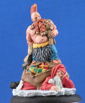
Hey there fellow CMON\'ers! I\'ve been out due to school and other great stuff, but I finally got around to completely finishing another miniature.

Ick! I deleted and redid the photo!

Here\'s the link if you feel inclined to vote!:
http://www.coolminiornot.com/209729

This is my first mini completed entirely since I\'ve been done since I\'ve been able to really sit down after my finals and my LSATs, so I feel I am a bit rusty, but it\'ll get better again with time.

As always, comments and criticism is appreciated!

Jake
 

Shawn R. L.

New member
That intense green background is way too overpowering.........the mini looks ok, be good to see it with the green toned down.
 

redarmy27

New member
I completely agree with you. I was a bit tired when I decided on the background, so here we go:

PresentationAngryDwarf.jpg


I kept the background it was shot in and did the resolution a bit better so it should look better.

I updated the voting link as well. Thanks to those of you who voted and leave comments!

Jake
 

GreenOne

I paint my thumb.
I think the pics look a little washed out.
It could use some darklining between the dwarf and the bag, the bag and the gifts, and the white parts of santa and the base.
Otherwise, nice job. I really like the fur.
 

redarmy27

New member
Thanks for the comment :)

I was afraid to put more contrast in there, but I will in the future. As for the photography aspect, do you have any advice on how to make it so it doesn\'t appear that way? I took over 32 shots of this guy before I got the few I wanted. I didn\'t alter any levels with PSP X2, but I could tinker around with it.

Jake
 

GreenOne

I paint my thumb.
I\'m only learning to edit, but I think moving the darkest level to the beginning of the value curve helps fighting the washed out effect...
Errrr...To compensate for the crappy explanation, here\'s a screenshot:

screen1-1.jpg
 
Back To Top
Top