Candy & Cola

jahminis

New member
hey CMON...

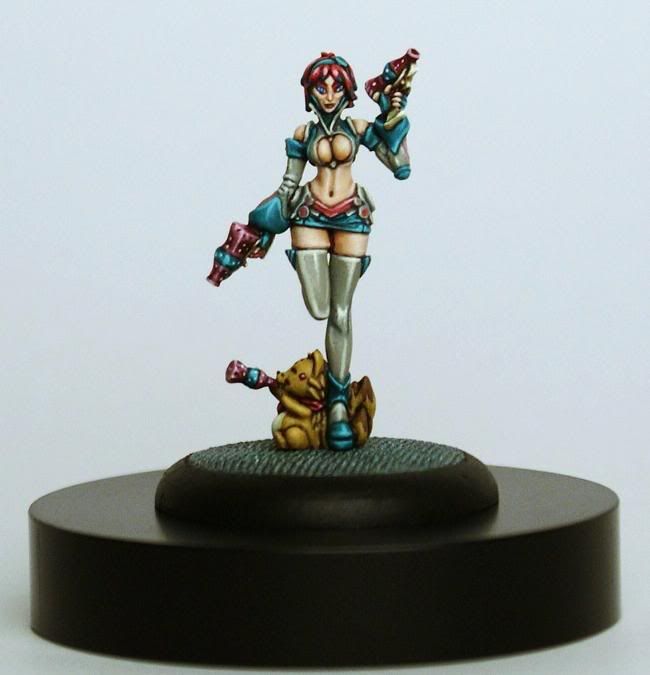
my latest mini is up for votes:

http://coolminiornot.com/245919

i painted this girl for the Darkson Designs Painting Guide Vol. 2...
it really slowed down the painting process, taking all the WIP stage pics...
inspired by the concept art, this was a cool scheme to bring to life...
i got to use my favorite color, the OOP GW paint, Scaly Green...

my first Soda Pop mini!!!
these are some fun sculpts...
very tiny, but great anime style, well worth the effort...
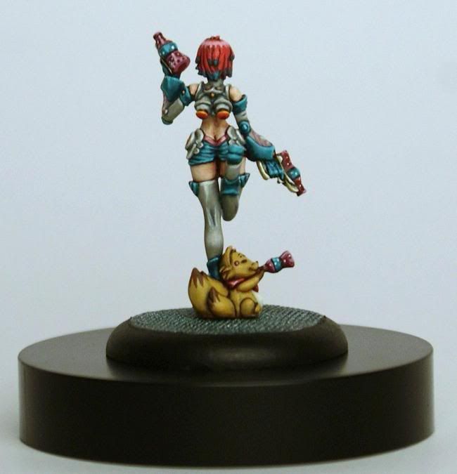
the pics make her look way bigger than she really is, but show off the detail better...

here she is at actual size:
CandyColaActualSize.jpg


and here she is at show-off size:

CandyCola.jpg

CandyCola2.jpg


i have a feeling that these pics will not score well, and that some people will absolutely hate this mini...
oh well...
i'm off to finish my next Space Marine...

thanks for lookin'...

cheers
jah
 
Last edited:

monkeyboy30672

New member
Exactly! The painted play of light on the model is exceptional!! The stockings and the shine from the bottles are what I notice the most. VERY well done!

--Dirty.
 

SkelettetS

New member
agree with freak, not really into the mini (i like big guys with tons of muscles :D ) but a really good paintjob technically and nice colourchoises.
 

Tagamoga

New member
Hello.

I am sorry, but his hard comic style is not quite my taste. The contrast between the single details are sometime to hard for me, and the blacklining reminds me of a childs book to color out sections.

I am missing shoadows in the face - it looks very flat -, under the BIG BIG boobs, at her bottom - looks flat too -, at her fingers (though in shadows are these as light as the face) and so on.

Playing with effects and techniques is great: bottles, the shoes, hair and so on.

It is for somethin between 7 and 8. I still dont know, what i will rate.

Greetings, Taggi
 

cheelfy

New member
I'm not a fan of the mini and of the comic painting you've used on it. As Taggi said it looks a bit flat. I think her cat is pretty nice though. You have a 8 from me.
 

jahminis

New member
thanks, everybody...

i knew that this was one of those minis that people would either love or hate...
my photography is not helping at all...
she looks a lot smoother to the naked eye...
i hate the submission, but really like the mini on my table...
looks like i need to practice my photo-fu some more...

my editing really threw the values out of whack...
in person the white reflections on the stockings aren't so harsh, and the skin has more life...
the blacklining is not so heavy in person as well...
there actually is onlythe tiniest spot of black, where the tail tips meet the body...
the rest is dark brown and marron for the lining...

the comic-style is, of course, intentional, as this is a copy of the concept art...

hopefully i will get some better shots that really show her true colors...

thanks again...

cheers
jah
 

Joek

New member
I think this is one of the best things you've painted Jah :) I'm not completely convinced by the figure - I'm torn between rather liking it, and actually thinking it's just too cutesy, but your paintjob certainly does it immense justice!
 

monkeyboy30672

New member
Well, Jah, when you make a photographic image that's about 400% the size of the model itself, EVERYthing looks biger, including the blacklining. And blends tend to look a bit rougher, and details are kinda thrown outta whack.

After the comments on my Rasputina, I looked at the model in my hand, and there is a BIG difference. That's why I never printed a shot of a model larger than 100% while I worked in the GW Studio. Here, when I posted the thumbnails, I didn't realize they would show up so large! *heh*

Honestly, I don't think your model looks bad at ALL. I LIKE the facial tones in the photo, and I like the highlighting of the stockings, too.

--Dirty.
 

COG

New member
No sure why everyones dogging the mini.
its not a bad mini although i thought that was picahchhoo at the bottom. oops
its funny shes shooting soda as a weapon.
as far as the painting goes you've hit the anime style on the head. looks superb!
i think the base looks like carpet or dunno but you might have improved that
um the large pics lack sharpness/clarity but nice job.
 
Back To Top
Top