Colour Theory

El Matador

New member
Hello friends,

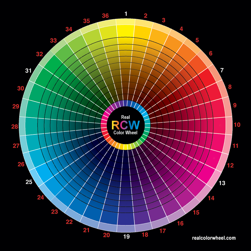
I was thinking about colours whenever i was painting and thought a colour wheel would help me. From what i understand Colours on opposite sides of the circle are complimentary and when mixed create a darker shade without shifting the hue, which i assume makes the painting or mini take a realism, which leads me to my question...

how do colours side by side on the colour theory/ wheel react or influence the eye?

I ask as i have been playing about with colours and tried out using red to shade blue. It looked really unnatural and i really didnt ike it and whenever i mixed the red and blue paints i got a purple which i have seen people do to add depth to a blue. So if i MIX colours side by side and use it to shade (eg purple on blue) on a colour wheel together how does that effect the eye? my initial assumption would have been that it creates a cluttered effect or an effect of chaos on the mini or painting but now i am really confused? ???

Also if anybody has a decent understanding of it could they tell me if i have the basics right as most of what i have odne is in guesswork eg opposites complimentary.

Thanks alot, El Matador
 

airhead

Coffin Dodger / Keymaster
opposite colors: red would not shade blue, but orange would darken it and move it towards brown.
 

Gilvan Blight

New member
There\'s a really good article on Colour theory written by Chrispy on here somewhere.....

http://www.coolminiornot.com/article/aid/194

And it\'s green to shade red.
 

Gilvan Blight

New member
So Teal should be used to shade Red? Or does the whole colour theory change with this fancy shmancy new wheel... well ball...globe?
 

AinuLainour

New member
Originally posted by Gilvan Blight
So Teal should be used to shade Red? Or does the whole colour theory change with this fancy shmancy new wheel... well ball...globe?

The \'new\' one is just more accurate... it was more of a turquoise but I\'m sure the exact colour can be found just to make sure.
 

krom1415

New member
AinuLainour, how do we find the colour to shade red
??? on this wheel.

I like using brown to shade red lol but I think that might complicate things
 

Gilvan Blight

New member
Had edited my post but since you replied, I will post this as separate instead:

actually isn\'t that an additive colour referance where as painting is subtractive? Or something like that. I\'m no expert on colours, but it has to do with the fact that if you add red green and blue plaints you don\'t get white but with light you do.
 

AinuLainour

New member
rcwphotographers825.png


All I know is that this is the most accurate that I\'ve worked with :) (I actually just started with it too this weekend . .) The technicalities aren\'t really my speciality!
 

krom1415

New member
That was quick AinuLainour :D cheers

I just tried the opposite, i.e. blue to darken red, looks rather nice too, I guess just adding a small amount would do the trick:D
 

uberdark

New member
being an art teacher, i have a big understanding of color theory and can match a color for a student in less than 5 minutes.... *tooting my own horn here*

i have studied the relationships of colors and the many uses colors have in our lives, if anyone is interested in my own theories on colors and army painting and what not i wouldnt mind doing it..... i just dont want to do it if there are enough articles out there. as for the some quick things to shade and get better tones

red = green
violet = yellow
orange =blue

of course peaches also work well with shading purple because of the addition of yellow to it. and then reds can use browns and blacks, i actually prefer blacks most of the time, and yellow works better in getting darker with more light browns....

dont even get me started on the grayscale.

muwahahahaahaha..

all color wheels are great from the easiest one to the most complex, they all follow pretty much the same theories.

well gotta go

later on
uber
 

mattsterbenz

New member
The problem with that \"real\" color wheel is that many of those colors have white in them (pinks, light blues, etc). You do not want to use those for shading otherwise it will create a color that is too light or neutral. That large color wheel works in theory (light filtered through a spectroscope or prism, for example) but not in reality when it comes to mixing paint.

For mixing colors (ESPECIALLY darks) you want to use pure hues that have no white in them. I mix oils all the time in my paintings and you can get extremely dark colors from only the primaries (which is why I don\'t use black). My palette is usually W&N French Ultramarine, Bright Red, and a nice pure yellow. For a very deep red I will use Rembrandt Scarlet occasionally.

For example, say I am shading a red area. I will take a bit of red on my palette, and add small amounts of blue (the darkest of the primaries) until it is near the shade I want. It will appear purple, so I will add very small amounts of yellow to adjust the warmth, make it appear more brown, etc.

There\'s not really any rules for mixing colors. When you are shading red, DO NOT just add any green to it. Greens vary. Some greens have more yellow in them, so your shade would look brown/dark orange. Some greens have more blue in them, so your shade will look purple. Some greens have white in them, so your shade will be grey.

It\'s important to understand these things when working with colors. I\'d recommend that anyone interested buy a few primary oil paints (as these won\'t dry quick like acrylics, and allow you plenty of time to experiment) and mix many colors. Make charts, label the ratios of colors that you used. Create both cool and warm versions of colors.

-Matt
 

Einion

New member
Originally posted by El Matador
I was thinking about colours whenever i was painting and thought a colour wheel would help me.
In colour-planning terms yes, but don\'t expect one to help with mixing behaviour as much as you expect it will.

Paints mix the way they do - in detail, not general gist - because of the pigments they\'re made from, not because of \'their colour\', the colour they appear when used thickly or seen in a container.
Originally posted by El Matador
From what i understand Colours on opposite sides of the circle are complimentary and when mixed create a darker shade without shifting the hue, which i assume makes the painting or mini take a realism...
Sort of. This is mixing up two things (that are often quite separate, despite what some books tell us or suggest). There are two kinds of complements, visual complements and mixing complements. They are often not the same.
Originally posted by El Matador
how do colours side by side on the colour theory/ wheel react or influence the eye?
That\'s a very complex question. Far too much to get into really; pondering it is essentially what consumed some artists for most of their later careers (decades). Plus there is a little subjectivity in it too, which doesn\'t help! What colour one person thinks \'goes\' with another is often governed by cultural influences firstly and then with exposure to theories and simply what colours they like more.
Originally posted by El Matador
I ask as i have been playing about with colours and tried out using red to shade blue. It looked really unnatural and i really didnt ike it and whenever i mixed the red and blue paints i got a purple which i have seen people do to add depth to a blue.
This is an example of what I mentioned at the top - with the right red and blue you get a perfect neutral grey :)
Originally posted by El Matador
So if i MIX colours side by side and use it to shade (eg purple on blue) on a colour wheel together how does that effect the eye? my initial assumption would have been that it creates a cluttered effect or an effect of chaos on the mini or painting but now i am really confused? ???
This is an aspect of colour planning and largely a matter or taste - if something looks good to you that is all that really matters.


Originally posted by AinuLainour
All I know is that this is the most accurate that I\'ve worked with :) (I actually just started with it too this weekend . .) The technicalities aren\'t really my speciality!
Careful of the theory behind that colour wheel - many things on that site are not quite the way he claims they are.


Originally posted by krom1415
AinuLainour, how do we find the colour to shade red
??? on this wheel.
That\'s a very important point: you really can\'t use a wheel for this. ANY wheel.


Originally posted by uberdark
being an art teacher, i have a big understanding of color theory and can match a color for a student in less than 5 minutes.... *tooting my own horn here*
That long? :D

Einion
 

airhead

Coffin Dodger / Keymaster
OK, help me out. My brain is straining the morning.

Mix the three primary colors together and you get brown?

You can use brown to darken almost any paint.

Dealing with fleshtones and \"natural\" colors (landscapes, etc.), I learned to use purple as an underpaint to get shadows (airbrush). Paint the shadows (almost like a black & white photo - but purple) then paint over with pigments. Not quite that simple, but that was the basis.
 

El Matador

New member
yeah this definatly helps guys especially Mattsterbenz\'s reply about his oils, so really its just a matter of personal taste for the side by side colours and when you use a colour at the other side of the circle and mix it in it should darken it without changing the hue eg no white or black mixed in?

This helps alot so does that also mean that if i mix black or white in instead i will get a more cartoony look or comic look?

Thanks, El Matador
 

uberdark

New member
Originally posted by El Matador
yeah this definatly helps guys especially Mattsterbenz\'s reply about his oils, so really its just a matter of personal taste for the side by side colours and when you use a colour at the other side of the circle and mix it in it should darken it without changing the hue eg no white or black mixed in?

This helps alot so does that also mean that if i mix black or white in instead i will get a more cartoony look or comic look?

Thanks, El Matador

yes and no. its truly based upon how you shade with blacks. you get more subtle tones usually when you use complementary colors.
 

mattsterbenz

New member
Shading with black gets you more of a grey tone.

Here\'s something you might find interesting. Mix black from the primaries. It is possible. It won\'t be as deep of a black as black pigment, but you can get extremely dark with them. What\'s the point? Shading with black is just like shading by mixing in all three primaries. When you add in all three primaries to a color you get a neutral color. I see no use in shading with black, because I do not get the variety that I could when mixing darks from the primaries since black is already mixed for you.

Using the primaries and only the primaries gives you the brightest and truest colors possible, and is the only way to get the widest spectrum of color. Remember that you still can create neutral colors by mixing all three, and can create any shade of grey or brown you desire. That\'s why I value the primaries + white so much.

I don\'t shade by adding in the compliment specifically, I shade by adding in the primaries that make up that compliment. It gets you closer to the color you need, than simply adding any old green to shade a red.

It all depends on personal taste. Some painters believe black one of the best colors (many renaissance painters swore by it).

As far as painting miniatures go, I just do what Dan says. Simplify things :) Acrylics dry too fast to bother with only using three colors. And I use black all the time with those, heck I only prime black! :D But everything else I\'ve said still applies when using pre mixed paints. Know your paints well. For example, know that when shading Red Gore, don\'t add Goblin Green for the shading because it has white in it. Use Dark Angels Green because it has more blue in it. Etc...

There\'s so many other factors to consider when trying to capture realism. Reflected light, ambiance, atmosphere, color of the light, etc.

Plus with oils there\'s another technique that can\'t really be done easily with miniatures (I used it on one of my demon entries, article to come. I\'ve also heard of some people doing something similar) it\'s called the \"mother color\", also called \"common color\", \"mud\", I\'ve heard all kinds of names for it. It consists of mixing a neutral color (or in my case usually a greyish purple) and adding in a small amount of this color with every other color you mix. It tints all of the colors in the painting slightly and really unifies everything. So when you consider that also, I am never shading with just the compliment, but the primaries that make up the compliment, plus the \"neutral color\" mix, plus a lighter, cooler color for reflected light, plus... well you get the idea :) Way too complex for most to worry about.


-Matt
 

Einion

New member
Originally posted by airhead
OK, help me out. My brain is straining the morning.

Mix the three primary colors together and you get brown?
Mixed correctly any three primaries should be capable of producing a neutral grey; close to black if they\'re of the right type (at least two need to be very transparent, ideally all three).

Originally posted by mattsterbenz
Shading with black gets you more of a grey tone.
Not necessarily. Those who use black - like Vermeer, Caravaggio, Rembrandt etc. :) - didn\'t necessarily use it by itself for a start and even used alone it matters greatly what it\'s mixed with.
Originally posted by mattsterbenz
Using the primaries and only the primaries gives you the brightest and truest colors possible, and is the only way to get the widest spectrum of color.
Only for those hue, not for intermediates - can\'t match Phthalo Blue Green Shade with any mixture, can\'t really get close. Similarly few mixes will approach the brilliance of Cadmium Orange, Dioxazine Purple, Quin Magenta. There\'s a reason few painters use just a primary palette (although some do, and their work can be very nice).
Originally posted by mattsterbenz
I don\'t shade by adding in the compliment specifically, I shade by adding in the primaries that make up that compliment.
All painters using primary palettes work this way (by necessity!)


Originally posted by El Matador
...when you use a colour at the other side of the circle and mix it in it should darken it without changing the hue eg no white or black mixed in?
With the right one, yes. But it\'s not as simple as picking something of opposite hue (for a start, how do you know just by looking?) In brown paints many reddish browns will dull down a wide range of blues, so clearly they\'re not working just on the colours that directly face them across the colour wheel.

Another good example of this from the opposite perspective is there\'s a specific orange, a specific red and at least two earths in artists\' pigments and all make good greys with one blue.

Einion
 
Back To Top
Top