Dwarf Lord - GW

ScottRadom

Shogun of Saskatchewan
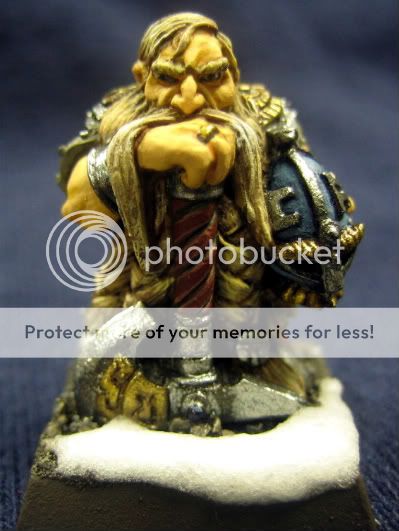
Hey, I banged this guy out today. I thought the fleshtones were a step forward, the metals... meh, and the hair pretty dreadful. I\'ll slap the votey link on when it\'s approved. Thanks to all for the CC so far and the encouragement!
IMG_0598.jpg

And the votey link....
http://www.coolminiornot.com/206812
 

GreenOne

I paint my thumb.
Overall it\'s quite neat.
The skin is a bit yellowish to my tastes especially since the hair is yellow too.
Hair could use more of that depth thing everyone talks about, a good wash and some more highlight maybe.
You should be careful to apply the metal as a very thin layer then wash it a lot then highlight it.. there\'s a good tut for that on the site.
Keep it up:)
 

ScottRadom

Shogun of Saskatchewan
Agree about the flesh vs hair. It was an experiment in blond hair and maybe should\'ve gone on a model with less flesh showing. Maybe I should\'ve taken the hair to more white fend result?

And metals STILL plague me. I\'ve gotten excellent advice, love the tutorials, but still need to work on them. I got over 20 years bad habbits using metalic paint and trying to break them is becoming problematic. I think it\'s still a marginal step forward. Thanks for taking the time sir!
 

GreenOne

I paint my thumb.
No prob.
I haven\'t seen your previous work so i dunno where you came from.
The way metallics work best for me is by applying the basecoat in a way that borders on drybrushing (Without actually drybrushing cause you\'d get metallic dust all over the place)
Default GW skin colors are very yellowish, maybe you should try mixing your own. I think dwarves look best in a more pale, reddish skintone.
It still pretty neat like I said, if you want to improve you sure are at the right place.
 

Dragonsreach

Super Moderator
Staff member
Scott there are a couple of things I\'d suggest for the metals on this figure or other Dwarves,
Firstly; smooth the metal (Semi Burnish it) with the side of a needle. You\'ll find that the primer lies smoother and therefore you can get smoother metallics.

Secondly; Always try to thin your paints so that you end up needing two or three coats. Ok you might need to resort to using a hairdryer in between coats, but so what. lol

Lastly; Try to apply your mettalics with the brush strokes all in the same direction. This seriously improves the way the metallic particles tend to lie and reflect light.

If you are doing metals on Orcs the surface of the mini looks better if there is a touch of pitting, making the metal look older and well (mis)used.
 

ScottRadom

Shogun of Saskatchewan
Mike-Good tips!

-A needle, really? I\'ll give it a shot.

-The paints are thinned, but obviously I need to thin them more. One thing this model does suffer is that it\'s been stripped (Badly) about three times now and there is a little \"ick\" in the extreme recesses.

I will take those tips to heart! I have the same model in a blister witing for a period when I can really take some time with it. It\'s a fantastic model. Anyone know if it was one of Felix Pangua\'s?

I got at least one month off from my painting obligations (as part of an army paiting challenge locally) so I can knock off a few models and spend the appropriate amount of time.

A needle? Never would have thought....

Thanks! I\'ll try to apply this to the MaxMini Dwarf I got waiting for me at home.
 

generulpoleaxe

New member
to sort out the flesh mate, add space wolf grey into the mix for your highlights, it will desaturate the colour and help get rid of the yellow look.

add some shading, use bestial brown and add in red to increase the depth and warmth, finaly adding a touch (it realy only needs to be a tiny amount) to cool the shadows.

then use a tiny amount of purple to add character around they eyes, less is more in this case.
 

Dragonsreach

Super Moderator
Staff member
Originally posted by Bigdennis52
heh i saw this on your wip,

a hairdryer in between coats... hmmm I never thought of that :yawn:
Simple and expedient.
OK I\'ll admit to being on my third \"El Cheapo\" but as I\'m paying £2.99 at Argos every couple of years I recon I\'m getting value for money.
 

ScottRadom

Shogun of Saskatchewan
Originally posted by generulpoleaxe
to sort out the flesh mate, add space wolf grey into the mix for your highlights, it will desaturate the colour and help get rid of the yellow look.

add some shading, use bestial brown and add in red to increase the depth and warmth, finaly adding a touch (it realy only needs to be a tiny amount) to cool the shadows.

then use a tiny amount of purple to add character around they eyes, less is more in this case.

Chris- Thanks as always for the tips. This one is already \"in the books\" but I got a lord on a shield I\'ll try those tips on. I think the grey will also give a little age to the flesh. Can\'t wait!

Mike- I don\'t think I will do the hairdryer trick. I currently have enough problems with my kids trying to kill themselves with any tools I lay around. My one year old daughter was crawling around trying to get the lid of my super glue about a week ago (Thank jesus the wife didn\'t see that!) and my boy was in the garage with me over the weekend and said the turpentine I was using smelled \"Delicious!\". So I\'ll have to let mother nature take care of my drying for a little while longer. Tons of projects so I just will have to keep a RnF model or two handy..

Thanks to all!
 

Dragonsreach

Super Moderator
Staff member
Originally posted by ScottRadom
I currently have enough problems with my kids trying to kill themselves with any tools I lay around.
Toolbox & padlock = safe kids.

(Ok I\'ll admit to double standards here myself as I tend to leave my stuff lying around all over my work room (Bombsite :rolleyes: ). But I have no kids and any injuries to myself my wife just laughs at.)
 

generulpoleaxe

New member
for some reason i didn\'t type the word turquoise scott.
that belongs in the part about the shading where you add it into the mix after the red (only a tiny amount though)
 

ScottRadom

Shogun of Saskatchewan
Hey there Chris, you\'re not secretly trying to get me to \"gay-ify\" my dwarf models, are you?

Seriously I will give it a shot. I saw Mike/Dragonsreach post a real life portrait of an incredibly ugly man where it was quite visible to see all the greens, purples, reds and such and together it really made quite a picture.

I\'ve got a Nurgle Sorceror I may take a stab at and work the colors. Thanks again.
 

Dragonsreach

Super Moderator
Staff member
Originally posted by ScottRadom
I saw Mike/Dragonsreach post a real life portrait of an incredibly ugly man where it was quite visible to see all the greens, purples, reds and such and together it really made quite a picture.
Gustav Flaubert or Vincent Van Gogh?
Here
 

ScottRadom

Shogun of Saskatchewan
Originally posted by Dragonsreach
Originally posted by ScottRadom
I saw Mike/Dragonsreach post a real life portrait of an incredibly ugly man where it was quite visible to see all the greens, purples, reds and such and together it really made quite a picture.
Gustav Flaubert or Vincent Van Gogh?
Here

Yup, that\'s the feller. What a looker! Thanks, I saved that sucka for reference. It\'s mind numbing to think of some of the techniques used to produce quality results. If someone last year had told me I needed to add more turqouise I woulda spit in there face, because they were obviously loony. But now I am a more enlightened soul, and I\'ll have to give it a shot.

Thanks again guys!
 
Back To Top
Top