Fabius Bile C&C.

redarmy27

New member
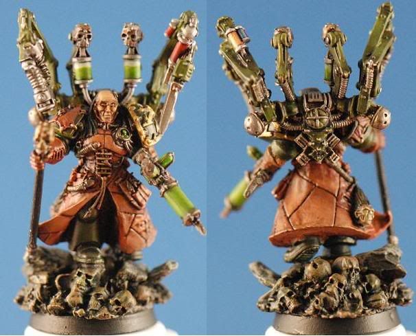
Over the weekend I was finally able to complete Mr. Bile. He was a great miniature to work on and definitely put me back on the right track to getting back into the painting hobby.

Here he is:
FabiusCompliation.jpg


Here\'s his gallery link (votes with C&C greatly appreciated!): http://www.coolminiornot.com/197470

Now that I\'ve completed him, I think there are a few things that I need to work on. Matt made the observation that my shading is good, now I just need to work on the highlighting. I can see that as well as that I did do some highlights, but I need to make them stand out more. I also need to work on my blending a tiny bit more.

Aside from the painting, my photography is improving, but for some reason my pictures still come out grainy. I use my macro lense on the camera, crop them and adjust them slightly and they look great. However, once I run them through Photobucket, they blur a little bit. If anyone has any tips of that, I\'d be extremely grateful!

Thanks for looking. Any comments and constructive criticism would be greatly appreciated! I\'m looking to excel at painting and photography in this great hobby.

Cheers,
Jake
 

Cleezy

New member
Hye Jake i really like the model and the way you approached and painted it, good to see some variation on the colours.

I think though you have pointed out your main area to improve already and thats the highlighting. From what i see of the model it lacks a defining highlight that makes it \'pop\' like on the vials an edge highlight would make the glass seem to sheen an the liquid to swill. Also the armour is quite flat, and it seems if it was any lighter it would blend in to well with the other green on the model. So thats a tough choice you will have to address on future models.

One last part is really there are no colours that make the model have great contrast. It all seems to blend nicely into one.

I know this sounds harsh but im being as critical as can be, i love how you have painted the model and your ability is great just a few extras are needed to turn great into exceptional
 

redarmy27

New member
Thanks for your comments, Cleezy and don\'t worry I don\'t worry about being harsh. Often too many people would like things sugarcoated to them, but if it\'s not being disrespectful then it\'s good, constructive criticism.

Thanks for being honest everything, :). I have another mini I\'m working on now. I guess I have to learn that when painting minis, I must almost over-exaggerate the highlights so that they do \"pop\". I also will take into consideration to study the color wheel closer to determine proper color contrasts.

I\'m still not quite sure on how to improve the quality of the photos, but I\'ll continue to look for methods in doing so.

Thanks again for the constructive criticism :)

Cheers,
Jake
 
Solid painting i think, everything looks nice and neat which is always a good foundation to improve upon :) I actually think your shading could be improved some more, i think some areas need some more definition. I agree about the highlighting too, i find it a good idea to take a picture of the mini just undercoated and shine 1 bright light from above (if using zenithal lighting) and edit the contrast a little on some editing software so you can see the light and shadow easily, i don\'t really use that technique so much now but it definately helps when you are unfamiliar to this kind of technique. Continue happy painting, look forward to seeing some more :)
 

Thunderhawker

New member
Okay let’s see: Your technique is not bad at all. Smooth.

For the flesh coat, I would have used more varying shades of flesh to indicate that they are not from the same person. A similar effect could be gleaned with colored washes from panel to panel.

With the exception of the green, it comes off as a bit monotone (this is not necessarily a bad thing). So a bit brighter green, in fewer places may give it a bit more pop.

Your metals could use some washes of color in the recesses to define them a bit more.

The base is cool, and as such needs as much love as the main character here
 

ErunnerXI

New member
Other than what has already been said regarding your highlights, I was anxiously awaiting your release of the finalized model. Great job.
 

redarmy27

New member
Thanks for the comments everyone. While it will already be making its run to the owner shortly, I\'m taking in stride at all the suggestions that everyone has given me. I\'m already starting on my next mini and will work even harder to make it better than this one :)

What I\'ve learned is that I have to almost over-exaggerate the details of the mini. It\'s a little weird for me to do this since I like to paint things as \"real\" as they are, but I have to remember that it\'s a 28mm figure. Thanks for the comments and support! Further C & C is appreciated as well.

Thanks again everyone :)
Cheers,
Jake
 

Manus

New member
Originally posted by redarmy27

What I\'ve learned is that I have to almost over-exaggerate the details of the mini. It\'s a little weird for me to do this since I like to paint things as \"real\" as they are, but I have to remember that it\'s a 28mm figure.

I think you made a good looking mini - what you point out above is IMO one of the hardest parts going from army/normal level painter to good painter and showpiece painter. It takes a long time getting used to adding those extra layers of highlight when you are used to painting \"real colors\" as you say. But keep up the good work and take all these advice ad notam and you start improving fast.
 

redarmy27

New member
Thanks, will do :). I finally got Paint Shop Pro 12 working on my laptop from my PC and I redid the images correctly before sending them through photobucket. There\'s a world of difference! I\'ll resubmit Fabius at a later date, but for now I\'ll heap up all the advice that you guys and gals gave me and go for it in my next mini. Thanks everyone :)

Cheers,
Jake
 

Shawn R. L.

New member
quote:Originally posted by redarmy27

What I\'ve learned is that I have to almost over-exaggerate the details of the mini. It\'s a little weird for me to do this since I like to paint things as \"real\" as they are, but I have to remember that it\'s a 28mm figure.

I used to do theater work (plays and such) and to see one of the actors up close was strange. Their makeup was garish and HEAVY. The point of it was that the actor is being seen from far away and especially the face needed some help to be able to communicate an expression though the person was small due to the distance from which they were being viewed. Similar here. You\'re trying to communicate something tiny and thus have to overcompensate.
 
Back To Top
Top