Finally finished Necrosius, Nurgle sorcerer by Forgeworld

phreak0

New member
i dont know if anyone is interested in viewing it now since it took so long to finish it (due to studies, family, life etc)

but here he is:
nurgle-sorcerer-klar-1.jpg


voting: http://coolminiornot.com/253968

cheers and thanks for looking, feel free to critisize and comment as that is the only way i may learn to paint better.

//Dennis/Phreak0
 

TheDrescher

New member
Very cool. I especially like the armor on his arm in the small box. What colors did you use to achieve it? As for critique, The one thing I noticed right away is that the face is colored very similarly to the armor: enough so that it seems to blend in a bit. Perhaps a few washes or something to separate the head from the chest plate?
 

phreak0

New member
yeah i know, i had a lot of problems with the face, i wanted it to ne kind of the same colour as the rest of the fleshy areas but a bit brighter, fatally failed that i guess. then i tried to make all the surrounding areas dark to try and give the face some contrast but i feel that didnt really help either. maybe i´ll just wash it with some purples and greens to make it stand out a bit more, thanks.

the armour is based on Cyrils glowing eyes tutorial with pretty much the same colours and then i added some purple and GW scorched brown aswell as some GW hawk turqoiuse and P3 Menoth white base to give it that yellowish finish.

thanks again.
 

crazyboyae1

New member
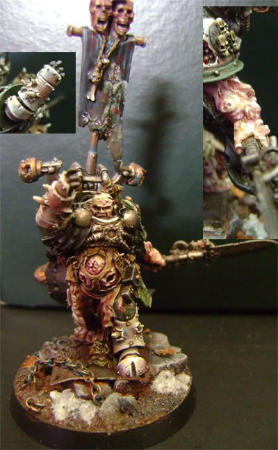
i think the problem with this model is that the components for the most part are painted well, but the color choice is off. the skin and the armor are very close in color, which muses together the whole model. also the skin all around seems to be different and so does the cloth. it would be better if you made all of the cloth one color, like you painted some black and some a cloth color which is also very close to the skin and armor. it just makes it so hard to look at and see that everything is well painted. then you made the cloth he is waring dead skin, but the model is already covered in skin. it would be ok if it was dead skin of a totally different color but its the same color which adds less and less contrast.

i will give you credit, this is an extremely hard model to paint. to even come up with the right colors. and you finished it which is great because i ended up throwing mine aside (mostly because his spear broke) you are certainly on the right track because the components are well done. you just need to think about what you paint where more to optimize contrast and pleasure to look at it. hope im not to harsh, only the upmost constructive crit is ment here.

keep painting, judging by this and your gallery your on the right track.

-Ansel
 

supervike

Super Moderator
I really like the muted colors. It seems drained of life in a way. And the way the dude 'feels' to be part of the base. Quite often it seems like a miniature is just stuck on the base, but this one looks like he comes from that world.

I agree that the face, which should be the focal point, kind of gets lost in the composition.
 

phreak0

New member
Crazyboyae1: i think the lighting is spooking around a bit with the pic which creates the effect that the skin and loincloth are the same colours, the skin is more of a purplish, yellow, pinkish think while the cloth is a solid brown with some small splashes of blue shades and grey highlights. one of the reasons i actually went with a similar colour for the armour and skin is that it looks like his right leg is morphing into skin from armour in a way and i wanted to use this across the mini. sadly all the pics i tried to take of that leg looked bad.

no prob with the crits, i aim at getting better so just tear me a new one :D

Supervike: I actually mirrored the colours from the mini in the base, all the nuances and coloursplashes is on it but in other constellations :D
i was actually going for the effect that you mention.

yeah i have to do something about the face, i have to think about it i guess.

thanks to you both.
 

supervike

Super Moderator
Supervike: I actually mirrored the colours from the mini in the base, all the nuances and coloursplashes is on it but in other constellations :D
i was actually going for the effect that you mention.

That makes it even cooler! Keep posted stuff man!
 
Back To Top
Top