GDUK 2011 Monster; Slann on Stegadon

winterdyne

New member
I'd appreciate critique and suggestions on this chap, want to push myself a bit more next year:

steg_done1.jpg

steg_done2.jpg

steg_done3.jpg

steg_done4.jpg
 

jcichon

New member
What critiques can one offer! The kit is incredible! If I were to offer one it would be the glodwork looks a little flat with no real highlights but it sure does not take away from the kit at all. Really great work!
 

PegaZus

Stealth Freak
Feck. I'm done. Just going to go put my brushes through a wood chipper.

Must criticize something... uh... uh... uh... the rainbow feathers. Those can't exist in real life. Minus 1 point.

Okay, more staring and trying to find anything I could comment on... and I did find something. I honestly can't help you fix this problem, but maybe by pointing it out, someone else can add something to help. In the 3rd picture, it is most noticeable, but the stegadon has a very plastic toy look. What I mean by that is it almost looks like a plastic toy that you'd buy prepainted. The underbelly is just too clean and smooth perhaps?

Very difficult to critique something this nice.
 

SkelettetS

New member
niiiice stuff! the main thing i think you could improve is the base. honestly, it's pretty boring and looks rushed. working more with vegetation and plants would really make a huge differance and would push this lovely painted mini at least one level.
 

me_in_japan

New member
I have to agree with everybody else. It's blooming difficult to find a "you need to work on..." for this mini. Blending is lovely, highlights are well placed, and colour choice is very natural.

Hmmn. OK. Constructive criticism rather than useless praise...

It seems to be quite uniformly lit. If you darkened down some areas, maybe some pools of shadow, itd create more of a contrast with the brighter areas.
The base is quite "standard" looking. A bit more work on the base with some interestingly shaped rocks, a few wee beasties scampering away, or even footprints or something might add a wee point of interest down there.

*edit* Skel got in there first. Base, yup.

Does that help at all? As I said, I'm reaching, here...
 

winterdyne

New member
Thanks guys. I have an opportunity to rework the base a bit as he's going onto a combined display base with a unit of Temple Guard. The basing above was done on the morning of GD, in about half an hours frenzied work (along with varnishing the plinth - actually the top off a rotary tool box)... so yeah, figured that may be a weak link. ;-)

I might throw some mud pigment up at the belly of the beast, that should help with shading down the bottom half too. All useful feedback, thankyou!
 

LegionoftheCow

New member
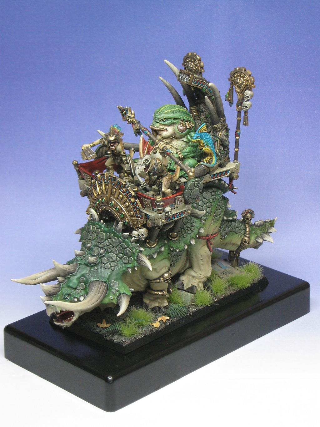
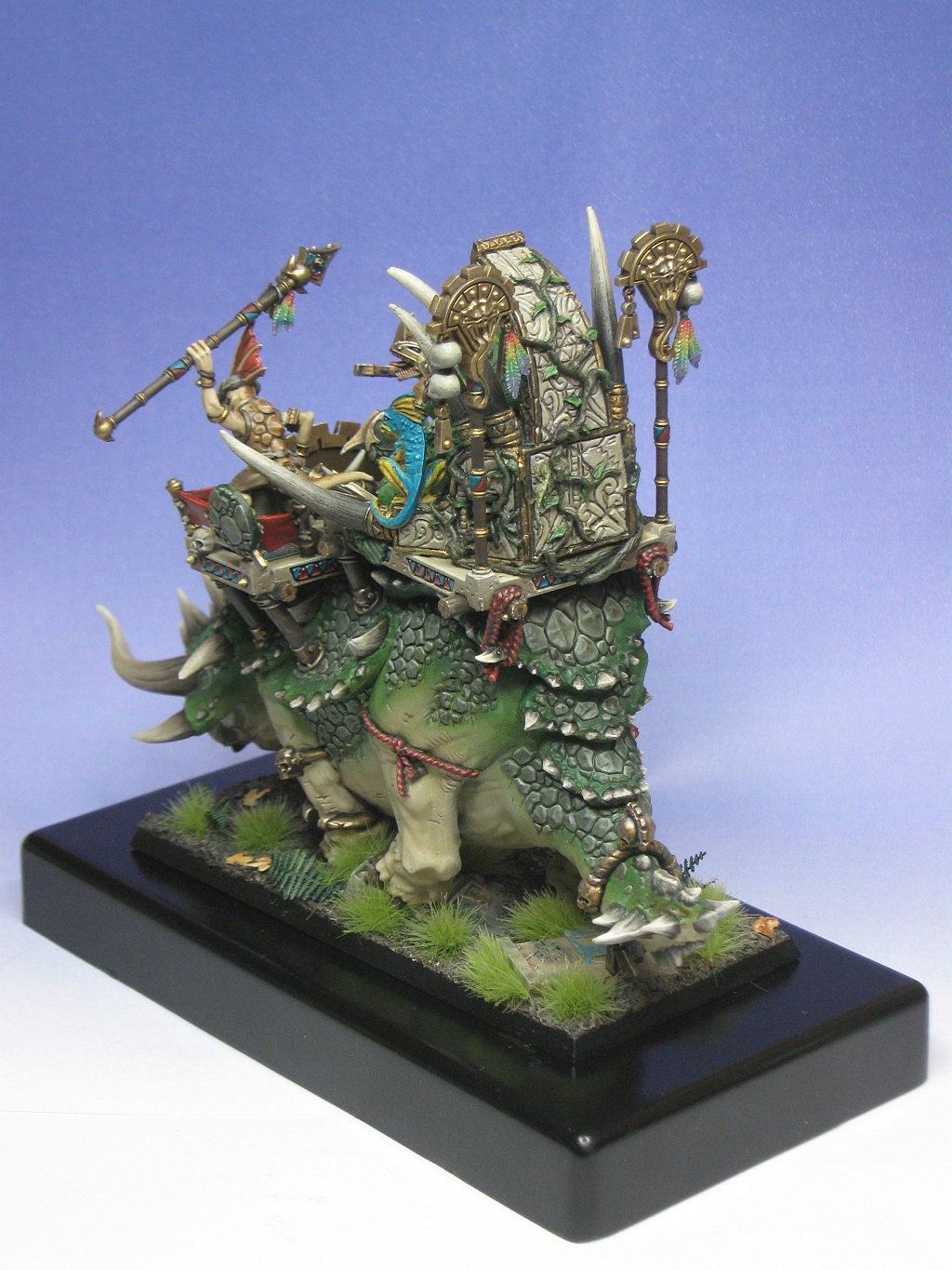
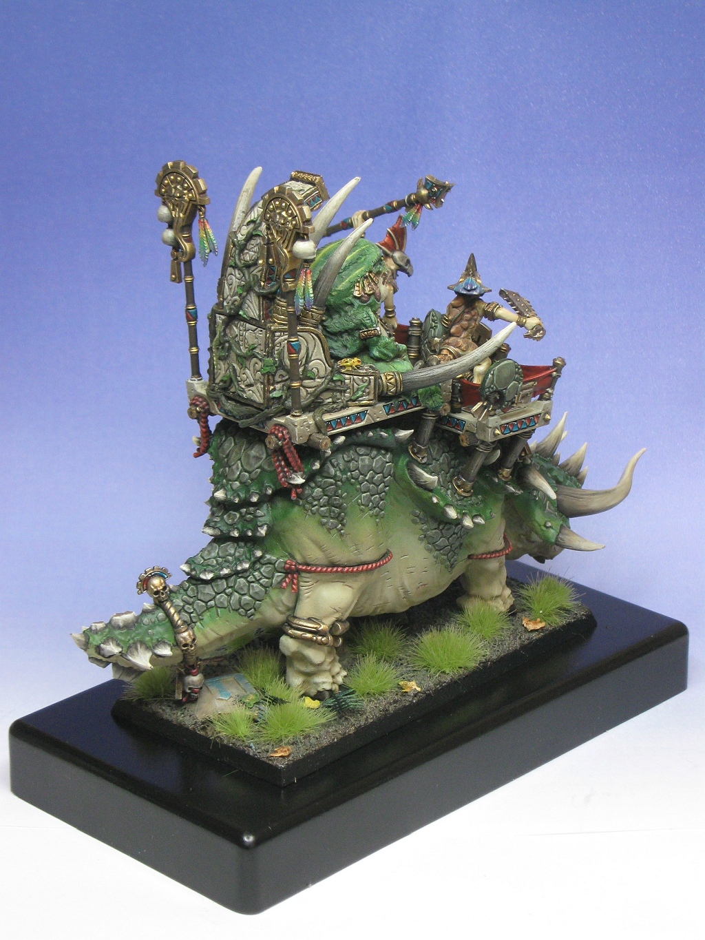
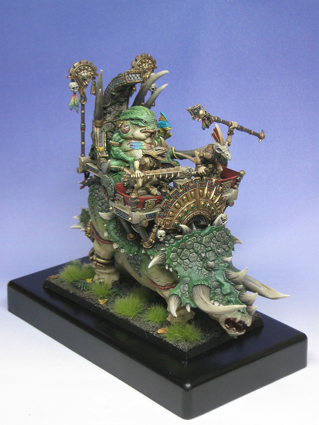
The most noticeable thing for me, is that, it looks like an airbrushed basecoat. Soft colour, large surfaces covered by the same minimal tones, and minimal transitions.

To be as honest and helpful as I can, the GW kit is doing a lot of the work for you, as FW kits often do for others. To bring your skills up a notch, you will have to spend more time managing light, transitions of colour/light, and using your techniques to do the work instead of the kits.

I think the concept of basework as an afterthought is a big point, as Ive found that most gamers who become painters paint models, while top painters, build characters, scenes, personalities, ideas and so on. Creating a vision will help you better present, organize and deliver a certain mood or idea with your colours, composition and basework,

Hope this is helpful for you!

You have by no means done bad work, but the best part is, you can do many things to improve! (itd be boring to be perfect :p)
 

BPI

New member
Too much flat beige and green with mostly natural shadows (just to emphasize points made and acknowledged above).

Tufts on base look too plasticky and uniformally coloured. Wash & drybrush is your friend :D

it's quite a rewarding piece to spend a while with as I keep spotting new bits but for an eye-catching first impression it's the turquoise and yellow lizard on the throne arm that my eye is drawn to. Presumably not the intent.

Keep in mind that the above doesn't mean that I'm not a little bit jealous though ;)

Cheers, B.
 

Einion

New member
First off, excellent job - good colouring, neat, tightly done. Very much a picture-perfect version of this style.

That said, I would have had some critique even if you haven't asked, which will echo a few things LegionoftheCow says above. First thing that struck me was the slightly flat look to some of it, especially on the beast's hide. But overall more shadowing (even if just a little more) I think would help. Looking at the skulls for example, that level of shadowing looks great to my eye and I think the whole thing would benefit from matching their handling a little more closely. I'm not sure if more highlighting in a few key areas might be a good idea, with enhanced shadows they might not be needed at all.

I would like to see a bit of weathering, but it's by no means a necessary addition - this clean look is a style and it's a perfectly good one.

You're reworking the base anyway so may I suggest going with just a few bits of greenery, that amount of grass begins to take away from the greens in the subject for me. I think a rocky/gravelly base with an ochre or slightly reddish colouring might set off the main colours nicely.

Einion
 
Back To Top
Top