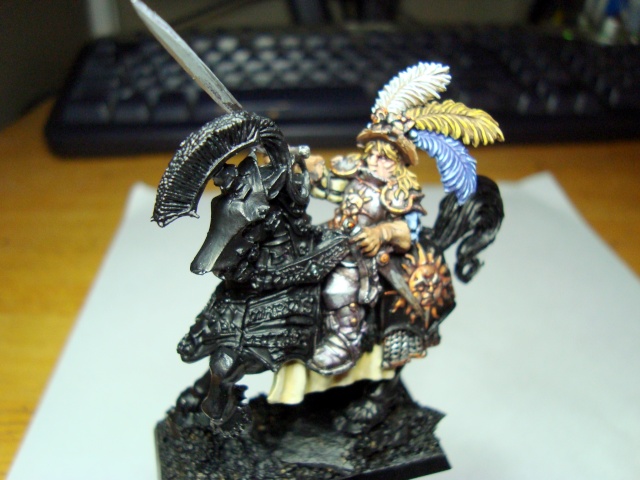
General of the Empire

carsong

New member
Hey everyone,
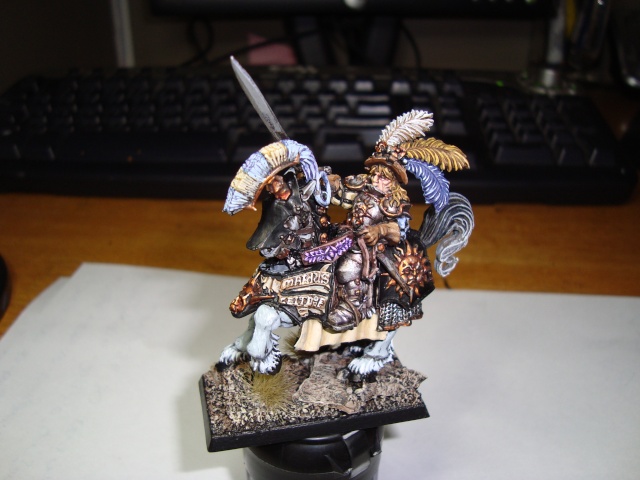
A Quick pic of some early work on this excellent mini from GW. Right now I'm working on the armour.
I started with a basecoat of boltgun metal followed by several washes of devlan mud. Highlighted with boltgun metal followed by chainmail on the highpoints. I then applied a purple glaze into the recessed areas.

Sorry the pics are not so great.....do I need to rehighlight the chainmail or even add some white to the chainmail for a final highlight?


cheelfy

New member
Nice. You can highlight Chainmail, with Mithril Silver for example. Adding white to it is also a good idea but I would go on a very bright grey (any grey you want + white) to have a better effect.
 

mud duck

New member
I thought that the highlight was to add Mithiral Silver, or at least GW's way of doing things. As for your highlight, I think that its looking good, then again I like my armors on the dark side.
 

Wyrmypops

New member
I'd be inclined to leave off further highlights on the armour until more of the mini is painted. You'd want to ensure the whole miniature works together, considering the tonal range of it holistically. Not having one part heavily highlighted while another wallows with less contrast.

If you deem it neccesary, could add some precise highlights later on down the line. Could line the occasional chain mail link that wouldn't be in shadow with some Mithril Silver. Might want to mix some Silver with Chainmail paint for a point on other chainmail links too.
 

carsong

New member
Thanks for the feedback. Appreciate the tips Wyrmypops!

I'm going to move onto the rest of the rider and will post up some work tommorrow.
 

ScottRadom

Shogun of Saskatchewan
Hey, attaboy Carson! Carson won't admit it but he and other newcomer here HillbillyCarl are friends of mine from Saskatoon. I've been trying to get them to come here for a while. Glad you did buddy!

I think waiting to get more of the mini done is a good idea, but my personal opinion is that no level of highlighting is too high for metal. By no means are my metals hot stuff, but I really like it when metal goes from near black all the way up to near white. I'd go for some mithril silver, when the time comes. If you like I might have to do an order soon for some more Vallejo Model Air metalic, and that stuff is the cat's ass. Also some vallejo metalic medium really gives the final highlight a real shine to it. I'll show you next time you're around. We should hook up for some painting.

Next weekend, on Saturday do you and the old lady wanna go to the Fox, or the Cave? Wade should still be around and the bro and some other peeps are in for drunking.
 

carsong

New member
Yeah I finally made my way here! I definitely need a break from army painting, stretch my painting legs and all.

I'd like to try out the vallejo range. I also like the final highlight on armour to be quite white. I did mix in some white into the chainmail for another highlight but it seemed to almost wash it out abit? I'm probably gonna go over a few of those areas again.

Can't wait for this coming weekend, Paintin and drinken is always quite right with me! I'll be in Friday morning with the boss, er my lovely wife.


edit: added in a pic of some more work I wipped up.
 
Last edited:

carsong

New member
A few more steps done here. Any thoughts on the horses barding. I'd like to keep it black but was not sure wether to add some sketching or some other effect on it?


carsong

New member
Managed to get a bit more work done here. Kind of divided on the armour's scroll work, not exactly sure where to go with it. I also need to figure out some form of crest for the armour plate on the horses head, or even if I should attempt it. Thought?


ScottRadom

Shogun of Saskatchewan
It's coming together. I am awful at freehand so I wouldn't. BUt give ti a shot if you like! I vote for a little more shading or variation in the crest feather thingy. Slightly darker on the bristles at the base I think. Right now it looks like it's shaded in the recesses than all of it highlighted the same. I'd rather see it a little bit darker at the base and lighter at the top.

Keep it up Carson!
 

Wyrmypops

New member
I'd agree a wee bit more shade to the base of the horse's crest would be groovy. More than an extra highlight on the very tips of the crest, though that could be worth doing later down the line if it recedes in punchyness as more of the mini is painted.

You wondering about designs for the barding. On the flat parts you mean? The metal on the forelegs and head, or the cloth hanging beneat the saddle?
On the cloth, could add some squiggly bits. Reinforcing the "Knights of the Blazing Sun" motif on the rear of the horse. Those squiggly bits coming from the sun, rendered in black or red, as trim along the cloth could be peachy. Like a series of squiggly "I I I I I I" along the trim.

It's odd to see that wreath on the reins rendered in lilac. Normally see wreaths in green. Does make it stand out though, albeit with some oddness.

Sure is looking yummy though. Clean and punchy.
 

carsong

New member
Good tips there guys, The crest is something I missed, Gotta work that up. I'd really like to try some sort of etching to the armour plates on the horse but am a bit scared. If it dosn't work I can always recolor it black.

I though I'd try something different on the wreath to really draw the eye in, plus I love that color on figs.
 

Wyrmypops

New member
The etching, you thinking of freehanding it on with paint? I would. I tried a proper etching tool years ago, it was mad, like a tiny power tool, could barely control it. Made a glorious mess. :doh!:

Any freehand, might be worth trying out a design on paper first, rather than using the mini as the sketch pad. Just to see if the elements of the design work out right against each other and the rest of the mini. Most common thing I've run into is the size of text being too big or small.
 

GTherk

New member
I also need to figure out some form of crest for the armour plate on the horses head, or even if I should attempt it. Thought?

It looks really good so far, I like the many bright colors. But, I'm wondering if a crest or other design on the armor plates, esp. the horse's head, wouldn't be too busy. The model already has quite of bit of intricate design all over the place and maybe just a solid color on the armor plates, like a gold or a blue, might help to balance things out. Just a thought, keep up the good work.
 

carsong

New member
Sorry guys for the lack of updates here. The got completely side tracked by buisness issues that I was faced with.

When I finally was able get back to painting I had lost focus and rushed through the rest of the fig just to finish it.

Anyway, here is the finished model. Let me have it with both barrels, I can take it.

I'll move unto a fresh model and will post up my WIP. I'm really looking to take my painting up a notch and so am looking for all C&C.

cheers
 
Back To Top
Top