What\'s in a picture....
I\'ve been watching/reading with interest all (and there are a lot!) of the topics relating to the varying standards of the GD\'s and also the photo standards of GW.
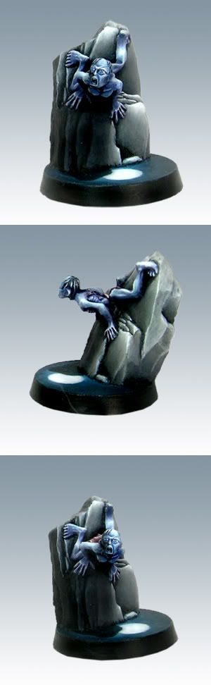
Re the comments on this thread about EricJ\'s Gollum and the \'bad\' pictures taken by GW, I thought I\'d add show you these pics.
Both of these were taken at GD2005. I was in the usual GD crowd i.e. cramped, being jostled, rude kids just barging in front etc and of course, the models are all displayed in glass cabinets.
I only had a few minutes for each picture because of the environment (you are kinda swept along with the crowds!) so no time for a setup with lighting etc. For the purposes of showing them here and wanting to prove a point, the pics have only been cropped and resized. I haven\'t done my usual \'auto contrast & colour adjust\' stuff.
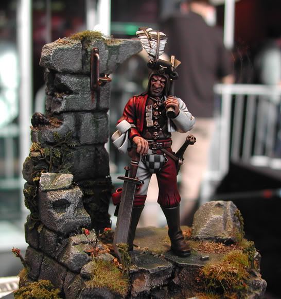
Mike Anderson\'s GD2005 entry
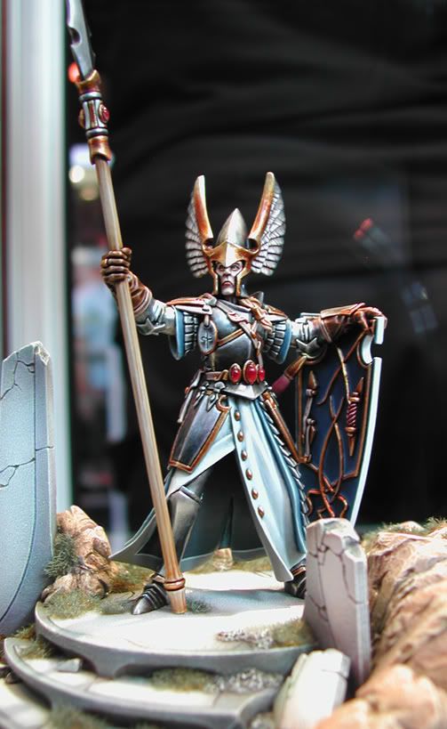
Martin Footitt\'s GD2005 entry
For comparison, as I know someone may comment on the size difference of the above models Vs Gollum... another pic taken at the same event of..... Gollum
Unfortunately, I\'d love to credit the painter, but I simply do no know who painted him

I guess the point I am trying to make is, it all comes down to the quality of the model and the paint job