Message original : ScottRadom
Anyone got some really good mini\'s to reference for this?
[edit]Anders beat me to it

[/edit]
Examples for the deep or directed shadows :
http://www.coolminiornot.com/113668
http://www.coolminiornot.com/182658
http://www.coolminiornot.com/156016
And the more historical minis.
The rest is for the discussion on materials :
As always with Anders\' mini, the effect is subtle, but it\'s there
:
http://www.coolminiornot.com/221228
You can see the gleam on the hair in front, and then a shadow marked by the raised arms. It\'s also interesting to compare the hair to the skin. The later one is matter.
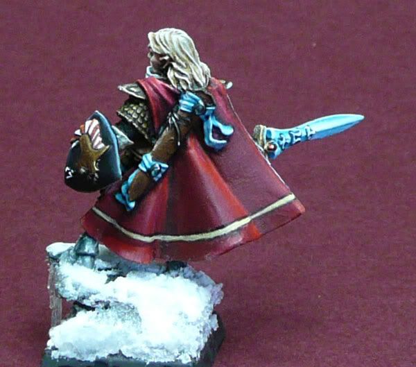
In this one :
http://www.coolminiornot.com/192255
The leather tends to pick up most of the light with a few sharp marks whereas the metals tend to have harsher contrast. And the painted shoulder pads are one of the mattest parts of the mini.
And another example :
http://www.coolminiornot.com/184584
Message original : ScottRadom
What I would really love is to see some snapped pics of stuff in progress by some of the members around here.
I find it distracting to take pics in between painting phases for a same surface. It kind of kills the momentum and often I\'ll touch up or add details to a zone well after the initial highlights and shades are done. But I agree that painting follow ups like what Giganticdarks did a while back for his marine are a pure pleasure to read
.