You are using an out of date browser. It may not display this or other websites correctly.
You should upgrade or use an alternative browser.
You should upgrade or use an alternative browser.
Help with NMM - Sanguinor WIP
- Thread starter Aliengod3
- Start date
nels0nmac
Member
New to NMM.. hmm that sword looks pretty damn good to me. Certainly from the pic the blending looks really smooth.
The face does need some work. It looks like the light source is directly in front of his face as oppossed to being off to one side. So the symetrical highlighting that you have doesn't quite work. It also looks like you have highlighted up to pure white which is a bit to intense. I only use pure white to pick up the spot highlights where the light reflects the most. If you give a thin wash of yellow over the face you will knock back the intensity of the white and IMHO get a better gold colour.
The face does need some work. It looks like the light source is directly in front of his face as oppossed to being off to one side. So the symetrical highlighting that you have doesn't quite work. It also looks like you have highlighted up to pure white which is a bit to intense. I only use pure white to pick up the spot highlights where the light reflects the most. If you give a thin wash of yellow over the face you will knock back the intensity of the white and IMHO get a better gold colour.
Elly3438
Member
I agree with nels0nmac, the sword looks really stinkin good, and the face looks blended well, there is just too much white in it. Try to imagine where the light is coming from, and use the white sparingly and you'll find you will get a more reflective look.
Looking forward to seeing more progress on this!!! Keep it up~
~Jeff~
Looking forward to seeing more progress on this!!! Keep it up~
~Jeff~
AllTerrainMonkey
New member
Another thing you can try and do is reserve the dark half of the colors in your NMM mix for areas from the horizon point down to the ground, and the upper half for the areas from the horizon point up to the sky; even if you're not doing SENMM the metal will still be reflecting the majority of light from either the sky or the earth.
Aliengod3
Active member
Another thing you can try and do is reserve the dark half of the colors in your NMM mix for areas from the horizon point down to the ground, and the upper half for the areas from the horizon point up to the sky; even if you're not doing SENMM the metal will still be reflecting the majority of light from either the sky or the earth.
Good idea! I will have to give this a try too
")
Routaporsas
New member
Here is a good article to read: http://www.elfwood.com/farp/theart/williamreflection/Reflective2.htm
I just thought that might be usefull for you seems to llike rather shiny and reflective metals.
I just thought that might be usefull for you seems to llike rather shiny and reflective metals.
Aliengod3
Active member
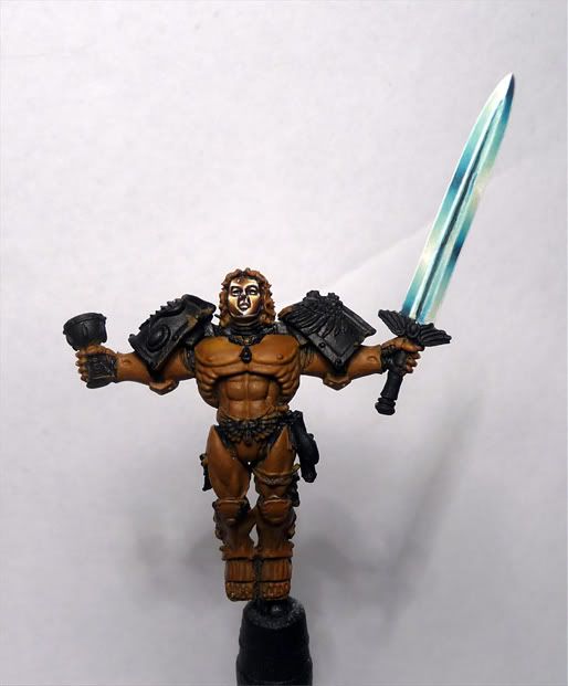
Here is the most recent photo I have. Painting NMM is pretty hard. I do not know how yellowone does it... My biggest problem is getting the color transitions smooth. I have noticed that even when I dilute my paint I still have trouble getting it to coat evenly, and I also have trouble getting the paint to flow from my brush to the model. When I try painting a straight line I will have to paint several lines to get an even coat but my hand is not very steady so by the time the line is smooth the edges look real rough.
@Routaporsas: thanks for the link!
@Routaporsas: thanks for the link!
Last edited:
freakinacage
Well-known member
it looks great. nmm doesn't always have to be smooth, but any large areas have to be so it's a good model for your blending skillz!!
ChemicalFencer
Lost in the desert
I showed your pics to my wife (not a painter) and she didn't believe you weren't using metallics. I think you've done a fantastic job with the NMM. Will there be a tutorial?
Lyuun
New member
hell, that nmm is pretty gorgeous! i mean, if anything you might be using a bit too big contrasts, which is basically the opposite of what i'm doing (i think). that's not saying i'm nearly as good as this, however. dazzlingly well done.
just a note on the sculpt though. what were gw thinking? i mean, yeah it looks cool, but that's a body-length sword! how super-super-human must he be to lift it with one arm?
just a note on the sculpt though. what were gw thinking? i mean, yeah it looks cool, but that's a body-length sword! how super-super-human must he be to lift it with one arm?
Einion
New member
Yep, sure is! It helps a lot if you know in advance what you're going to do be doing - so painting directly from reference material is a good idea (either photos of polished metal or of painted NMM, whichever effect you want most to mimic), and practising on spare parts is well worth doing.Aliengod3 said:Painting NMM is pretty hard. I do not know how yellowone does it...
Might try more intermediate colour mixtures. I used to commonly use seven or more mixes from light to dark, not including white if it was going to be applied thinly as the lightest highlight colour, and any black for a bit of lining.Aliengod3 said:My biggest problem is getting the color transitions smooth.
This is something where practice and experience definitely help. It can also be a good idea not to use very dilute paint, instead thin just enough to get good flow (use additives as well as or instead of water if necessary) and try to get it in one or two goes.Aliengod3 said:When I try painting a straight line I will have to paint several lines to get an even coat but my hand is not very steady so by the time the line is smooth the edges look real rough.
Einion
Aliengod3
Active member
Thanks for the great feedback!
@ChemicalFencer: I am actually using a NMM tutorial in White Dwarf magazine done by Razza. It is in the WD with Blood Angels on the cover from about 2 months ago. However I am not going to be using the magazine's tutorial when I paint the wings I have my own idea for that so if I have enough cajones to do what I want to do I will definitely do a tutorial on that
@Einion: Ya I found a nice mid tone color that was hiding from me in my paint box. I think it will work very well for this mini so I am going to use it when I paint the arms, legs, etc. I found some good pics of reflective gold on the internets (C3-PO!!!) so I am going to use them as guides as well as the article
@Lyuun: I think his weapon is suppose to be similar to a broad sword but who really knows? In my opinion as long as it looks cool practicality can be thrown under the bus, haha!
Thanks again! More pictures soon. I have a calculus final in about 2 hours I have to finish studying for.
Aliengod3
Active member
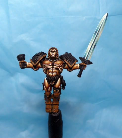
I had a bit of time today to work on this mini. Painted the arms and thighs. Painted different from the article because the reflections did not look right so I painted them the way they are now. Did my best to make sure that the mid tones were more visible and not painted over too, haha! Pretty happy with how everything is looking. Critiques and advice are always welcome
Last edited:
not bad, bro...
the only thing is, when painting the Razza method, is that the reflections (on the thighs for instance) are very stylized...
the thighs you painted have a nice smooth blend, but are not dramatically lit like in the studio version...
this tends to give the armour a leather appearance, more than a reflective metal look...
it makes the torso look out of place...
maybe it will work once you get the rest of the armor painted...
cheers
jah
