As for my two cents:
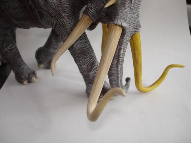
Great job on the tusks, they look quite excellent. The Skin of the beast looks great as well, perhaps you may want to experiment with come controlled thin washes to dull the contrast of the wrinkles in the areas of the model that would not be receiving direct light? It looks like you may have done so already, but its difficult to tell if that's achieved in the piece, or just by your photo.
The Fallen warrior is much of the same that has been said: he needs just a bit more contrast in some areas, less in others. A technique i like to apply for corpes is to focus which parts are highest off the ground. since hes laying on the ground, unless the sun is setting your light source will be mostly above him.
For example: The Fallen Warrior is laying atop his cape, yet he has received the least amount of highlighting, i.e. The white areas of the cape appear to be brighter, thus higher than the warrior. Now this does give the appearance that he is sinking into his billowing cloak, but it also makes the cloak look like a big unwieldy thing.
Something to consider would be to place some highlights on the Red areas of his tunic; the very edges of its lower half, the edge of the sleeve where it meets the glove. These highlights will draw the attention to the body on the ground, not just the cape he was wearing. The Face could use some more contrast and a more deathly complextion less pink/peach and more grey/green-drab tones. Dont be afraid to use alot of contrast with your minis- it will look great and accentuate the features. This is why actors and newscastors wear makeup on TV- to keep "flatness" at bay.
All in All though, it looks like you have a very nice handle on your greens and browns and I like the boots and subtle highlighting of his chest very much.
Another note on perspective: It looks like the "valley" in the center of the cape is more raised (it appears this way on the photo, it looks like the highest focal point of the cloth) than the other sections above and below it, yet this center section has the largest and darkest highlight. Consider having this dark shadow begin just above your white edge highlight on the bottom lip of this valley. Blend this dark section above the lip lighter as you progress upwards in the canyon, to that nice Olive tone youve achieved. Then look at the lower third of the cape and see if those folds need some greater contrast with this new change above them. In effect, it may give more depth to the cape as a whole garment, instead of a collection of peaks and valleys which may or may not be connected.
These are things that I have learned to focus on recently (within the last year or so) as I got back on the horse and started painting again. Its helped me quite a bit and from what I can see, you definitely have enough skill to accomplish our suggestions. Sometimes it just takes a fresh eye to notice the model as a whole- I cant tell you how many times I've shown my brother a figure and hes pointed out one or two things which didn't even occur to me. When we spend hours stooped over our beloved figures, things get overlooked as we focus on that "one little area that just... needs... one... more..."
You get the Idea. The figures look wonderful and I hope I was able to keep my late night ramble coherent and constructive. Keep at it and post again if you make any changes!