How to push my painting skill up a notch?

MathewBaich

New member
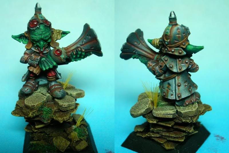
hello all. I am in need of some guidance to push my painting skill to a new level as I am not really content with my current skills.Here is my Gallery
tell me what you guys think and some major things I could do to help give my miniatures that extra pop to help them stand out. Really tell me what I need to do better, none of that candy-coated advice. be brutal!
Thanks.:)
 
A

Antnol

Guest
Your stuff is not bad by any means but it could use some work. You have the techniques down you just need to refine them. Learn to blend a little smoother and thin your paints a little more and I think your work will improve dramatically. Just keep practicing basically, and dont be affraid to try new things or ideas.
 

airhead

Coffin Dodger / Keymaster
OK,
This guy:

GoblinSniper.jpg

The creases need to be darker. The background is too dark and too blue. Kinda clashes with the greens on the goblin. The eyes are lost. Green irises are not showing up. The base is interesting, but doesn\'t really help the mini. Rather than combining your pics side by side, stack them vertically. CMON has a width limit and an overall file size limit, but they can be a mile tall. This would give us an overall larger set of pictures to look at and vote on.

This guy:
img466c38983f7d8.jpg

is in a much better width of picture. We can really pick out the details (that can be good or bad). He needs some darklining between his cheeks and nose to the gun. I\'m not sure if you painted a reflection or if there is an overpaint there. Overall, the metals need much more depth. Some ink washes (or Vellajo or Tamaya \"smoke\") would help bring out some of the depth and details.

For metalics, look at Tidicco\'s gallery and get him to help you. Way beyond my current levels.

Your green skins are very good and the gem on the top gun is great.
 

freakinacage

Well-known member
i think the painting generally is pretty good and you photography skills are letting it down. the last gobbo sniper you did was the best photo imo but the back ground could do with a subtle blue shift
 

Tommie Soule

New member
i agree with all that has been said so far, i would like to add something as well. which i think is key to your minis just being there and them having character, what I\'m talking about is focal point.
for the first mini airhead talked about his face should be where your eye is drawn and it isn\'t. this fellas face should be enhanced more, it\'s to dark(imo). because i find my eye being drawn to the gems and to the picture to the right of him(present pics vertically as said already)

you are already a really good painter you just need to step up your enhancements more and step back from the mini to spot where to put them (always the face for me, but bases do make of break a mini.)
be aware tho that even i talk of enhancing this does not necessarily mean more of everything all the time, it means be appropriate with your choices, for me i always keep things as simple as possible in eveything(except my waffle here).

hope i helped:beer:
 

Ritual

New member
What Tommie touches upon, and to which I agree, is that it you don\'t seem to consider the whole miniature when you paint each area. It\'s a \"mistake\" that is easy to do, as you get focused on each area and try to do it as best you can and forgetting about what part that particular area plays in the big picture. If you have a weak looking face, then a very well painted armour plate covering the miniatures thigh can steal the attention and almost do more harm than good for how the mini is seen as a whole. It is important to always paint things with the mini as a whole in mind so that you put down the effort in the right places.

I hope this makes sense. :)
 

fieldarchy

New member
After taking a look through your gallery I must say you do nice work. There are a couple of things that you should try to really make the minis pop!

First, whenever you are photographing them, photograph them against a background that constrasts the most! I have three background colors that are good for taking photos. Grey, Sky Blue and Muslin tan. I use decent size squares of fabric for my backgrounds that I hang off of something, adjust my lighting and take the photos. Now, my photo-fu isn\'t THE BEST but it\'s decent enough!

Second, dark line. It looks like you don\'t darkline on every model. This is something that needs to be done to give models and nice clean look to them.

Third, make sure your highlights are in the right places, highlight up to white and provide a lot of contrast!
 
Back To Top
Top