I\'m a biiiiig, baaaad man ....

Hey everyone!

Just finished working on a reaper miniature, Vidor the Northman. He was a lot of fun to paint and I decided early on that I wanted him to be a bit \'darker\' than all the other Vidor\'s I\'ve seen popping up around here.

Not exactly what I started out to do, as I changed palets half way through the miniature, but I found glazes saved the day and I was overall pleased with it. Tried out NMM gold for the first time as well thanks to Astonia, though I think I\'ve got a LOOONG way to go with that.

Comments and critiques are welcome.

LINK to VIDOR
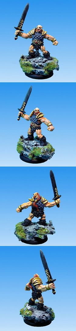
VidortheNorthman.jpg
 
Very nice Nathan, I like the blue and gold armour much bettter than I could do. IS the sword black? I also like the base. Keep up the good work.

Jeremy :cool:
 

Trevor

Brushlicker and Freak!
Looks great.

Tip for the NMM gold, paint most of the areas with the mid colour (like 60%), then rapidly go down to a very dark brown like scorched earth, and up to white in the remaining 40%. Did that make sense?

For what you have adding some white glints would improve it.
 

EricJ

Active member
yep, your best to date nathan, I think he\'s a high 7 so you got an 8 from me. I agree with what Trevor says about the gold, but for me the blue armor could also use one more slight highlight, but then I\'m a highlight obsessed freak :D.

The sword is very subtle but I think I like it, I\'m going to have to think on it for a bit to really make up my mind.

Nice work, can\'t wait to see your next one!

-Eric
 

Nelson

New member
I quite like the sword, although I think a sharp highlight could make it look more like dark metal. :) The gold is a good start!
 

Valander

Member
Left a comment and vote on the mini.

Pretty nice work, and I think your NMM gold is pretty good for a first shot. That one still gives me some problems. ;)

The base is nice, but (as I mentioned on the comment on the mini\'s page) the skin looks a little chalky. Maybe it just feels a little pale for a big burly dude (guess he spends too much time in dungeons ;) ).

More dramatic highlighting on the scale armor would make it look more like metal, as others have said.

Still, looking back at some of your earlier stuff, it\'s apparent that you have been practicing and improving. Keep it up!
 
Thanks for the comments and votes folks, they are much appreciated and taken to heart.

Yup, the sword is black with some highlights and then I went back over it all with a black glaze and highlighted a tad more, though I felt if I messed with it any more I was going to just foobah it. Think I could of done better on it in the long run but, practice, practice.

The armor I think could use another highlight and I very well may get around to doing that again. Again, I black glazed it to get the darker look I was after and then highlighted the edges.

As for the skin, I think honestly that my photo setup bleaches it out more than I would like to admit but I was going for a bit of a lighter skin. I guess when I think of \'Northman\' I think of a fair skinned race overall. I\'m hesitant to do those flesh washes though I think I\'m going to have to experiment in the near future with it.

As for the NMM gold Trevor ... nope, not a bit of it, but it is late so I\'ll re-read it in the morning and see if I understand it then. I\'m keen on getting this NMM down pact.

Anyhow, away from the humans and elves for a bit. I\'ve got a Rackham Wolfen Rune Guardian that I just prepped up and based and I\'ve eager to give that one a shot!
 

Astonia

New member
Hm, about the gold. What Trevor might be saying is: make your shadows darker and your highlights lighter. Contrast is important to get that metallic look. The transitions should go all the way from Scorched Brown to white.
However, I don\'t always go to complete white when painting gold nmm, but always when doing steel nmm.
It depends on how reflective an area should be, the more reflective the more contrast.

Hm, did any of that make sense? :)
 

Trevor

Brushlicker and Freak!
Yeah, thats what I meant to say :D

Also, looking at others work, the best NMM seems to have large areas with virtually the same colour, then a very rapid (in terms of space) change to dark in the shadows and light on the raised areas.
 
D

douglasgreen

Guest
As an amateur NMMist,I can honestly say your attempts are looking fruitful:D,unlike some of my earlier attempts:(,although I am improving now:cool:,thanks to the wealth of inspiring pics in here and the numerous tutorials by painters,I gave it an 8 anyway,nice one!(Don one-Solo mafia):bouncy:
 
Thank you kindly. I\'ve found CMON to be the best help for my painting anywhere as it has a community that helps out its novices, plenty of articles and a ton of refernce material to work from.

Have to admit though, I\'ve had my fair shair of pinesoling, though thankfully, I\'m on five minis out that haven\'t hit the stripper yet! Lets see if I can keep that going now.

:D
 
Thanks.

I\'ve still got some tweaking to do on it with my light sources so I don\'t bleach out the skin (last couple seem to have done that) but I learned it all here and on the reaper forums where I saw the light box thread (which I saw here so ..).

So when are you going to build me a background for me to take pictures of my miniatures on?

:innocent:
 
P
Next time I\'m down your way brother- I\'ll stop in and build ya one.;)
Actually I was going down to the big easy last year but it fizzled- so it is still in my long range forcast.
I love the USA, such a great country and people, but have yet to make it to your neck of the woods- been West, N East and Northern/ Central, never South though dang it. I want to do it by train to see the country too, with lots of stops.
 
Back To Top
Top