

Bailey03
Well-known member
I know that can be frustrating. Competition was very stiff at the Crystal Brush.
You're on the right track and your pieces are definitely getting better. The areas I'd say you should continue to work on shadow/highlight placement, increasing contrast, and smooth blends. It's not the kind of stuff that you can master on a single project, but stuff that gets better slowly over a number of projects.
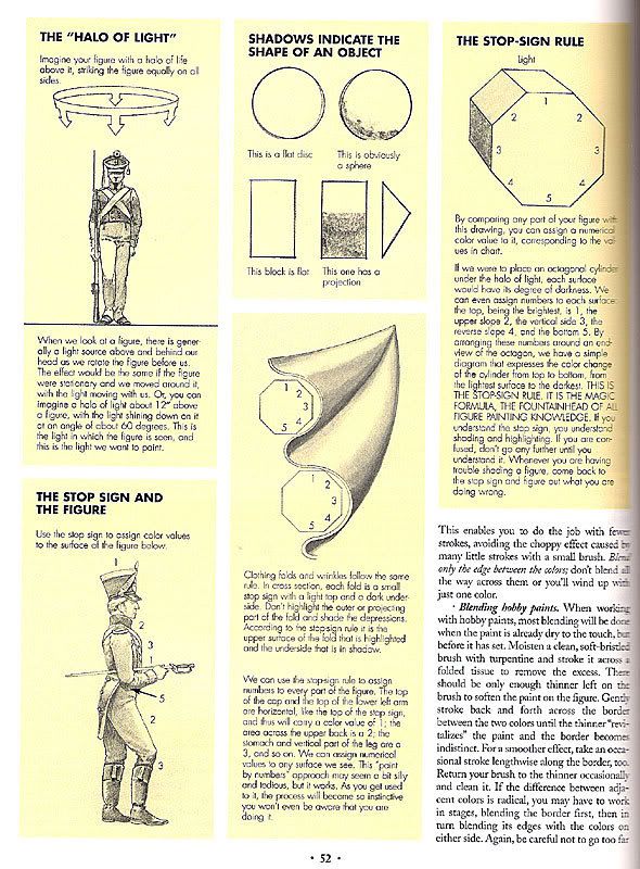
Shadow and highlight placement, zenithal lighting, can also be described by the stop sign rule. Here's an excerpt from Shep Paine's book discussing the idea. Correct and consistent placement of shadows/highlights plays a major part in the realism of your end result. Your work is getting there but keep working on the light/dark placement.
Here's a look at some of my past work and progress. This first piece is a 75mm figure I did back in 2010. You can see that I've got some light/dark variation in the blues, but the contrast is low and the placement doesn't really show the light source.

Jump forward 2 years and here is a similar project, though 54mm in size. We're starting to see more light/dark contrast (although there could be a lot more). Whereas on the last figure it was hard to tell if it was really there, this time there is definite difference on the pants and coat. I was also getting better at placing the shadows and highlights correctly on the folds. But, on other spots like the red sash, shading/highlighting is barely noticeable. The face has some, but is also a little flat.

6 months later I did this 54mm Napoleonic figure. Focus on the green coat, shadow/highlight placement is better and contrast is increasing (though still less than what follows). The shadows on the face, in the cheeks and eyes are also better.

This is a piece about a year later, in 2013. Compare the contrast on the back of the coat. The range from light to dark is much bigger than the previous piece. Same with the pants, even though they are white there is still decent contrast. He's got variation in the level of highlight/shadow corresponding to the stop sign rule.

And here is one from a few months ago. Again the contrast has been increased from the last one. Not only in the main color, but more in the details like the fold backs on the rear of the coat too. I then went on to add weathering to him for increased realism, but left it out of the photo so you could better see the original paint.

And here's a closer look at some of the details. This is a 75mm piece, so more room to work. First image is just the base coat over primer so you have a reference. The normal lighting gives you some idea of where the shadow and highlight location should be.

And here is the painted version. Notice how much deeper the shadows are now and how much lighter the highlights. This close up you can also see the transitions and blends better. While not perfect, it is still difficult to see where one shade goes into the next.

You can also look at other stuff like what colors to use for highlighting and shading (using the color wheel, cool/warm variation, etc), glazes for subtle variation, weathering, basework, etc. But that is more fine level adjustments. Keep that in mind but really focus on pushing the contrast, picking the highlight/shadow locations based on the primary light source, and keeping those blends smooth. Increasing contrast and keeping blends smooth are tough to balance.
Hopefully these series of past projects helps you see the progression and how each builds and improves on the last. For you work, like Eldric, you can go further with the shadows on the arms to up the contrast and help define those shapes. The shadows on his clothing have decent contrast, but the blends can be worked on. It also looks like it goes from shadow up to basecoat, but no highlights. Pick those smaller spots where the most light would hit and add a bit more brightness. As I said, your work is definitely improving. My advice is keep focusing on those fundamental concepts, continue to work on them and try to push them with each new project. Don't expect to do it all in a day, what you see here is my efforts over 4-5 years of painting. It takes time so don't get frustrated. Find artists and examples that you like and work up to them.
I tried to cover a lot of ground rather quickly, so I hope all that is helpful!
You're on the right track and your pieces are definitely getting better. The areas I'd say you should continue to work on shadow/highlight placement, increasing contrast, and smooth blends. It's not the kind of stuff that you can master on a single project, but stuff that gets better slowly over a number of projects.
Shadow and highlight placement, zenithal lighting, can also be described by the stop sign rule. Here's an excerpt from Shep Paine's book discussing the idea. Correct and consistent placement of shadows/highlights plays a major part in the realism of your end result. Your work is getting there but keep working on the light/dark placement.
Here's a look at some of my past work and progress. This first piece is a 75mm figure I did back in 2010. You can see that I've got some light/dark variation in the blues, but the contrast is low and the placement doesn't really show the light source.
Jump forward 2 years and here is a similar project, though 54mm in size. We're starting to see more light/dark contrast (although there could be a lot more). Whereas on the last figure it was hard to tell if it was really there, this time there is definite difference on the pants and coat. I was also getting better at placing the shadows and highlights correctly on the folds. But, on other spots like the red sash, shading/highlighting is barely noticeable. The face has some, but is also a little flat.
6 months later I did this 54mm Napoleonic figure. Focus on the green coat, shadow/highlight placement is better and contrast is increasing (though still less than what follows). The shadows on the face, in the cheeks and eyes are also better.
This is a piece about a year later, in 2013. Compare the contrast on the back of the coat. The range from light to dark is much bigger than the previous piece. Same with the pants, even though they are white there is still decent contrast. He's got variation in the level of highlight/shadow corresponding to the stop sign rule.
And here is one from a few months ago. Again the contrast has been increased from the last one. Not only in the main color, but more in the details like the fold backs on the rear of the coat too. I then went on to add weathering to him for increased realism, but left it out of the photo so you could better see the original paint.
And here's a closer look at some of the details. This is a 75mm piece, so more room to work. First image is just the base coat over primer so you have a reference. The normal lighting gives you some idea of where the shadow and highlight location should be.
And here is the painted version. Notice how much deeper the shadows are now and how much lighter the highlights. This close up you can also see the transitions and blends better. While not perfect, it is still difficult to see where one shade goes into the next.
You can also look at other stuff like what colors to use for highlighting and shading (using the color wheel, cool/warm variation, etc), glazes for subtle variation, weathering, basework, etc. But that is more fine level adjustments. Keep that in mind but really focus on pushing the contrast, picking the highlight/shadow locations based on the primary light source, and keeping those blends smooth. Increasing contrast and keeping blends smooth are tough to balance.
Hopefully these series of past projects helps you see the progression and how each builds and improves on the last. For you work, like Eldric, you can go further with the shadows on the arms to up the contrast and help define those shapes. The shadows on his clothing have decent contrast, but the blends can be worked on. It also looks like it goes from shadow up to basecoat, but no highlights. Pick those smaller spots where the most light would hit and add a bit more brightness. As I said, your work is definitely improving. My advice is keep focusing on those fundamental concepts, continue to work on them and try to push them with each new project. Don't expect to do it all in a day, what you see here is my efforts over 4-5 years of painting. It takes time so don't get frustrated. Find artists and examples that you like and work up to them.
I tried to cover a lot of ground rather quickly, so I hope all that is helpful!


