Khorne Lord

ScottRadom

Shogun of Saskatchewan
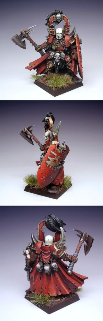
Heyo. I was trying to practice painting red some more, so I picked this guy. I tried shading the cape with a bluey black and the armor and shield with Orkhide Shade and some black. Spent way more time on this mini than I am used to. LMK what you guys think!

http://coolminiornot.com/248469

Khornedude-1.jpg
 

doyme

New member
The red is really nice and the model is well painted all round. One thing that is bugging me a little is his axe. There's a bit of a heavy highlight line between the blade and the rest of the head in the top photo. It could just be that the TMM is awkward there and it needs more light on it when you take the photo. But the rest of the TMM is great.
 

ScottRadom

Shogun of Saskatchewan
Ah! That part of the Axe was a pain. I worked the hell out of it, and it looks pretty good from all most angles except the full on one. Shame. Good eye, and thanks for picking it out. I probably shoulda basecoated it and started from scratch on that axe head. Lazy!

Thanks for the compliments, and a good catch there doyme!
 

b3rtil

New member
Looks great. Really liked the white helmet, brought out a nice contrast.

Think I will re-buy this fella some time in the future and repaint him =)
 

jahminis

New member
great work on the shield, and the skulls on his back and shield...
the play of light and shadow is perfect...
the rest of the mini looks a bit flat in comparison:(...

you're gettin' there...
keep up the good work...

cheers
jah
 

ScottRadom

Shogun of Saskatchewan
Thanks guys! Special thanks to Dragonsreach/Mike as you've been there from the start! It's nice to put my latest stuff next to the mini's I was painting just prior to the net. Much appreciated!
 

mattsterbenz

New member
The reds look great! Keep pushing that contrast... darker shadows. I think the cape could be a different color red from the armor to add some variety.

Some solid painting there Scott. Keep it up!

-Matt
 

cleen X

New member
Looks very good! You just keep getting better. I agree that the cape maybe could be another shade of red, on the back, where the cape meets the armour it is not enough lining, another shade might have helped it stand out a little more or just line it with a darker color. The shield also seems to have a lot more contrast than the rest, maybe it's the pics but if it's not you should try to push the contrast on the armour as much as you have on the shield.
Some blood and gore might fit this guy to, check out massivevoodoo.blogspot.com as they have some amazing tutorials on blood and gore..
I did sound a little harsh here and I'm sorry for that! Apart from what I said I think it is great! Big fan of your works :) Keep em coming!
 
Last edited:

ScottRadom

Shogun of Saskatchewan
Thanks again guys. I agree with all the crits, and I'll be taking them into the new stuff I paint. Much obliged!
 

ScottRadom

Shogun of Saskatchewan
Oh man! How lucky am I? I put this guy on eBay and Avelorn (moderator to the stars!) bought him. He did me a HUGE solid and snapped these better pics and even BETTER he gave me and absolutely fantastic critique of the mini. He diagramed it all out. I want his permission to post it though, but assuming he's OK with it I want to show you guys everything that is good about getting such a great critique of your work. Any skill I have vs. where I was when I started is owed to the fact I've gotten awesome advice from around this site and others for sure. Anyway, here's the better pics!
ScottRadom2.jpg

There's the bigger image at the voting link if you like!
http://coolminiornot.com/250783

Thanks very much Sven! And of course to EVERYONE who's been helping me out. Much appreciated!
 
Back To Top
Top