Kingdom Death: Pinups of Death - looking for criticism !

Wondercat

New member
Hi fellows.

It's not long since the wife and I felt confident enough to start uploading some pictures on CMON. But we're trying to improve ourselves and, well, this is the place. We'd really appreciate some advices to enhance our painting : what work, but mostly what doesn't.
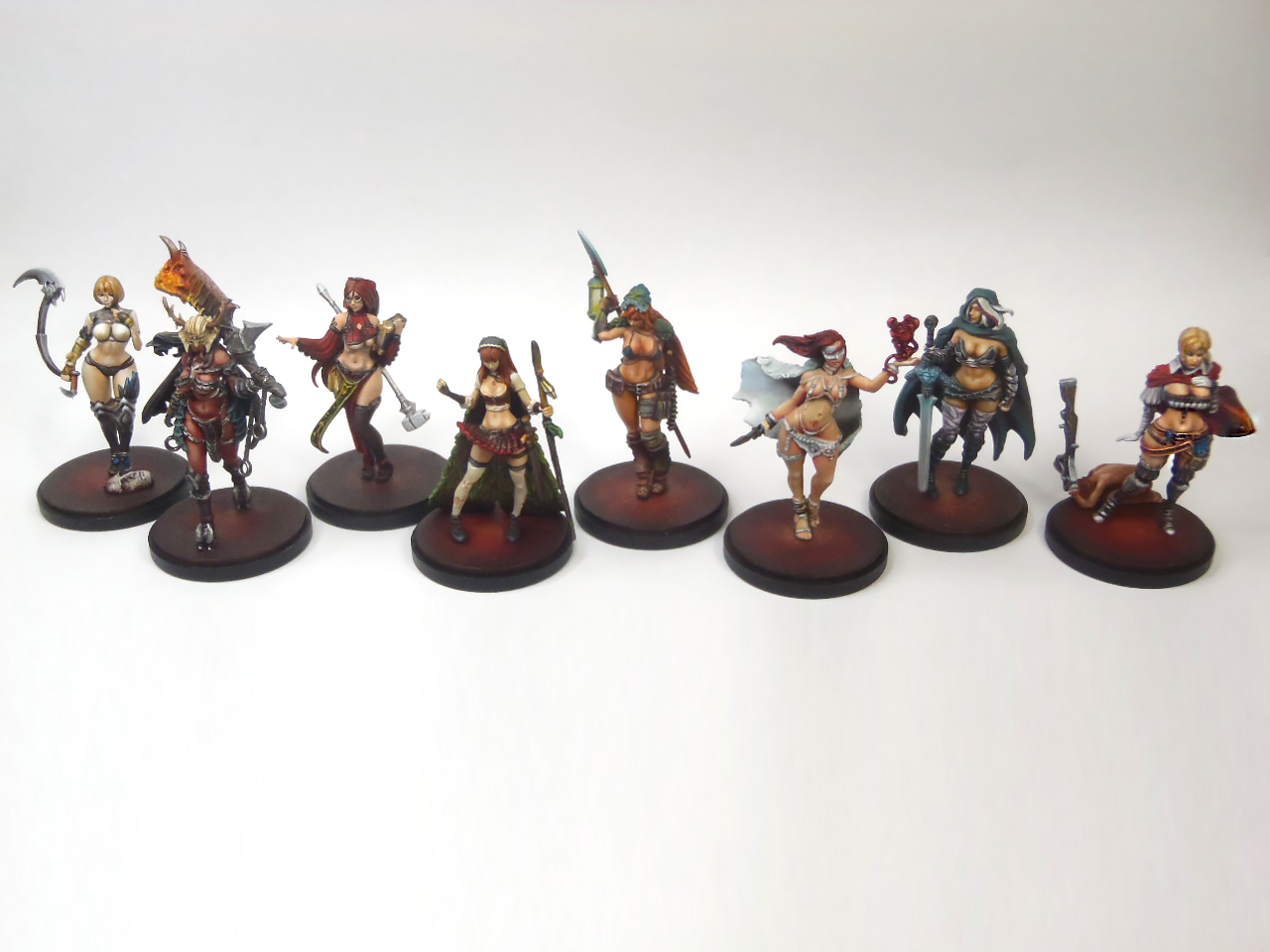
It will be 3 years that we started painting in a few months. We gave our best on those ladies. Those are the 32mm versions.
There are more views on our CMON gallery.

Thanks really !

The wife one's :

pic1988896.jpg


pic1998761.jpg


pic2003841_lg.jpg


pic2011385.jpg


My owns :

pic1988895.jpg


pic1998762.jpg


pic2003842_lg.jpg


pic2011384.jpg
 

gohkm

Active member
Nice work. Your painting style lends itself quite well to a 'drawn' look, rather than painted. In particular, I really like the shading colours you used for the pin-up librarian.
 

Yuggoth

New member
Veeery nice quality! I will try to criticise, but be aware that this is really just nitpicking. You should both not be so humble :-D, those are really spectacular. Do you have a groupshot? Apologies that I don`t know the proper names for most of these:

Chick with Glasses: The blue tones used for the shades of the skin work spectacularly well. Would have added more contrast to the weapon. Looks a bit too uniform compared to the rest. Not entirely sold on the osl, but I can`t really nail what bothers me about it. Maybe ist the fact that the figure as such is allready quite bright in itself.

with sicle: Are the breast covered in some material? They look different than the rest of the skin, but it might as well be the photo.


with cleaver: The cloak is really great, full of subtle tones and very smoothly shaded. The blueish thing around her waist and the metals could benefit from more contrast imho. Also there seems to be some spilled skintone under her breasts. If this is meant to be a reflection, it is not entirely convincing. The biggest gripe I have is with the flame on the cleaver. Look at how Victoria Lamb does her flames and push the contrast.

with peacock-cloak: Oh my god! Nothing to criticise here. The colour composition and the smooothness are spot on. I think she is my favourite of the bunch.

with sword (twilight Knight?): Nothing to criticise. The osl is subtle and convincing.

with blood Magic: Good use of a more limited Palette. There seems to be some colour-spillage on her ancle bands. Maybe clean this up?

with lantern: Can`t figure out whats going on with here face. Looks not as smooth as the others. Also the osl needs a bit more work. I am not sure, is the mask supposed to be glowing as well, since the colours used are very similar?

with crossbow (great game hunter?): Nothing to criticise. The shading of the cloak is silky smooth. I`m envious.

Best regards

Alex
 

Zab

New member
Wow, now i may never paint mine :p Those have a really nice looking cartoony or almost anime like quality to them, great job!
 

unszene

New member
I agree with everyone else. Your work looks great! Remember that the eyes are very expressive and an important focal point of most models. Develop your skills at eyes and you'll be golden.
 

Wondercat

New member
Thanks a lot for the advises guys ! And the kind words. It's encouraging and very helpful.

From what you said it appears some stuff aren't obvious about what they're meant to be. We need to work our textures and chose colours more carefully then !

with sicle: Are the breast covered in some material?

Yup, it's some transparent clothing. We should have tried to give it more colour to make it more obvious it isn't skin. The artwork is pretty neutral about that but exaggerating the blue hue would have been a good idea.

2440663-web-kingdom-death-pinup-architect-artwork_c628b593-be3f-4c99-8114-4d5c48daa1aa_1024x1024.jpeg


Also there seems to be some spilled skintone under her breasts. If this is meant to be a reflection, it is not entirely convincing.

It's bones, and you're right using colours too close to the skin makes it confusing !

Can`t figure out whats going on with here face. Looks not as smooth as the others

It appears the freckles aren't working so good !

I am not sure, is the mask supposed to be glowing as well, since the colours used are very similar?

Yes, double yes. Big issue here. The mask isn't supposed to be glowing, but again the colour used is so close to the light one that it's super confusing.

I did some group shots but my camera is pretty poor (but satisfying in macro mode) and the definition is bad, as are the colours :

Pinups%20All.jpg


Thanks again really ! It's really good to see where are the flaws.
 

Yuggoth

New member
Thanks for the group-shot! Looks really great! And I`m really jealous :-D I wish my wife would share my painting compulsion (and be damn good at it too!)

Thanks a lot for the advises guys ! And the kind words. It's encouraging and very helpful.

From what you said it appears some stuff aren't obvious about what they're meant to be. We need to work our textures and chose colours more carefully then !

QUOTE]

As I said, some of the things could be more clear in person. I know full well how fotos can kill subtle differences in hue and texture.

I think that Jen Haley has painted some faces with frackles and she might even have touched on that in her tutorials. Unfortunately her site is down atm.
Remember that freckles are usually very small allready on a normal human. In 35 mm scale they are reeeealy hard to do convincing and end up looking like acne or pox more often than not :-D

What do you plan to do next? I guess the Arena Rex line would be really somthing to consider once they hit the market. They would really benefit from your mastery of skintones.

Best regards

Alex
 

Wondercat

New member
I was really on the threshold when Arena Rex was on Kickstarter. I'm super sold on the monsters, they got that scary-weird-vibe I really like.
Though I am trying to hold me back a bit regarding new games especially with miniatures : our pile of to-paint stuff also has a scary-weird-vibe.

Currently we're painting Rivets Wars for someone. There won't be as many hours as there were individually on the ladies though !

We might continue our Zombicide or perhaps something faster like Kemet that we wanted to paint for a long time.

And I agree, painting wives are a must have !!
 

chaos spawn

Member
Critisism: The glasses of the first girl don't really look like glass and the freckles of the one holding the lantern seem to be too big, looks more a red tatoo in her face ;) (nitpicking.. she still looks wonderful), apart from that I can hardly see any room for improvement. Very nice skintones and absolutely beatiful. I'm impressed!
 

Peebs

New member
^^ I'd agree with this. Beautiful painting but the glasses and freckles don't work for me. There is so much more to admire here than to criticise though. :)
 
Back To Top
Top