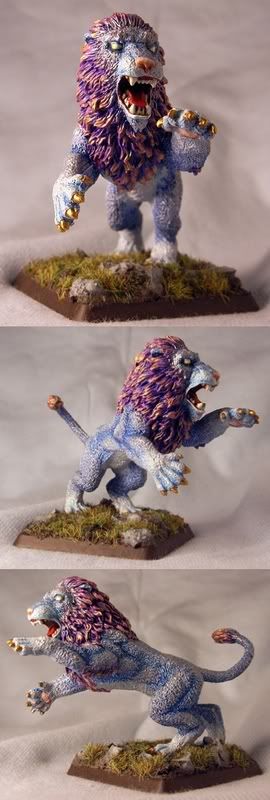
Kitty!

Amazon warrior

New member
This is one of my most recent (completed!) paintjobs, on Reaper\'s celestial lion. After some creative input from the other half, I selected this rather atypical colour scheme. After all, a subdued palette is all very well, but occasionally it\'s fun to dig out the bright colours too. I\'d love to know what y\'all think. Cheers then! :)

Lion_all.jpg


Vote
 

Thunderhawker

New member
I actually like the uncharacteristic color scheme here, the only thing that grabs me is that the eyes appear unfinished and seem to drag away from the overall effect of the mini.
 

spazzy

New member
You did a great job inside the mouth, but I\'m not sure about the color scheme. Very different. Props for the bravery!
 

Amazon warrior

New member
Cheers for the comments, people.

@Thunderhawker: Glad you like the colours. I have to say, I agree with you on the eyes, but wasn\'t sure what to do to improve them. Do you have any suggestions?

@spazzy: Thanks. I don\'t think I realised how much of a love it/hate it effect it was going to be when I posted it. I was curious to see what I could get away with, however.

Looks like more people are on the hate than the love side, too. It\'s currently hovering just below a 6, which is a little disappointing, given I thought I\'d put a decent amount of time and effort into it. :(

I don\'t really mind bad scores, so long as some sort of reason is given. Even if it is \"I hate the colour scheme\". At least then I\'d know whether my skills or my lack of conservatism was at fault. C\'mon, guys! It\'s a magical beast! Who said it had to look like a carbon copy of the real thing?
 

PegaZus

Stealth Freak
Originally posted by Amazon warrior
@Thunderhawker: Glad you like the colours. I have to say, I agree with you on the eyes, but wasn\'t sure what to do to improve them. Do you have any suggestions?

I think that you should make the eyes a brighter yellow, then highlight back up to white in the middle. As it looks now, it appears just white (mostly), and so appears unfinished.

I don\'t really mind bad scores, so long as some sort of reason is given.

My VERY best mini so far is sitting at 5.9, probably because I did a lot of extra stuff on the base. Someday I hope to cross that 6.0 line on a mini.

I\'d say the color scheme is part of the reason, as a lot of voters don\'t seem to take to things that don\'t match the way they would paint it. Accept that and don\'t worry about the score on this.
 

Amazon warrior

New member
Originally posted by PegaZus
I think that you should make the eyes a brighter yellow, then highlight back up to white in the middle. As it looks now, it appears just white (mostly), and so appears unfinished.

Yes, I think I\'ll try that, possibly starting from orange rather than the yellow I used here.

Originally posted by PegaZusI\'d say the color scheme is part of the reason, as a lot of voters don\'t seem to take to things that don\'t match the way they would paint it. Accept that and don\'t worry about the score on this.

I\'m hardly in the running for the number one spot, so it\'s not really worry, more curiosity. After all, one of the criteria for judging stuff on CMON is imagination. However, if I use mine and it isn\'t well-received, I know to keep those pieces to myself and just post the more \"traditional\" stuff.

I\'m aware that I have fairly whimsical tastes at times, and I\'m still very much at the stage of trying out new or different techniques to see what happens and what effects I can achieve, so input regarding this is very valuable to me, so I know what works and what doesn\'t. I don\'t think I\'ve really developed a \"style\" yet, so things often come out rather randomly.
 

fieldarchy

New member
Wacky colors are fantabulous!

I love the colors you chose overall! The colors on the mane are really nice. I\'m just not sure how well the mane and the fur jive together though. I may have gone with a lighter blue for the body and kept the mane those vibrant colors.

Still, very nice job! Large aminals with lots of fur are a challenge for me to paint so I definitely give you props on the paint job and the color choices!
 

Onis Lair

New member
Cool color choices, no way you can\'t look at this lion and know it\'s not a normal beast. The gold claws just pop for me for some reason, the mouth is amazing looking but the eyes do look unfinished. I\'ve always thought solid white eyes looked undone but great work.
 

Amazon warrior

New member
@fieldarchy: If you like wacky colours, I have a hippocampus you should meet... :p Regarding mane vs. fur, I did give the mane a good wash with blue to try and get them to mesh more, but I didn\'t really want the coat to be much lighter because I wanted to differentiate between the paws and underbelly and the rest of the coat. Also, I don\'t know how obvious it is from the photos, but the principle highlight colour for the coat was mithril silver to give it a \"magic\" pearly look. On the lighter parts the highlight was mithril silver+white.

@squig: Thanks!

@Oni: Cheers. I figure, if it\'s magical, it should be sparkly! The eyes are my least favourite part. They are in fact yellow, but I inadvertently made them far too pale, so they\'ve whited-out in the pix.

Here\'s the inspiration for it, by the way: Linky
 

fieldarchy

New member
If you want that pearly look but don\'t want to cover up color there is an irridescent pigment that you can add directly to a gesso or paint on varnish. it adds the pearlescent look but still dries clear. If you use a gloss coat but don\'t want it glossy just hit it with some dull coat. Still shows the pearly sheen but doesn\'t give the wet look to the mini.

I love wacky colors!
 

Amazon warrior

New member
Originally posted by fieldarchy
If you want that pearly look but don\'t want to cover up color there is an irridescent pigment that you can add directly to a gesso or paint on varnish. it adds the pearlescent look but still dries clear. If you use a gloss coat but don\'t want it glossy just hit it with some dull coat. Still shows the pearly sheen but doesn\'t give the wet look to the mini.

I love wacky colors!

I\'ll keep an eye out for that. While I was in Japan, I picked up half a dozen iridescent paints that were sold in a craft shop there. One of them is pearl white, which might have been better, but at the time that I painted this fellow, they were in transit between Australia and Germany, so not really an option.

The evil airport people took my dulcote from me when I flew back from Aus, which was annoying. Silly me, I\'d forgotten the don\'t go a bundle on explosive cans in airplane holds. :( Consequently, I haven\'t put and seal of any kind on this mini.

How\'s this for wacky? :p

Hippo_all.jpg

Edit: In case it isn\'t screamingly obvious, this is a wip. And I\'m seriously considering changing the colour of the gills, possibly to a pale green fringed with pink.
 

fieldarchy

New member
I wouldn\'t change the fins, they are pretty. I would just try to get smoother transitions from the colors you used. Very nice though.

See, wacky colors are ok. Don\'t let anyone tell you differently!
 

spazzy

New member
mmm...love this one. I think you are right about the gills, it would look more appropriate that way. Still, what you\'ve got going there looks great.
 

Amazon warrior

New member
Thanks again! :) I was inspired by tropical fish for this one. I have a few underwater minis and wanted to get a shimmery look going.

The fins will stay as they are, I like they way they look almost firey. I\'ve changed the gills, and I think they look a bit more subtle now. I\'ve also highlighted the head and done the eyes, which improved matters. When I\'ve stuck it on a base, I\'ll probably put it in the WIP section for people to shred at will.
 

Thunderhawker

New member
Nah don\'t sweat it. If you are painting for someone other than yourself, you may be in the wrong hobby (commissions not withstanding). If you like it, thats all that counts. All of us have gotten \"sniped\" or feel shorted on others opinions of our work, but just use it to drive you further and do better. You\'ve gotten positive feedback where it counts: here, in the forums where folks have taken the time to truly evaluate your work and leave constructive commentary that may help you improve in the future. Keep painting and pushing your creative limits.
 

Manus

New member
I quite like both of these minis, some wierd colors and...well I once heard of something called LSD :D
 
Back To Top
Top