My latest post, chosen knights of Tzeentch!

Hey everyone!

I have another pic posted now. This is a unit of chosen knights of Tzeentch lead by an aspiring champion as the battle standard bearer.

http://www.coolminiornot.com/75184
Tzeenchknights.jpg


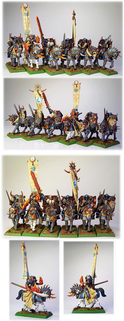
I really like the unit and it\'s quite a bit different from the other Khorne flavored stuff I\'ve done. I dig the clean and sharp Tzeentch colors. I\'d love to hear any comments or feedback you have. If you like em, please vote!
 
Absolutely LOVELY set you have here - I immediately went ...\'ooooh\' (no, there was nothing sexual in that .. filthy buggers).

Great colors and combinations - only thing that really doesn\'t catch with me well is that it seems that such a perfect job was done on everything but that the horses themselves seem like they only got the smallest amount of work (the hair, skin ... whatever). Seems a bit flat to me considering the way the rest of the set just jumps out to you.

That being said though, I think they are fantastic.
 

supervike

Super Moderator
*sound of me applauding*

I like these even better than your dragonogres (and that is saying quite a bit).

The banners and the creamy colored cloth really add to the sense of confused feminity that works so well for these warriors.


They are just striking. I commented and or voted.....
lol
 
Thanks so very much guys!! Wahoo! My first 10 from Supervike. Talk about a day to remember!:D:D

Thanks for the comments. I know what you mean about the horses. Believe it or not, I proabaly did spend more time on them than the warriors on top simply because I kept screwing them up! I did have a hard time with some of the flatter areas on the horses (trying to get a noticible blend on them) and I think in my attempt to keep them clean I may have made them appear a bit dull compared to the flashier and shinier bits riding them. I\'ll try and make them a bit more dynamic in the future. If you want them to look good in digi-pics, you have to exaggerate! Subtle sometimes just doesn\'t get picked up.

Thanks again!
 

Ritual

New member
I wasn\'t as generous as Supervike (now I feel like Scrooge... :( ), but at least I voted and commented...

-Anders
 
LOL, that\'s OK man. I\'m not going to be able to float everyone\'s boat equally. lol I\'m still quite happy with an 8. At least in my book, that\'s where the \"wow\" minis start.

Can you tell me what would have really done it for you with this unit? I know it\'s all personal taste and of course I will paint it so I like it first and foremost, but I\'d love to hear any constructive criticism. Thanks for the comment about the staff. Up close, it looks very nice as the colors light up the runes carved in there very well. But yeah...let me know if you think something is really lacking or it just doesn\'t have the impressive power that makes you wanna reach for the top of the voting scale.
 

Ritual

New member
You\'re right, 8 is where things is starting to be amazing. As for constructive critisism... I think the horses skin is a bit flat. It doesn\'t reach the same level as the rest of the minis. Smoother blending and a bit of variation in the skin would make a huge improvement. Perhaps one of the grey horses could have legs that become more black closer to the hoof? Brighter highlights on the knees is another suggestion. Also, as I mentioned, close-ups on the knights! Let us see that cool staff properly, and the banners. Those seem to be really eye-catching details and well painted too, so use that to your advantage and show it off. :)

I could perhaps give you more advice, but then I need to see bigger pics.

Hope this helps! :)

-Anders
 
D

donga666

Guest
Commented & rated!

Very good work! I like them alot, but you do need some close-up shots of the fab free-hand work. Good work though, you should be very happy, and eight is a good score!!! Especially for a regiment!
 

freakinacage

Well-known member
lovely, man. the banners are great. i agre with the previous comments about the horses. my only other bugbear is that the flames are painted the wrong way around. aside from that - great
 

LouisCypher

New member
yeah yeah yeah here we are!

A really nice, striking, cartoonish looking unit!

They must be looking fearing on the battlefield! I like xpecially the blue tones on the armours and their contrast with gold.

If I have to make some cricicisms, i\'d say:
-paint the flames in the right way :D
-give the folders of the vests another darker shade
-tell me how you did that! :D :D :D lol

Luca

p.s. great work, 8.5 for me!
 
Thanks for the comments. I\'ve thought about redoing the flames, but...since they\'re Tzeencian flames, we\'ll forgive them for being unnatural lol

Let me know if there is any part in particular you\'d like me to explain better and I\'ll do my best!
 
Back To Top
Top