You are using an out of date browser. It may not display this or other websites correctly.
You should upgrade or use an alternative browser.
You should upgrade or use an alternative browser.
my new work
- Thread starter Alex Khorn
- Start date
Dark Seraphim
New member
Looks good, but in the wrong section, Discuss Submissions next time ")
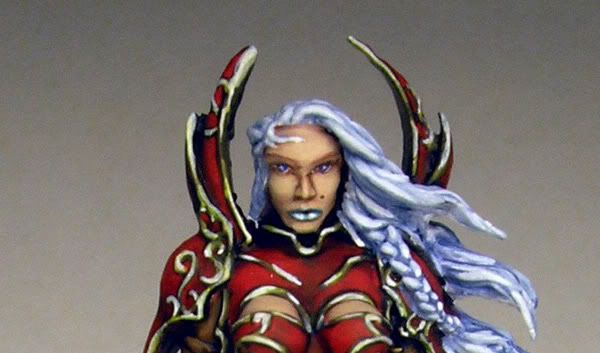
Not too fond of the Sculpt though...
Not too fond of the Sculpt though...
Alex Khorn
Member
Originally posted by Dark Seraphim
Looks good, but in the wrong section, Discuss Submissions next time
oh sorry!!!
demonherald
New member
oh well it\'s here anyway so wil comment.
Nice rich colours and the sword NMM is looking great .. nice one
Nice rich colours and the sword NMM is looking great .. nice one
Drake Farstrider
New member
Well done, the only thing I don\'t like painting wise is the lips. They seem too bold for this. I really like the red armour.
I really dislike this sculpt though.
I really dislike this sculpt though.
Moved it over for you.
Nice paintwork.
Nice paintwork.
tidoco2222
Active member
Excellent paintwork, love the freehand on the skirt.
TyronMagda
Member
Great!
Voted and commented! :yes:
Voted and commented! :yes:
green stuff
Active member
Sorry if this seems harsh, but I\'m judging from your other minis .
Overall, although the paint job is clean, I find the colors flat. The armor, skin, and loin cloth could IMHO use more contrast. The blood on the cloth she\'s holding seems a bit too purple. As is, it looks more like a wine stain then blood. But that could be my computer screen or intentional on your part.
The base could use more work (more textured surfaces and more color tons for nuances).
The blending on the blade could be smoother, especially on the dark parts.
@Tim : That\'s not freehand, it\'s on the original sculpt : http://www.rackham-store.com/boutique/images_produits/LIHE_A_0201.jpg
.Overall, although the paint job is clean, I find the colors flat. The armor, skin, and loin cloth could IMHO use more contrast. The blood on the cloth she\'s holding seems a bit too purple. As is, it looks more like a wine stain then blood. But that could be my computer screen or intentional on your part
.The base could use more work (more textured surfaces and more color tons for nuances).
The blending on the blade could be smoother, especially on the dark parts.
@Tim : That\'s not freehand, it\'s on the original sculpt : http://www.rackham-store.com/boutique/images_produits/LIHE_A_0201.jpg
Ian Newbold
New member
Voted & commented.
Alex Khorn
Member
Originally posted by Dragonsreach
Moved it over for you.
Nice paintwork.
Thanks that has moved a theme
Originally posted by green stuff
Sorry if this seems harsh, but I\'m judging from your other minis
Overall, although the paint job is clean, I find the colors flat. The armor, skin, and loin cloth could IMHO use more contrast. The blood on the cloth she\'s holding seems a bit too purple. As is, it looks more like a wine stain then blood. But that could be my computer screen or intentional on your part
The base could use more work (more textured surfaces and more color tons for nuances).
The blending on the blade could be smoother, especially on the dark parts.
@Tim : That\'s not freehand, it\'s on the original sculpt : http://www.rackham-store.com/boutique/images_produits/LIHE_A_0201.jpg
Can be!!!
Originally posted by hakoMike
Really, really nice work... except for that highlight on the lip. It makes her look like she has fangs or big buck teeth. Is the highlight being artificially accemtuated in the photo?
The mole is a nice touch.
Simply in there photo small
I have made lips purposely dark blue, red color of lips has bothered, has decided to make so, and a sharp patch of light on lips it as though brilliant lipstick
Alex Khorn
Member
Originally posted by Ogrebane
Well I like it. You have better work but this is a beautiful mini and you have done a commendable paint job. I like the lips and hair makes it a bit different than all the other ones Ive seen. Great job voted.
Dude of thanks big for understanding!!!!
