Need weapon suggestions

rikard

New member
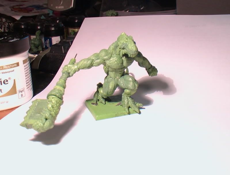
Ok this is the mini as he currently stands. After reading Lonos post in another thread I felt that the weapon as a whole and not just the end of it may be a little out of place.
AUT_0492.jpg

AUT_0490.jpg

AUT_0503.jpg

AUT_0504.jpg

AUT_0506.jpg

AUT_0505.jpg

I am aware that the pose may look a little awkward but it was designed to be made at the end of a swing (which also explains why he is in a lunge position)

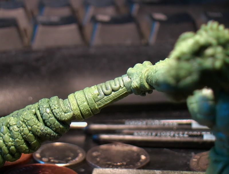
The main thing I think I need on this one is at least some redesign ideas for the weapons butt (at the moment its just a square block pretty much) if anyone has any suggestions (or better yet pictures) please post them and let me know.
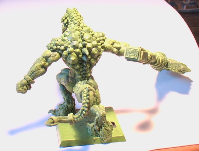
 

OrkBoy

New member
I think the weapon is really good, I like it a lot. I think the rest of the piece is awesome aswell! ;)
 

Starks333

New member
I dont really know its background, but i think it suits him, the blockyness gives you the impression its a blunt weapon, which works because that lizard is built! so its like he uses his strength to mash through everything

the only thing im unsure of is the \"snake\" that joins to the blade, it looks a bit awkward i think but then again i cant see the blade


Starks
 

lono

New member
I mostly brought it up because you commented that you weren\'t happy with it on the Warhammer forum. Having said that, it is the one thing that takes away from the overall quality of the sculpt for me

This picture is the one that just doesn\'t sit right - the head of the weapon looks absolutely gigantic. Too much so in my humble opinion.

AUT_0481.jpg


Some of this could be down to perspective, but it just looks a bit too massive and beefy once you get beyond his hand for me.

I think what enhances the over the topness of it is that he has it in one hand. It\'s still meant to be a two-handed weapon, and you have gone for the look that he is at the extension of a mighty swing I believe. Because just one hand is supporting it and the other hand (which I would assume has let go of the weapon at some point during the swing) is clenched and out to his side, rather than open and more across his body, the balance is lost from the overall feel a bit though.

I just feel it\'s such good work, it\'s a shame that this relatively small element of the overall piece is letting it down. But that\'s just my opinion, others may well disagree (and I am well known around here for being a fussy git too!).
 

funnymouth

Active member
ah! now that i see it in its entirety, and the model for comparison, i have to agree, way to \"top-heavy\" for its pose. maybe just lob off the big head and sculpt a smaller mallet-head there (perhaps in the shape of a coiled snake?).
 

emopainterguy

New member
Well I think that it could very well be due in part to perspective of the shot, but it does look rather large. Perhaps a top down shot would clear things up a bit... I can\'t help but think that with that pose an open mouth would have been more suited to it (I realise there isnt much you can do about that now), and the left arm seems a little odd (again could be the photos). It really is fantastic work (infinitely superior to what I could do), and can\'t wait to see it all sorted out and painted.
 

rikard

New member
Thanks for your comments, I\'ll get a better overhead shot tonight to see if that makes things easier.
 
Back To Top
Top