New Empire Captain GW guy

ScottRadom

Shogun of Saskatchewan
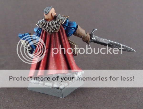
Hey, bought this dude \'cause I love the sculpt. I was trying to get better at red and blue painting (plus all the rest of course) and I think those parts are okay. The red was finished off with about 1/2 Bronze flesh equivalent and 1/2 VMC Red. Should I still take it lighter? Anyway, thanks for all the help over the last year. Have a vote....

http://www.coolminiornot.com/225430

WIPS001-2.jpg

WIPS005-1.jpg
 

freakinacage

Well-known member
i would maybe take it a little lighter, especially some edge highlights on the shield.

also, the shading on the sword is very dark but not so on the armour. either darken the armour to the same level o lighten the sword

all in all, a nice piece. pretty smooth
 

Donga

Active member
Scott, good work!

The Red, I wouldn\'t add a further highlight. I\'d add more shading, that would bring out the highlight you have. You can add blue, green, blue/green or even purple to shade with.

The blue, the cloth is spot on. The shield could do with a further highlight maybe just Spacewolf grey. Or painting \'chipped paint; then a further highlight.

Metals, just read Automaton\'s tutorial. That should tell you all need to know!

Bloody good work though :D
 

ScottRadom

Shogun of Saskatchewan
Thanks for the tips and ecouragement guys!

Donga, that article by Automaton takes some time to wrap my head around. I must be getting better, as it takes until about page two now for me to get lost! Yikes, that dude can brush!
 

crazyboyae1

New member
first of all, this model looks good dude. i would try to blend your metallics on the sword a bit more and make the rest deeper shaded. it might just be the pics but i can see the trasitions pretty well on the sword (even tho it looks great) so try to water it down more and build it up in alot of layers! the more the better lol

for the red try adding some blue or green or purple to the shading! meby some hawk turquoise to the shading! if you wana highlight it more, a great color for red highlight i have found is bronzed flesh! because its orange, but not stupidly orange so its perfect. :)
hope that helps
-Ansel
 

BPI

New member
Hi Scott that\'s a nice neat looking captain you\'ve got there. I like the way you\'ve got him looking toward the camera on the top shot. As I\'m just stepping away from a world of flat black bases (no, I never even bothered with sand!) I\'ve just tried a couple of flagstone effects, you have very nice cobbles sir, I\'m jealous :)

I\'d have been tempted to try & highlight the red more so it\'s interesting to read folk recommending just shading instead, seems eminently sensible to me. The lighting effect you have on the front of the sword is very nice, I\'ve been having a terrible time with metal paints of late (as much in application as where to apply) and seeing some of the amazing work here has made me realise how far I have to go (a smooth coat of bolt gun metal used to be all I considered necesary!). Is there writing on the shield? Oh, and how long did this chap take, do you consider this to be your top level or is it just a quick bit of fun for auction?

Cheers for posting, I\'ll go vote now...

B.
 

Trevor

Brushlicker and Freak!
The blue is spot on, the red is nice, you could push the highlights, or shading a bit but it looks good.

Where are you getting lost with Automatons article? At its core, its all about painting metallics like you would any other part of a model and applying some of the principles of NMM in terms of light.
One thing I find is that its easier to make dirty metals look good than clean ones. One thing you could try is some very subtle glazes or juices to add some colour to the metal, for a clean model like that it probably needs to be blue, or maybe very subtle brown or purple, basically anything to give it a bit more \'interest\'.
 

lizcam

New member
Scott, I still want you to do a side-by-side of the first thing you posted here with this one. I\'m very proud of how much you\'ve improved. No real advice to add other than the feet are a bit rough. Well done!
 

cleen X

New member
Agree! Well done :)
I love the sculpt as well :D Some nice sculpts in the new Empire stuff by GW I think.
 

A Luna

A Lunatic
Damnnnn Scott.. you\'re getting so much better. The red and blue look really ace! Although the armor is really boring. Several glazes of different colours will make it stand out more.
The face is clean too. Keep it up.
 

ScottRadom

Shogun of Saskatchewan
Thanks for the crit\'s and encouragement guys. Seems the model has settled into a score of 7.3ish, which is a damn fine score by my own standards. 7 is sort of the bar I set for myself nowadays which is nice as it was a goal for me at the begining of the year to be able to do that.

What is especially encouraging about the 7.3 score is the .3 which seems to indicate some are inclined to vote it at an 8. I\'m sure pleased with that, and really enjoying pushing to that mark!

....and yes I know, they\'re only scores, they don\'t matter and yadda yadda but when the scores are favorable, then I say believe in them! When the scores let you down, obviously the system is broken!

Thanks again for all the crit\'s and encouragement!

Love,

Scott
 
Back To Top
Top