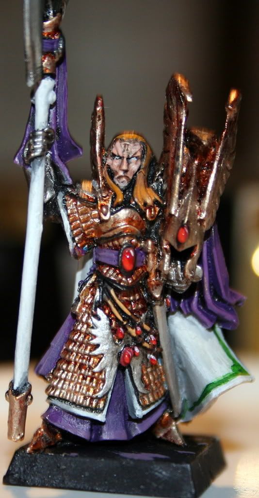
Nick232 WIPs/ update 22/4/08 orc boar!

nick232

New member
this is my latest mini. it is not finished and some parts are sloppy at the moment.

aaaaaaaggggggggghhhhhhhh i cant get the pis to come up can someone help here are the the URLs:
http://s270.photobucket.com/albums/jj90/hacon2/?action=view&current=IMG_1734.jpg

http://s270.photobucket.com/albums/jj90/hacon2/?action=view&current=IMG_1732.jpg

http://s270.photobucket.com/albums/jj90/hacon2/?action=view&current=IMG_1733.jpg

what do you think? could you give me some ideas for a base.
~nick
 

Torn blue sky

New member
Could use with thinning your paints. I know it sounds like a universal critisism, but i\'m not saying it to be an ass lol Some parts look a bit patchy though like it\'s too thin.
It\'s looking like it\'s coming on though, nice bit of attn to the face, some of the colours you used there are good! Basewise...I dunno lol what do you see him doing?
 

JesterzUSMC

Recovering Megalomaniac
Originally posted by nick232
this is my latest mini. it is not finished and some parts are sloppy at the moment.

aaaaaaaggggggggghhhhhhhh i cant get the pis to come up can someone help here are the the URLs:
...
what do you think? could you give me some ideas for a base.
~nick

Use the Direct Link URLs and img tags.
IMG_1734.jpg

IMG_1733.jpg

IMG_1732.jpg


I too would suggest thinner more numerous layers of paint, and that would go a long way to smoothing your blending.
 

Thunderhawker

New member
Hear hear! (or is it here here?) I agree with the more numerous, thinner layers. Also I would suggest cleaning your brushes so there is no paint in the ferrule (the metal part), as this tends to screw up the point. Also if you are using GW brushes, ditch them (that is just an opinion BTW as there are several folks who use them to great result). I do have to compliment the pic though, as it is usually terribly difficult to get that close:)
 

nick232

New member
new WIP the time a DA Master:

IMG_1735.jpg


IMG_1736.jpg

what do you think? i really want your opinion on the NMM.
~nick

PS-Please do NOT coment on the cap i kinda F**ked itup ans need to redo it.
 

Torn blue sky

New member
You have the right idea on the NMM! It looks like everything\'s where it should be, just gotta work on those blends ;)
Thinner layers = good blending, as a general rule of thumb.
Looks like you got the concept though!
 

Thunderhawker

New member
You seem to have a tendency to leave alot of primer showing. You may want to try and get a bit more complete with your coverage. it may take a few coats, but it\'ll get there.
 

nick232

New member
so heres an update;

this was given to me by Talonicus, and i like!

Pict0118.jpg


Pict0119.jpg


Pict0120.jpg


the last high light on the fur is a bit too harsh so mayby a wash of some brown.

havn\'t started the rider Talonicus is painting the banner/flag thing!
 

Manus

New member
looks good, the yellow makes for a great contrast, just make sure it doesn\'t take all the attesion from the rider
 
Back To Top
Top