Painting Gothic Script?

Roger Bunting

New member
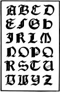
Okay, for some masochistic reason I\'ve decided to paint the names of my Grey Knights on the shoulder scrolls in Gotic Script, like this.

CAL27Gothic_UC.jpg


However, I\'m having some trouble with it. Has anyone got any tips or ideas about how to get it looking correct, with the correctly angled-looking lines, with the flat edges and so on? Of course one problem is that I\'m painting it with a round brush whereas it\'s written with a nib used at a 45 degree angle, hence the slanted ends of the lines.
 

Onis Lair

New member
Good luck with the idea Roger, should look great if you pull it off. I would suggest instead of a round brush use a Shader brush, maybe size 0. The small flat brush will probably give you the angles that your wanting.
 

Gilvan Blight

New member
Perhaps you can either find a nib small enough or go buy a flat end brush and hold it at a 45o angle.

Other then that I think you just have to paint them like you would do any other freehand, and not follow the \'strokes\' shown here, and just paint how you must to re-create the look.
 

mattsterbenz

New member
The tricky part with Gothic lettering on this small of scale is that it can be difficult to read, even if it\'s painted identical to the full-scale script.

What I like to do is paint the first letter of the word slightly larger than the rest, and in more detail. A script such as this:

170-Italian-Gothic-Letters-q75-326x500.jpg

note the fancy vertical marks (such as on the \"N\" and \"R\" letters), as well as the diagonal marks (on the \"P\" and \"U\" for example.)

Then I like to paint the rest of the word in a more simple, yet Gothic-like script. Sort of like the picture you have, just simplified slightly more (for example, I would not include the two extra marks on the left vertical mark on the \"K\", but rather one single, curved stroke).

Vary the brush pressure to compensate for not having the chiseled edge of a calligraphy pen. More pressure will create a broader stroke, less pressure a finer stroke.

The brush shouldn\'t matter as long as it has a fine point. I use only GW and haven\'t had a problem with them (that\'s a different matter I guess, but proof that it\'s not all in the brush!) :D

/rant over lol

-Matt
 

Roger Bunting

New member
You clearly don\'t understand me. lol Once I\'ve decided to do something I\'ll try my damndest to do that, so I\'m going to paint them, not use decals. :D

This is the lower case version of the sheet I showed in my first post.

CAL26Gothic_lc.jpg


I think that\'s more like what you were suggesting, Matt?

Here\'s the best I\'ve managed so far, although I wasn\'t being too fussy (and using too thick paint) on tidying up to get the shapes. Ignore the rest of the mini, too, it will be stripped.

name1.jpg


Edit: Just had a look at the Ginfritter stuff and the pics are too small to see what they\'re like.
 

Dragonsreach

Super Moderator
Staff member
Painting script on any figure is a right pain the the backside and I avoid it like the plague. Plus my handwriting is a disgrace, which is why I type almost everything.

However I do remember a technique from many years ago in Historical painting to draw two fine pencil lines to work as a top and bottom in between which you worked the painted letters.
 

mattsterbenz

New member
The lower case script is much more like it. :D

Looks great. The only thing I can see is the areas you touched up with white, you can see a little black showing through still. With a little time you\'ll have the brush control down where you will need to do very little touching up, so it will look cleaner. I\'d recommend practicing the alphabet on some sprue or plasticard. Once you are familiar with each letter design it will really speed things up (and make it look cleaner too). :D

-Matt
 

Roger Bunting

New member
Yeah, I didn\'t have paint consitancy right, either too thin or too thick, but it was just for a quick run-through to see if I could get the shapes.

I\'ll try DR\'s tip on the lines, too, as the letters are difficult to get at the same size.
 

Undave

Flockwit
It could do with being a bit more central on the scroll. I\'m sure you know already but the trick to spacing stuff like this is to start with the middle letter and work outwards. It does seem like a long scroll for a short script though, maybe he needs a longer name lol
 

Roger Bunting

New member
Well, unfortunately they don\'t give out different sized scripts so it\'ll have to do. I am not having long names, at least until I get better at painting the script. Yeah, I did figure out to work from the middle but I couldn\'t be bothered with the practice one there.
 

Shawn R. L.

New member
The surface you\'re painting on looks a tad lumpy. You should file the surface smooth as possible and lay down a good smooth base coat. At that scale, ANY bumps or such will make it very tough.
 

lahatiel

New member
As far as how to do it and get the correctly angled lines, you might get some ideas from this BrushThralls article on symbol painting:

http://www.brushthralls.com/painting-techniques/symbol-painting.html
 

Roger Bunting

New member
@Shawn. Yep it is bumpy. That particular mini was painted when I got back into the hobby, and is going to be stripped. The new improved ones are the minis that will have the script. Probably not perfectly smooth as I have the bad habit of painting when I\'m getting too tired, and of course, that happens quickly for me. One day I will learn.

Now, here\'s the latest attempt. The surface was prett smooth to start with but I was getting tired again and just wanted it done so the \"corrections\" are very lumpy. They do say the camera adds 10 lbs. They didn\'t say it was 10 lbs of paint. lol

script2.jpg


The letters (the ones that I managed to get between the lines) are 1mm tall.

EDIT: @Lahatiel. Aye, I remember looking at those tutes some time ago but thanks for reminding me.
 

Rastl

New member
Jen Haley has an article on her site about painting details. Gothic script is on page 4.

I was lucky enough to take her class in person. Yeah, it only looks easy.
 

Roger Bunting

New member
Thanks, Rastl. I wish I\'d done the method for the book on the purity seals and grey knights\'s book icon. Oh well, there\'s another 35 of them to perfect it. :D

My brush control isn\'t quite up to standard yet but I\'ll be practicing again tomorrow so maybe I can at least improve on what I did today. I\'m hoping to get the four GKs I\'m working on at the moment as finished as I can before the UK painting thing as I\'m going to take them.

EDIT: Now I need to get some fonts so I can print off some examples at the correct size as in Jen\'s article. I can just about get the examples I have shrunk down but of course it\'s a picture not a font I can use to type out specific words. Anyone got any links to any?
 

Roger Bunting

New member
Thankyou again, Rastl. :)

EDIT:

I\'ve been playing around with various fonts and here\'s what I think I\'ve decided on. There are three options in that style. Capital first letter and lowercase, all capitals, and a variation on the font with all capitals but the first letter larger.

GKnames2.jpg


I think that font has a good degree of legibility, isn\'t overly complex to paint at this point and so is something I could, hopefully, repeat on all the Grey Knights.
 

Shawn R. L.

New member
An odd little trick you can use is to try (you\'re probably to the limit already) to paint smaller than you actually need. You may not get it perfect but if you work it for a bit, THEN switch to the size you actually want it MAY be easier.........it will seem large and easier, hopefully.
 
Back To Top
Top