
hey CMON...
this is the winner of the Pit of the Oni, one year anniversary, painting contest...
http://www.coolminiornot.com/229183
this is the first mini in what i am calling the Gamer\'s Series, minis painted to sell specifically to gamers...
these are minis painted to what i call high-tabletop standard, \'eavy metal standard, or studio standard...
the series will mainly be GW, Privateer Press, and Infinity minis, since those seem to be the most played of all the miniature games...
the Gamer\'s Series will be minis such as a character model, a monstrous creature, or an army leader (something that a player will generally only need one of)...
the minis will be painted as replicas of the studio minis that gamers drool over in rulebooks, magazines, and catalogs...
painted to the studio\'s own standards, they will be an affordable addition to any collector\'s shelf, and yet be based and varnished for gaming (ready to take pride of place in any gamer\'s army)...
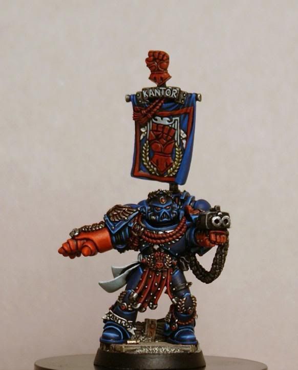
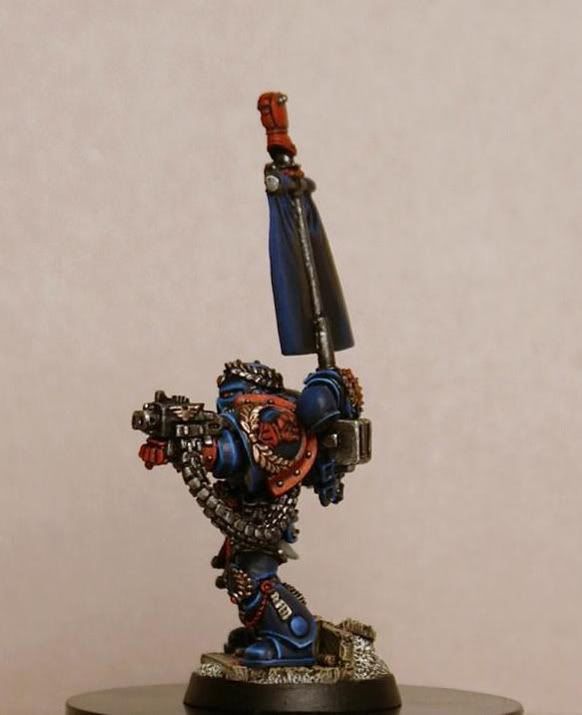
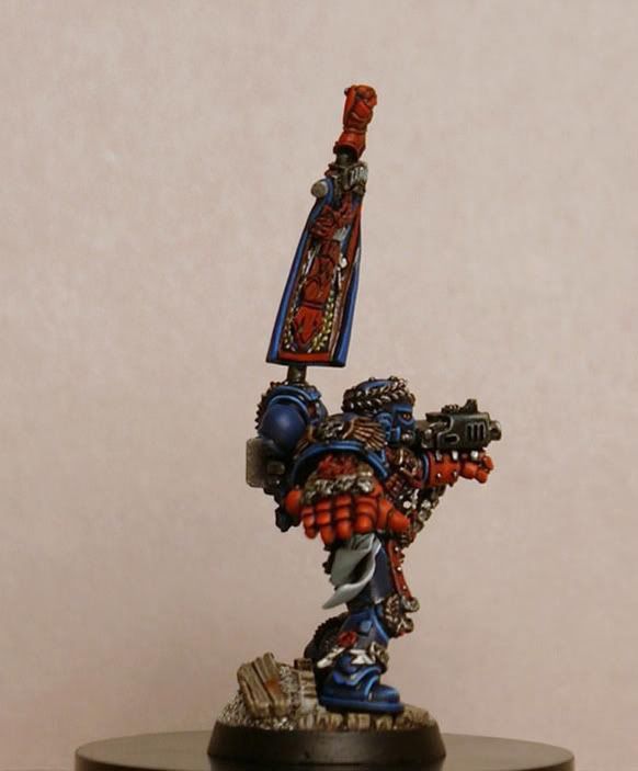
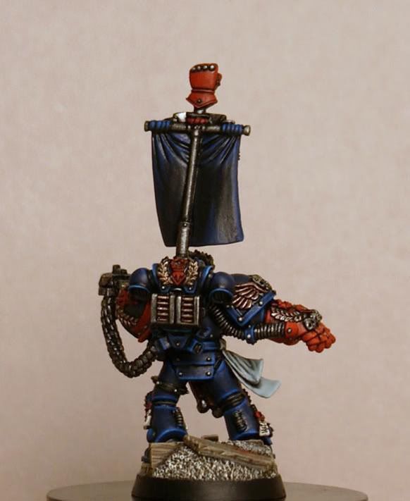
when i posted the pics for the contest, generulpoleaxe pointed out that i had not painted the studs on the left arm silver...
woops...
that has been remedied, and a few little spots have been touched up...
i also tried a new background, a more neutral beige, instead of stark white...
hopefully there is a little more richness in the blue now...
he\'s up for auction on ebay right now...
the link is in the trading post:
http://coolminiornot.com/forums/viewthread.php?tid=34070
thanks for lookin\'...
cheers
jah
this is the winner of the Pit of the Oni, one year anniversary, painting contest...
http://www.coolminiornot.com/229183
this is the first mini in what i am calling the Gamer\'s Series, minis painted to sell specifically to gamers...
these are minis painted to what i call high-tabletop standard, \'eavy metal standard, or studio standard...
the series will mainly be GW, Privateer Press, and Infinity minis, since those seem to be the most played of all the miniature games...
the Gamer\'s Series will be minis such as a character model, a monstrous creature, or an army leader (something that a player will generally only need one of)...
the minis will be painted as replicas of the studio minis that gamers drool over in rulebooks, magazines, and catalogs...
painted to the studio\'s own standards, they will be an affordable addition to any collector\'s shelf, and yet be based and varnished for gaming (ready to take pride of place in any gamer\'s army)...
when i posted the pics for the contest, generulpoleaxe pointed out that i had not painted the studs on the left arm silver...
woops...
that has been remedied, and a few little spots have been touched up...
i also tried a new background, a more neutral beige, instead of stark white...
hopefully there is a little more richness in the blue now...
he\'s up for auction on ebay right now...
the link is in the trading post:
http://coolminiornot.com/forums/viewthread.php?tid=34070
thanks for lookin\'...
cheers
jah


