Persifal's Nest

Maenas

New member
All I can say is that your NMM is by far better than the TMM from your ref pic. And that I like your study and result a lot. I do not find it to bright nor dark nor matte nor bluish. It just seems polished silver.
 

Persifal

New member
I hope so Lee.

Maenas, I think, silver look is very difficult, I must agree with people on facebook, that lighter version will be better. Thanks anyway.

Thanks Zab. I'm crying. I wanted it finished yesterday and end is far away:) Another models for GD waits.

attempt 2:
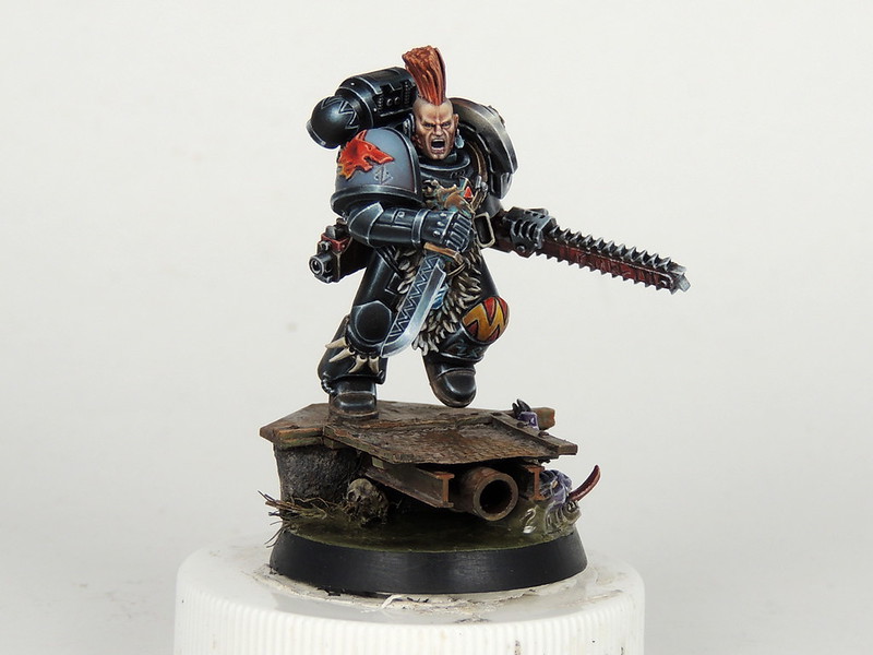
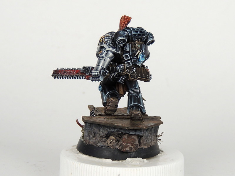
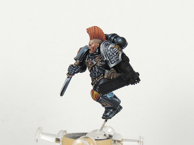
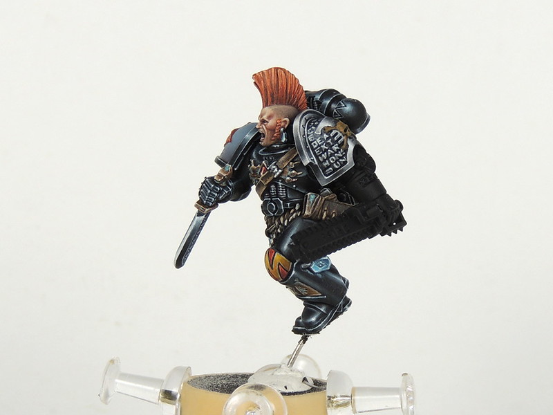
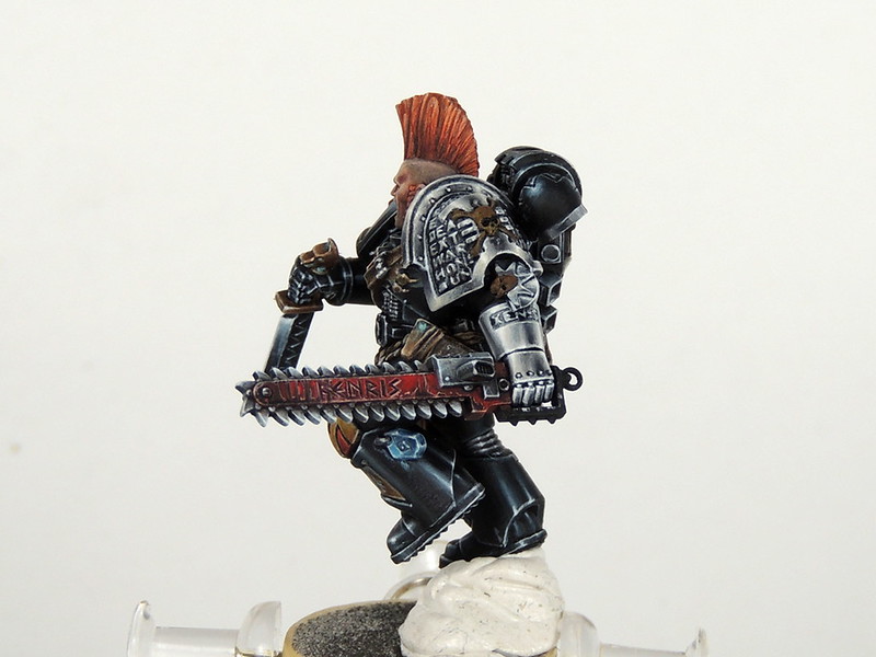
Drenn Redblade WIP by Tomáš Pekař, on Flickr
 

khavor

Member
The gauntlet is nice, but I love the chainsword. The teeth look a little clean though compared to the blade.
 

Persifal

New member
Yea SaintToad, red hair is my specialty :)

The chain sword is one of original equipment from his origin. I weathered it because he used it very often and he cannot paint it red again because there is only black paint on the Deathwatch vesels :) . Teeth are cleaner because he clean it to prevent stucking.
 

Persifal

New member
Only few final tuches left. I can't resist to show you. Very happy with the result. Please let me know, what change, if any :)

26733510386_79e0380271_c.jpg

26758908015_15dd9592f0_c.jpg
 

Canny

Active member
Looking awesome mate, I think the blue shoulder pad is not up to the same standard as the rest of the mini, a little more transition in the blues maybe?

The base is looking pretty sharp with the building, but to get up to scratch needs more tonal variation (not more colours just a larger light to dark transitions) and 1 little bright hazard stripe, number, or something to make the base a little more interesting. I love Artur's bases http://dobrakonsystencja.blogspot.co.nz/2015/10/base-50mm.html.

stunning work mate, the points are just my thought. Happy painting.
 

Persifal

New member
Thank you very much, Canny. I wanted add highlight on the right shoulder pad, but If I follow reflection painted on the right sphere of the backpack, the reflection take the place of the wolf head. Bad. The base is flat, I must add something. You are the third person speak about.
 

Canny

Active member
I see what you are saying, maybe increase the darker area of the shoulder pad to get the change it needs and lighter highlight on the edge of the wolf. And make the spot where the wolf highlight is extra bright so it works in your head when you look.
 
Back To Top
Top