Persifal's Nest

Persifal

New member
After posting pictures of this guy I had many suggestions and this is result of my work.
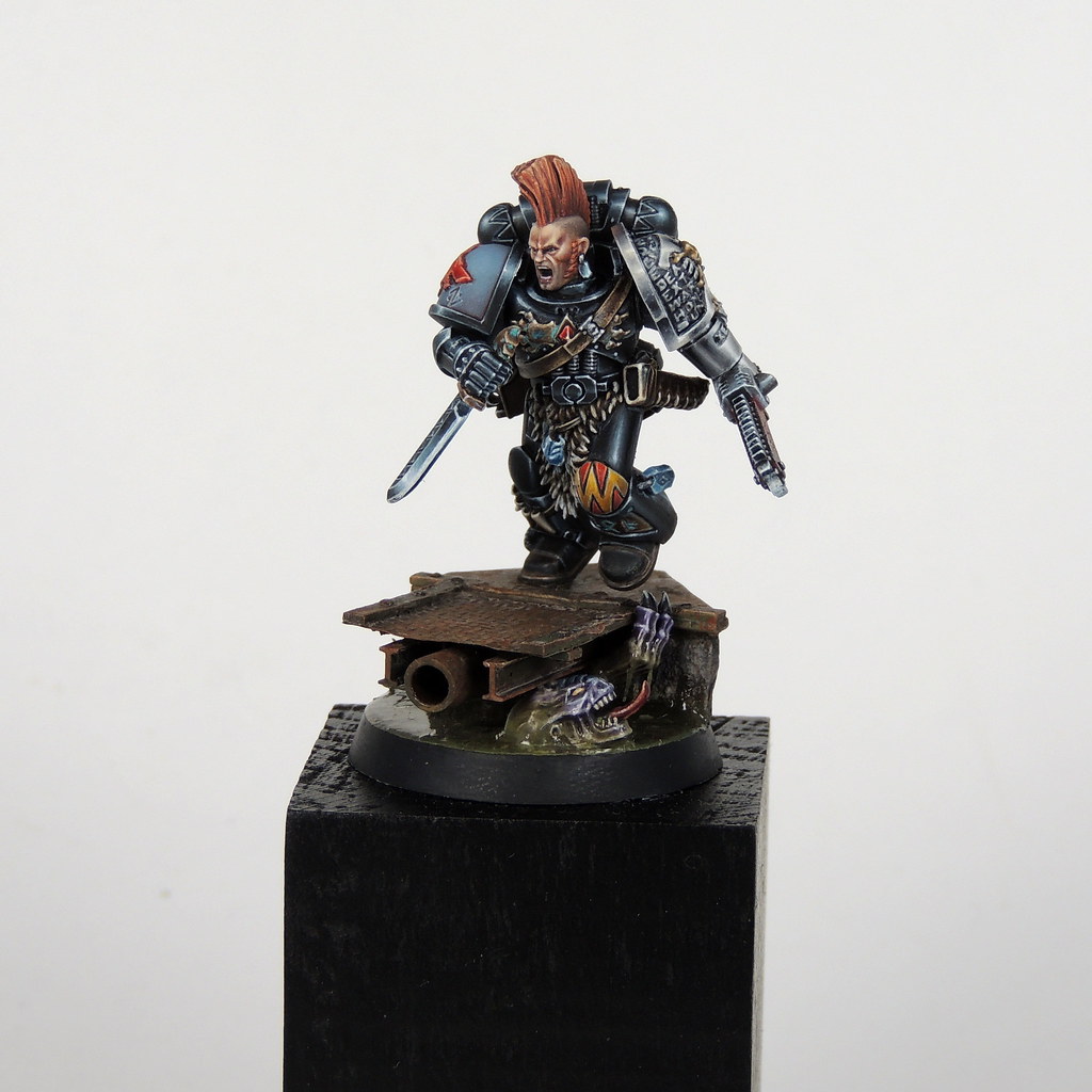
left: version presented earlier
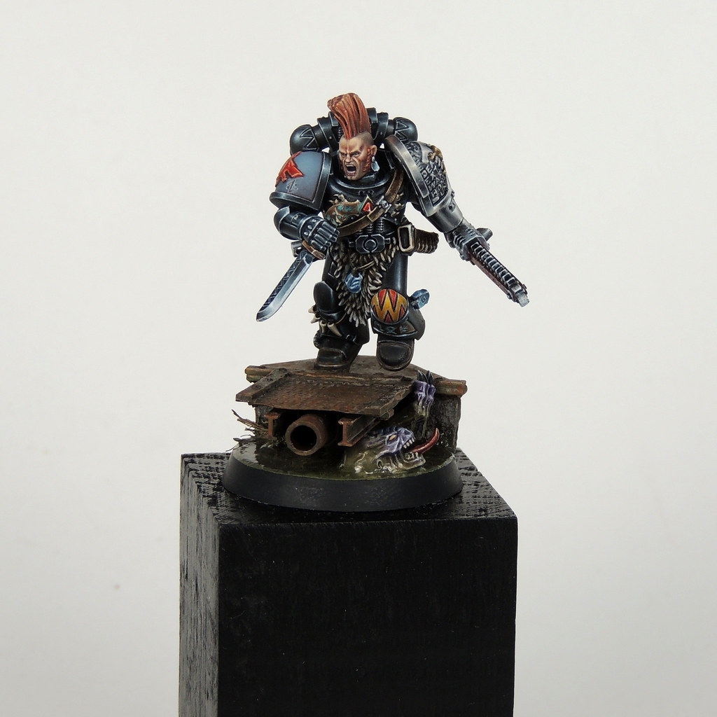
right: after tweeks.
- new contrast on the helmet and new eyes
- new highlight on the skin
- repainted some nmm bronze with more bluish corrosion
- glazes on cloth to raise green to more contrast.
- added blood
- steel is more darker now with some rust
- soften shadows on rocks


Small changes, big difference.
Slaughterpriest compare by Tomáš Pekař, on Flickr
 

KruleBear

Active member
I think I liked the sword better before...but it is amazing how the rest of the little tweaks made big improvements. Especially the eyes...creepy cool.
 

ten ball

Active member
Really great painting mate, the improvements have worked brilliantly with the exception of the sword , I'm with kruleb and prefer the before.

Also remember the 'luck' element in a competition, there might not be anything wrong in the first place it could be just how things are on the day .
 

Persifal

New member
yea, clean sword was good, but this is slaughterer :) After I placed blood on sword, I knew, it is mistake, but no way back. It is not too bad to leave it for now.
 

SaintToad

New member
I agree that the cumulative effect of the subtle changes is dramatic. It was a awesome model, but now it's an awesomer model.
 

Canny

Active member
Awesome mate much better, the flesh looks much more focal and there is more seperation of via depth and color choice in the mini. Great work.
 

Persifal

New member
Sorry for my long absence here. Because I or admins are not able to change name of my old thread I starting this one with more neutral name. Link to my old thread.

I started work on my last model on the end of last year. How many of you know, it is member of Adeptus Custodes from the Burning of Prospero game. Because I almost leave the way of true metals, I will pain it in NMM. My experimets with NMM gold from last few moths are not too succesful. So I decided to use mix of Painting Buddha NMM gold colors(VGC Scrofulous Brown, VMC Ivory and VMA Armour Brown) with colors from Vallejo NMM set(VGEO Heavy Goldbrown, VGEO Heavy Brown and VGI Sepia). I started work on the helmet. It is harder then it seems and wat I expected. But I think some part are good. Sorry for quality, it is little bit blurry.

31304924924_c203333345_z.jpg
 

supervike

Super Moderator
I can make no guarantees, but I may be able to change the title of your old thread, and merge these two? Shall I try?

If so, what name do you want it to be?

If I can't, sorry to get your hopes up.
 

Persifal

New member
Thank you guys for greetings.

@supervike I made ticket for this issue some time ago. It should be great to merge. Let the name is same as this thread, Persifal's Nest.
 
Back To Top
Top