Scibor Chaos Dwarf #2

ScottRadom

Shogun of Saskatchewan
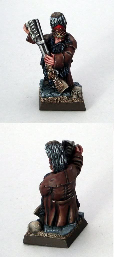
I got some comments on the other dwarf from this range I did. I think I took them on board and I like this one a little better. Not claiming perfection at all, but I think it's nicer looking. Dragonsreach/Mike also said my last one was a step backward for me. Yikes! I hope this one is more in keeping with an upward trend. Thanks for looking....

http://coolminiornot.com/236598

Moscaldwarf2.jpg


And for comparison this is the other one I painted....

Moscalmontage.jpg
 

crazyboyae1

New member
Hey scott, great paint job!
I like the blending on the brown cape a lot.
well done :)

Wow I just realized that the top one is yours too. that one is really top notch. i thought that was painting by scriber mini!
great work on the red and the over all blending on the model!
 
Last edited:

ScottRadom

Shogun of Saskatchewan
Holy smokes, if you mistook my stuff for a studio job I am certainly going to take that as a compliment! Thanks!
 

In Chigh P.I.

New member
well firstly i would say that the red jacketed piece looks more like what its supposed to be. The other one dosent really look like a dwarf (although i havent seen them in the flesh, as it were)

and those skulls on the guns just dont do it for me at all

But enough about the actual mini!

I saw the first (brown) one in the gallery and was impressed with the highlighting on the jacket (i know you spent a bit of time on that) but it looks like the other piece (red) could do with a bit more in that respect?

Mind you, i cant paint for toffee so feel free to ignore this post if you so desire :giggle:

Keep up the good work :)
 

ScottRadom

Shogun of Saskatchewan
well firstly i would say that the red jacketed piece looks more like what its supposed to be. The other one dosent really look like a dwarf (although i havent seen them in the flesh, as it were)

and those skulls on the guns just dont do it for me at all

But enough about the actual mini!

I saw the first (brown) one in the gallery and was impressed with the highlighting on the jacket (i know you spent a bit of time on that) but it looks like the other piece (red) could do with a bit more in that respect?

Mind you, i cant paint for toffee so feel free to ignore this post if you so desire :giggle:

Keep up the good work :)

Thanks, I totally agree that I could've doen at least one other layer of highlights on the jacket looking at the photo for sure. Thanks for commenting!
 

SkelettetS

New member
honestly i dont think the other dwarf is that bad, i think they are both two good looking chaps(atleast paintwise...) even if another highlight or two wouldnt hurt:)
stuff like for example the fingers on the minis looks very poorly sculpted/casted.

...oh, and i love the skull on the base, looks totally wierd :D
 

Ritual

New member
Those are some hideous minis! :poop: Paintjobs are nice, though, and the newer one looks a lot better than the previous. Still hard for me to appreciate it as I really dislike the sculpts. Sorry! :sidefrown:
 

Dragonsreach

Super Moderator
Staff member
Well I think that's a much better job than the first one you did.
The red works nicely.
Have to agree with someone above that the Skull on the weapon lacks something, but I think that's might be due more to the sculpt than any supposed shortfal in the painting.
(Can't leave to much of a comment have to rush off to a training course sorry..)
 

Enzed

New member
I think it looks great! I am really impressed with the reds. How long did it take you from start to finish for this one?
 

freakinacage

Well-known member
i still liked the first one and preferred the colour scheme you used on him. he just needed a little bit on neatening on the coat..

i have only bought one lot of scibors stuff, was very disappointed by the quality. did you find lots of crappy bits that made it seem unfinished? (i can see that the barrel is wonk and seems to have been badly extended (that wasn't you was it?). lots of min had gaps where he hadn't bothered to fill them when making the original (in between plasticard joins on weapons, for example)
 

Trevor

Brushlicker and Freak!
Looks great. I think you need 'spot' highlights. The blending is better on the new one, but on the older one you have sharp 'spot' highlights and the first one would benefit from these, it makes the mini 'pop' more. Hope that makes sense.
 

demonherald

New member
I'm firmly in the hate the mini but you've done a nice job on it chief.. they just don't do itfor me at all so it does always affect how it looks to me unfortunately .. however coparing the two the top one is definitely a step up chief .. nicely done.
 

ScottRadom

Shogun of Saskatchewan
i still liked the first one and preferred the colour scheme you used on him. he just needed a little bit on neatening on the coat..

i have only bought one lot of scibors stuff, was very disappointed by the quality. did you find lots of crappy bits that made it seem unfinished? (i can see that the barrel is wonk and seems to have been badly extended (that wasn't you was it?). lots of min had gaps where he hadn't bothered to fill them when making the original (in between plasticard joins on weapons, for example)


Hmmm, yeah the barrel was me. It came in two pieces and I puit the barrel on a little wonky so it seems. Dang!

There were a few air bubbles throughout the batch of mini's I got, but nothing super serious. I will buy from them again for sure.

Love 'em or hate 'em the Scibor stuff looks unique to me. Thanks for the comments!
 

Enzed

New member
I don't really know why no one likes them :( I think the figures are really good looking! I love the whole Russian-dwarf-snow-musket thing.
 

Ritual

New member
I don't really know why no one likes them :(
For me, it's the lack of plausible anatomy (they're basically just shapeless blobs with a head, arms and feet stuck on), the bland, expressionless faces (looks almost identical, BTW, and it is the same with a lot of his other stuff... this face appears a lot!) and the fact that the finer details that aren't CAD-designed, 3D-printed and press-moulded look sloppy (fingers, fur, beard, etc.).
 

freakinacage

Well-known member
For me, it's the lack of plausible anatomy (they're basically just shapeless blobs with a head, arms and feet stuck on), the bland, expressionless faces (looks almost identical, BTW, and it is the same with a lot of his other stuff... this face appears a lot!) and the fact that the finer details that aren't CAD-designed, 3D-printed and press-moulded look sloppy (fingers, fur, beard, etc.).
agreed. while i like some of his ideas, a lot of the finishing is poor. the servitor dude that i bought off him required a LOT of work, filling gaps that should have been filled on the original greens etc. i may buy again but this lack of professional finish has REALLY put me off
 

ScottRadom

Shogun of Saskatchewan
Fair enough. I still like the models, and the majority of the rest of the scibor range. They're defo not for everyone, but I likes 'em. I couldn't put my finger on it and yell and scream about what jumps out and appeals to me, but it's something.
 
Back To Top
Top