ScottRadom
Shogun of Saskatchewan
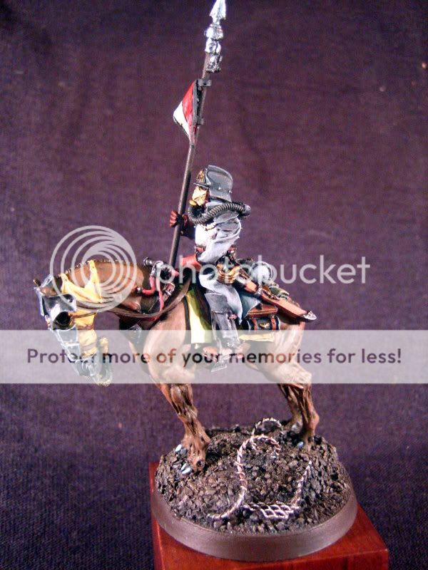
I\'m calling this one quits. I got some excellent feedback from Darklord about some things I could do to improve the details of this model, but in the end I just want to move on to something else. I am more or less pleased with it. I was aiming for a more subtle shade/highlight on the horsehair but I think it looks more lazy than subtle.
I love the model\'s in this range. The advice I was given was to subdue the highlights on the armor on the horsehead a little. I tried some thin washes to bring it down to the point it\'s at. I also highlighted ther red on the lance pennant a little more and highlighted the horse hooves to try and keep them from blending into the base as much.


Pic\'s are a bit crap. I got a light tent under the tree somewhere and soem better lights for early \'09 might be better too! Truth is the pics are pretty close to the IRL look of the fig. BLAST away amigo\'s! I\'ll put the votey link up once approved.
Thanks to all for the continued support in improving my skills in this hobby. This fig is quite an improvement vs. my last DKK submission I think!
http://www.coolminiornot.com/208355 here\'s the link.
I love the model\'s in this range. The advice I was given was to subdue the highlights on the armor on the horsehead a little. I tried some thin washes to bring it down to the point it\'s at. I also highlighted ther red on the lance pennant a little more and highlighted the horse hooves to try and keep them from blending into the base as much.
Pic\'s are a bit crap. I got a light tent under the tree somewhere and soem better lights for early \'09 might be better too! Truth is the pics are pretty close to the IRL look of the fig. BLAST away amigo\'s! I\'ll put the votey link up once approved.
Thanks to all for the continued support in improving my skills in this hobby. This fig is quite an improvement vs. my last DKK submission I think!
http://www.coolminiornot.com/208355 here\'s the link.
