Scott vs. Death Korps Rider

ScottRadom

Shogun of Saskatchewan
Hey, I\'m about to call this one finished but I thought I\'d pool some opinions. It\'s for an online challenge against EldinTux. Any suggestions?
IMG_1041.jpg
 

Crayfish

New member
The horse is looking ace, but the head thingamajig on the horse look a little rough in the highlighting. Also the colour on the cable in the dudes face look dull, maybe the highlights been washed out in the photo. Other than that, its looking spiffy!

Maybe try photographing it in several angels to give a more indepth view.

Love these models btw!

Hope I\'m in somewhat use for you :)
 

GreenOne

I paint my thumb.
Pretty damn nice :D
I think the polearm/flag stick thing is not as nice as the rest and a couple odd bits that could have more attention, like the grey thing over his leg that are a bit flat or the leather stapping. But that\'s just little details.
 

ScottRadom

Shogun of Saskatchewan
Okay so the suggestions I\'ll have to act on are...

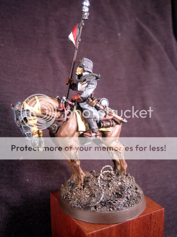
-Highlighting on the Horse head armor needs to be smoother. I\'ll try to wash it down a little bit maybe.

-The armor on the legs needs a little more pop. It\'s meant to look like painted metal, maybe I\'ll put a few metalic scratches in to make it stand out?

Upgrade the leather straps. A few more highlights, and the same for the lance.

Thanks guys!
 
Back To Top
Top