ScottRadom
Shogun of Saskatchewan
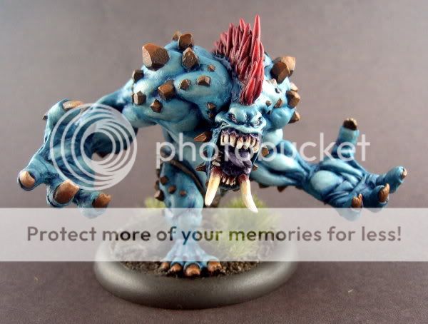
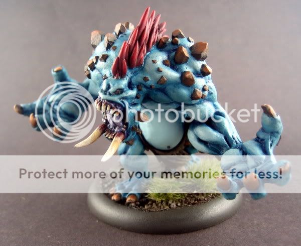
Hello. I painted this up for a paintign challenge duel and for a entry into a local Privateer Press competition. Mixed feeling about this model, and again patience was my enemy. I simply got itchy feet and had to walk away from this one. Fire away any comments you like. Here\'s the votey link.....
http://www.coolminiornot.com/216786
Things I was able to do on this model that I hadn\'t done before....
-I started the flesh from the mid tone and shaded down then highlighted up. I had just worked darkest to lightest before. Shading was too heavy on this model I think but I do think the experience was good for learning.
-I copied the entire color scheme from the box top. Okay, maybe not anything to brag about but I know nothign about hordes fluff and I am going to eBay this sucka so I wanted to make it as mass appeal friendly as possible.
Please fire away. I do think this model was another step forward for me, but it\'s clear I got a long way to go before I get truly happy with my results. And I gotta get way more patient. This onw was probably 8-10 hrs from primer to finish. Having said that there are some real problems I didn\'t bother solving with the assembly of the model as well.
http://www.coolminiornot.com/216786
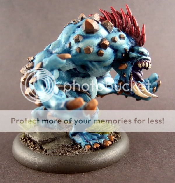
Things I was able to do on this model that I hadn\'t done before....
-I started the flesh from the mid tone and shaded down then highlighted up. I had just worked darkest to lightest before. Shading was too heavy on this model I think but I do think the experience was good for learning.
-I copied the entire color scheme from the box top. Okay, maybe not anything to brag about but I know nothign about hordes fluff and I am going to eBay this sucka so I wanted to make it as mass appeal friendly as possible.
Please fire away. I do think this model was another step forward for me, but it\'s clear I got a long way to go before I get truly happy with my results. And I gotta get way more patient. This onw was probably 8-10 hrs from primer to finish. Having said that there are some real problems I didn\'t bother solving with the assembly of the model as well.
 ) but I hope you get the gist of what I\'m rambling on about
