Scott vs. Flesh tones

ScottRadom

Shogun of Saskatchewan
Upon Lizcams suggestion I am trying to do a little practice on skin and skin tone. She reccomended a naked chick, but I got\'s none of them. It is disturbing how many scantily clad men I have though. I worked this guy this afternoon. Now, this is probably where I would call it done left to my own devices. Apologies about the pic, it\'s mounted on a pin vice and it\'s impossible for me to get a better pic then this currently...
IMG_1484.jpg

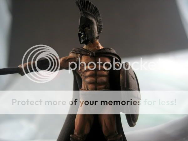
What i have done so far is a base of Scorched brown over the whole model. VMC colors were used for the rest, layering Biege Brown and then 6-7 layers of thin paint done in 4 coats each up to the final alomst white with a little pink extreme-o highlight. Then I thinned the GW flesh wash 3:1 water/wash and applied it about 3 times to try and smooth out the different layers. Now, thoughts? How do you guys do your stuff, and what should I do differently on the next stuff?

Thanks for any tips and crit\'s!

Scott
 

obsidianpainting

New member
I am also currently working on some skin tones. What is the colour scheme of the model? or do you just want to paint the skin?

You should lightly glaze all the areas of skin that usually get folded (i.e. armpits, under the chin.)
Then also add a slightly green-blue glaze(scaly green works nice) to all areas of skin that don\'t get much blood. (i.e the temples, along the nose, elbow crease area..... ) yah.. then glaze red to all the areas that get lots of blood. (i.e knuckles[as they flex alot] Cheeks)

Just take a look at your skin in the mirror and see where green, red, and blue shades apply. Then apply this to your model in VERY LIGHT GLAZES!

Im currently working on experimenting with these kinds of things..

Also, depending on the colour scheme of the model, i add certain colours to my basecoat(and i usually basecoat the midtone)

Anyways, you may be able to learn some things from my lathiem, beelphegor, horthak wip thread.

I haven\'t updated it lately as im currently painting the horthak. and am running into problems. and im sorting them out! so yah..


Cheers, Gary.
 

demonelf3

New member
The transitions are good, but notice how the flesh is very cold. Try to add a bit of warmth in there, maybe by glazing VMC Burnt Cadmium in there a touch. Otherwise it looks fine.
 

Backstabbeth

New member
Looks pretty good so far. I liek the tan...ness of the skin.

The pic is a little dark but what I see looks pretty good. I think you leveled up by completing the Undaves mini
 

ScottRadom

Shogun of Saskatchewan
Thanks man. Though I followed some advice from some other people and decided to tone down the starkness of the shading. I ended up with this....
IMG_1488.jpg

Now it doesn\'t look THAT crappy when it\'s not blown up 15 times the size to be fair, but it\'s not that close to the direction I wanted to take the model. I am thinking of taking it back closer to the original pic, but focusing the shading glaze more towards the waist line and leaving it more subdued towards the head. Thoughts on that? Since that pic I have finished the cloak. Really happy with it, I worked from VMC Cadmium red with a 75/25 mix of black/devlan mud shade in the recesses all the way up to a bright red mixed 50/50 with bronzed flesh as an extreme highlight. Taking pics while the thing is mounted is a bit of a pain, so it\'ll have to wait.

Thanks for the continued help and inspiration guys!
 
D
That\'s looking great Scott. Nice choice of model as far as practicing skin goes. Only suggestion I have is try adding a wash of purple in there to give it that \"cold\" shade in there.
 

Backstabbeth

New member
from the time i started here till now in all your WIP threads you seem to have made great improvements, this one is no exception. This is looking very well blended. It makes me want to see the finished product.

two comments.
1.The lighting is still squite dark on the photo.

2. If i am not mistaking this is Leonidas. Watch the movie again and see how the characters in that movie have flesh that has bright highlights and almost glisten... ehhh did i just say that??? I think you can get that effect on the mini by bringing the highlights up a notch but leaving the shading where it is.

regardless of what you do, i think you are stepping up in the span of models i have seen that you painted. Just my opinon.

Well done,

Tim
 

slah

New member
A tip to heighten the contrast without going too dark and too light is to glaze the highlights in yellowish colours and the shades with green/blue colours.

The yellow is a warm colour and the blue/green a cold colour, so the eye sees a bigger difference in range of colour than there really is, without having it look very caricatured and cartoony.
 
Great stuff - another Scott vrs \"insert topic here\" thread ! As my flesh painting aint great I\'m gonna watch the progress and tips here with interest.

Originally posted by ScottRadom
...... It is disturbing how many scantily clad men I have though ......
And yes this is disturbing, in many ways ......
 
Back To Top
Top