Scott vs. The Joker

ScottRadom

Shogun of Saskatchewan
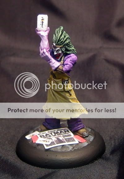
Hey. UnDave suggested I use this approach for Wyrd mini\'s \"Iron Painter 6\" contest. The first round theme was \"The Color Purple\" and this is what I wound up with. I am greatly indebted to SG2009, for scaling down the cards, Mickc22 for the same, Nathan Rinholm for getting the image for the paper, UnDave for the indea and the great people at WAMP for helping me get to this point. I feel like a bit of a turd as I had some suggestions to take it further but I just.... had to move on. It was a mental thingy. Too much other stuff! Thanks for voting...
http://www.coolminiornot.com/212656
IMG_1412.jpg

Everyone should give Iron Painter a try! Loadsa fun! Also WAMP: It\'s where all the cool kids are!
 

generulpoleaxe

New member
looks cool scott :)

try taking the highlights a little further to help with the contrast.

your realy coming along mate, i see big improvements with each figure (even when i don\'t comment on them in the forums i still check them out)
 

GreenOne

I paint my thumb.
Looking good Scott.
Love the way you did the face, and the presentation is cool also.
Good luck with iron painter ;)
 

ScottRadom

Shogun of Saskatchewan
Thanks guys!

GP: Thanks, I appreciate your comments especially since you were one of the first to help with my stuff when I got here.

GreenOne: TY Amigo!

Matty: Yeah, it\'s a cool piece of pewter. You inspired me to ppick up most of the rest of their range as well!
 

ScottRadom

Shogun of Saskatchewan
Thanks again guys

Freakinacage: It\'s a real struggle for me to get even one photo going! I\'ll try for some alternate angles maybe tonight. Reall appreciate the encouragement! As for the actual contest I don\'t think I have a snowballs chance. My opponent\'s gallery is very, very impressive. Still lots of fun though!
 

supervike

Super Moderator
BTW, I love the newspaper, although I think it could be slightly \'yellowed\' to make it more realistic.

However, I should refrain from giving you advice for the IP, since I should really remain neutral.
 

ScottRadom

Shogun of Saskatchewan
Nah, that\'s cool SuperVike. I\'m calling it done anyway.

I was emulating the model you showed with \"The dead walk\" on it. I tried some watered down flesh wash on an extra paper and I didn\'t think it was convincing. I also refrained from asking you how you did yours to keep the integrity of Iron Painter going (Translation: I forgot to consider asking the source of my inspiration!). So, how DID you get your paper to work?

I also wanted this paper to look fresh, like it was that mornings edition as well.
 

Backstabbeth

New member
thats reallycol. Ilove the way it turned out.
I apsecially like the color of the apron bounced off the purple. whats the base color for the apron?

I agree about the hilights,the mini couple do well with some more contrast. other than tha, I really like this mini and think its my fav in your library.

EDIT: i was going to go through and fix al he typos but this post is so bad it needs o be recorded.

anyway, great job!

Tim

voted
 

ScottRadom

Shogun of Saskatchewan
Originally posted by Backstabbeth
thats reallycol. Ilove the way it turned out.
I apsecially like the color of the apron bounced off the purple. whats the base color for the apron?

I agree about the hilights,the mini couple do well with some more contrast. other than tha, I really like this mini and think its my fav in your library.

EDIT: i was going to go through and fix al he typos but this post is so bad it needs o be recorded.

anyway, great job!

Tim

voted

Hey! Appreciated! The base for the apron is VMC Middlestone. HIghlighted by mixing VMC Buff into the mix with a touch of VMC Ivory at the end.
 

ScottRadom

Shogun of Saskatchewan
Originally posted by Undave
Nice one! That\'s pretty much spot on what I had in mind when I suggested it.

Aw man, thanks time 1.2 million for selling me on this idea brutha! Loads of good comments and tons of \"Why didn\'t I think of this before\" kind of stuff at wyrd. I still don\'t think I can beat my opposition but you\'re theme idea makes this contest as close as I could\'ve come.

Thanks, and thanks some more UnDave!
 

ScottRadom

Shogun of Saskatchewan
Oh, so close! It was sitting at about the 7.1 - 7.2 range but fell to 6.7 at 50 votes. Dang! I was pretty stoked as the 7.0 mark is a big psychological barrier for me. Ah well, thanks to everyone for the votes, crit\'s and encouragement. Next time!
 

A Luna

A Lunatic
Very nice Scottradom:)
Do you know the exact date for when the iron painter round closes? I would like to know how much time I got left:p
 
Back To Top
Top