
hey CMON...
here is my latest job...
http://coolminiornot.com/254853
painted to my basic commission standard, with the basic conversion/sculpting option added...
i threw in the freehand for free, because this guy would not have looked right without it...
the Chapter is called The Heralds of Light, a creation of one of the guys over on the Bolter & Chainsword...
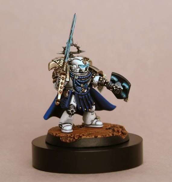
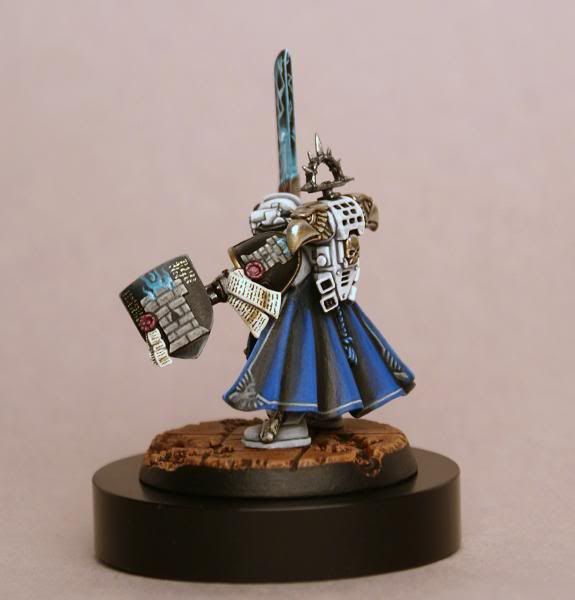
the icon on the right knee is the Chapter symbol, while the sculpted flaming tower on the shield and shoulder are the Company symbol...
this was a fun little conversion, since i rarely ever take a fantasy piece and put it on a 40k mini...
i chopped the chainsword off of the bionic arm, and added an empire shield...
the power coils on the inside are sculpted, as are the two tower symbols...
the sword is taken from the BA Sanguinary Guard...
it took a while to work out how to paint the white, as i usually work up over browns instead of greys...
in the end, after a royal pain with the photography, i got a close approximation of how he looks in hand...
i went for quite a strong comicbook look to this guy...
not very subtle, but quite striking.
hope you like him...
thanks for looking...
cheers
jah
here is my latest job...
http://coolminiornot.com/254853
painted to my basic commission standard, with the basic conversion/sculpting option added...
i threw in the freehand for free, because this guy would not have looked right without it...
the Chapter is called The Heralds of Light, a creation of one of the guys over on the Bolter & Chainsword...
the icon on the right knee is the Chapter symbol, while the sculpted flaming tower on the shield and shoulder are the Company symbol...
this was a fun little conversion, since i rarely ever take a fantasy piece and put it on a 40k mini...
i chopped the chainsword off of the bionic arm, and added an empire shield...
the power coils on the inside are sculpted, as are the two tower symbols...
the sword is taken from the BA Sanguinary Guard...
it took a while to work out how to paint the white, as i usually work up over browns instead of greys...
in the end, after a royal pain with the photography, i got a close approximation of how he looks in hand...
i went for quite a strong comicbook look to this guy...
not very subtle, but quite striking.
hope you like him...
thanks for looking...
cheers
jah


