Taking on the challenge-NMM

feanorthenoldor

New member
hey all, I have realized something about what I am expecting my miniatures to look like, specifically the armor, I want to see specific parts of it to shine and others to not, so I have decided to move away from using metallics and use NMM.

BUT first, I need some really helpful tips and websites to help me overcome this advanced technique.

I have looked at all of the NMM articles in this website, and they're awesome, so if you guys could give me some links of other sites, that would be great!!

thanks for the support

feanorthenoldor
 

Einion

New member
If you've read all the articles here you're not going to get much more in the way of helpful specifics from other places - I would advise now lining up some photographic references (or illustrations if you can find the right type, e.g. this) and going for it. This is mostly a matter of application more than theory, colour formulas or whatever; you need to put the ideas you've read into practice, seeing how you get on.

Einion
 

Tee999

New member
wow that silver is wow it's amazing ! the art work is nice also. But Damn that silver is amazing.

I am going to go cry in the corner for a while now.

Tee
 

feanorthenoldor

New member
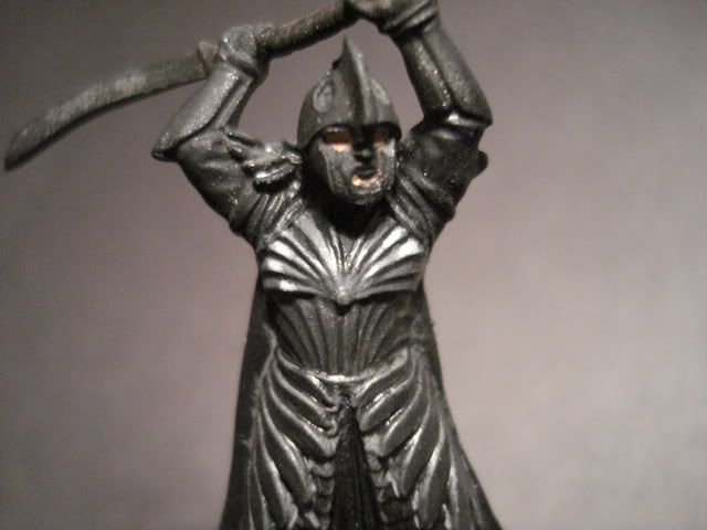
ok, here is my first ever attempt, ya its pretty bad
004-4.jpg


I only did the upper portion of the armor, as you can see, this was my process, and I know I have a lot of work to do.

1.Basecoat Codex Grey
2.Shade down with 70:30 Chaos Black:Codex Grey
3. Lessen the shade with 50:50 Chaos Black: Codex Grey
4. then I picked out where the light is supposed to reflect with a 50:50 mix of Codex Grey and Fortress Grey
5. As i was going along I cleaned up the spots where I put paint where it wasn't supposed to be.
6. Highlight reflection area with Fortress Grey
7. Hightlight reflection area with 50:50 Fortress Grey: Skull White
8. Highlight reflection area with pure skull white

And of course I diluted my paints to a milky consistency.

SO what can I do to step up the level of it?

Experts I await your orders!

feanorthenoldor
 

Einion

New member
Tee999 said:
wow that silver is wow it's amazing ! the art work is nice also. But Damn that silver is amazing.

I am going to go cry in the corner for a while now.
Well he's one of the best airbrush artists there is; he's been doing this since the 80s, so he's had a bit of practice :D

Seriously though, if you look at his earlier work you can see how much he's improved.


feanorthenoldor said:
And of course I diluted my paints to a milky consistency.
Looks like you might have a little too much paint on the brush though.

I'd suggest working on the blade first - a large, smooth area is easier to practice on. This is not the ideal subject to start out on! You picked a mountain to climb first, without having practised on hills yet. That armour would be a challenge even for someone who's done NMM before.

Einion
 

feanorthenoldor

New member
ok guys i have finally rapped my head around the NMM idea after reading about a million and one articles on it.lol

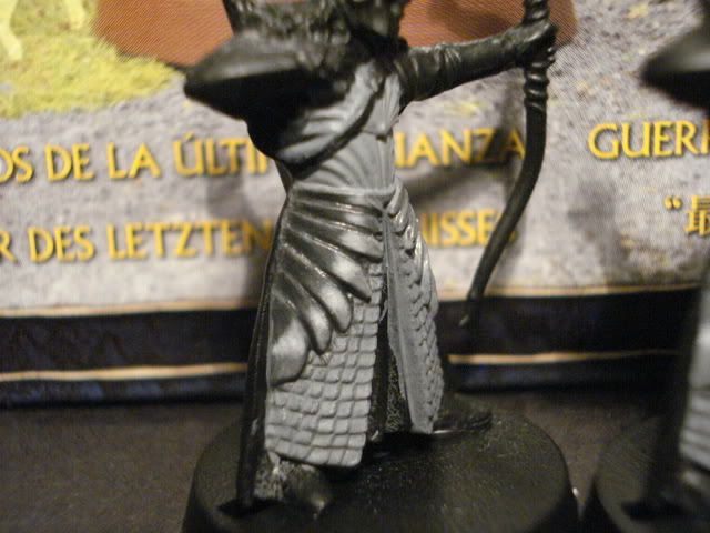
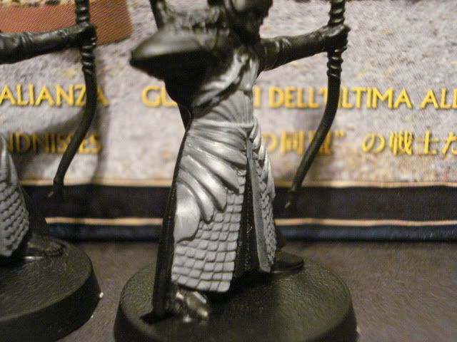
THe two different models I'm showing you guys have only the left(when your looking at it) scales done, none of the other parts have been worked on(besides the basecoat)

this first guy has a more darker and not a subtle transition from dark to white.
008-3.jpg

I think it is kind of unrealistic since the light (I want mine coming from 70 degrees above) should have some light touching every part of the scales of armor.

this next guy has a better transition but not as much of a dark shade.
009-3.jpg

I think that this guy is much more realistic, and I kind of like him better.

anyway, plz comment guys on what you think, with your comments I am able to make tough decisions.

thanks

feanorthenoldor
 

gsr15

Member
I'm no expert on NMM, never even tried it since my blending skills aren't there yet but here's my $0.02...your new pictures really look leagues better than the first one, I think if you can smooth the transitions between the colors a bit more it'll really pop (more so on the first one, the darker one, the transitions look starker.) Also, I think the final white highlight should probably be much smaller. To my eye, they both have the desired effect but the darker one has more contrast and makes me think it's a shinier more polished metal where the reflections are more specular than diffuse. The second one looks more like unpolished metal, but they both work for me...just depends on the look you're going for. Either way, pretty darn good for only your second attempts!
 

feanorthenoldor

New member
lol, actually its my fourth, I just didn't post pics, hehe.

but thanks I was thinking that the light from 70 degrees above hitting the model would hit some parts of the armor, so i didn't go to dark, maybe in my next attempt I'll add more black to the shade mixture.

thanks
 

feanorthenoldor

New member
hey all, I have been working along on my mini using NMM, one of my only problems is the chainmail under the scales, how could I paint that using a silver NMM technique.

thanks
 

Arne

New member
Whenever I see metal reflections I think of the Amiga Copper effects. For me, a typical reflection has a sky blue gradient and a warm ground gradient. On a miniature, the ground gradient would use would use base colors.

More advanced reflection (maps) are not flat 1D 'scan-lines' like in my example. They include details like windows, cars and people (mostly abstracted blobs). There's also self reflection to consider.

However, If you use a lot of little details in the reflection, the shapes/volumes of the figure can become gritty and hard to read. A simple 1 dimensional reflection with some tweaks here and there for self reflection will do, I think.

I'm primarily a 2D artist, but I think my technique for painting reflections would apply to miniatures as well. I'm not sure if I'd like the effect though. What Forge World did with their big silvery Necron centipede was effective I think.

copper.jpg


Anyways. What I do is... for every given point that I'm painting, I try to figure out the angle of the plane (the normal), then I use my gradient as a lookup table of sorts. In reality, highly reflective objects look different to each viewer, depending on viewing angle, of course.

(Thanks for eating up my paragraphs, post text editor.)
 

QuietiManes

New member
Arne: I think that's one of the best and most helpful and extremely simple (as in easy to remember and implement) explanations for NMM layout/colour placement I've ever read. That picture is worth a thousand words, I'm totally setting up a little board like that when I attempt NMM next. I especially like the "upper" and "lower" body curves showing how surroundings reflect at various heights on the figure.

Feanorthenoldor: Chainmail gives everyone migraines! Start with the dark (since that is in all the crevices and can't get there easily after), cover most everything, then work your way up towards the light (since that will be the highest). Cover the upper halves in the mid tone (avoid the crevices and heavier shadow areas), then do the highest points lined with the highlight. It'll make you slightly warped if the chainmail isn't all in the same plane, take it slow!

You've been warned! ;)

Best of luck.
 

feanorthenoldor

New member
ok guys i've gotten down the thought of NMM.

I tried it on a sword, I did a basecoat of several thin layers of codex grey, no shine, so this means base coat is good.
Then I started the shadows, added some black into the codex grey then dragged shadows into the deepest shadows, and it looked good.

THen I started to highlight the reflections themselves...

My main question is how do you make a smooth white color???? Whenever I try with white it always looks chalky and bad overall.

Oh, and by the way, I use GW's skull white for my white color, just so you guys know.

thanks
 

GraveRisen

New member
it's a really tricky balance when it comes to GW white paint.

Too much water and it looks chalky. Too little and it looks chunky. The best advice I can give is water it down a little bit LESS than you think you should every time. It's a thinner pigment than it seems. Maybe experiment on a throwaway model for an hour with different consistencies.

another idea is future..... I've never tried using it with paint, but back in the day I used to cut my inks with future floor wax, it gave a smoother blend and cut surface tension. Maybe try using a drop or 2 of future with your white to smooth the blend a little (usually runs about $4 at target/walmart/whatever)
 
Back To Top
Top