Erinna
New member
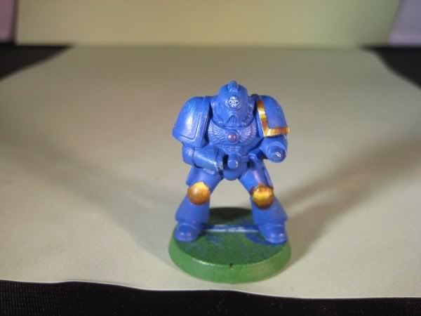
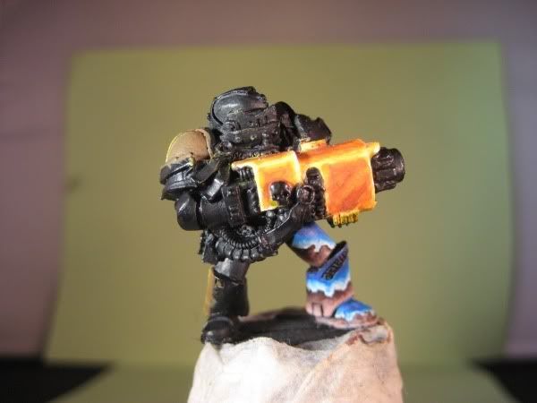
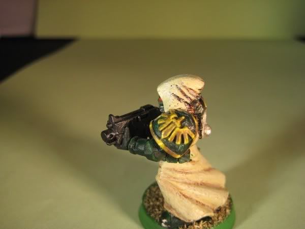
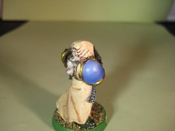
Hello everyone, Im Erinna and I'm new to CMON ;-) I'd like to have some input on my latest work in progress. Im doing this group together with Locutus and we are trying to get this unit above tabletop quality.
The unit will consist of 4 Terminators and the Lord (the 4th is WIP ). For now they are not posted for scoring yet, we wanted to see some reactions before trying that.
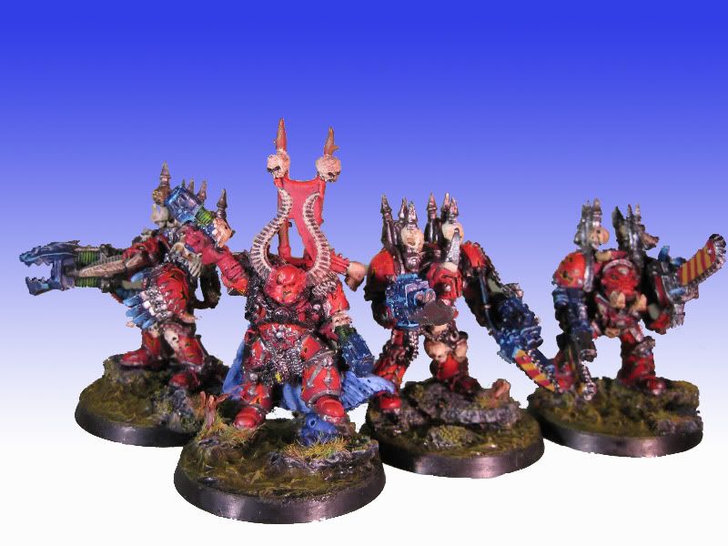
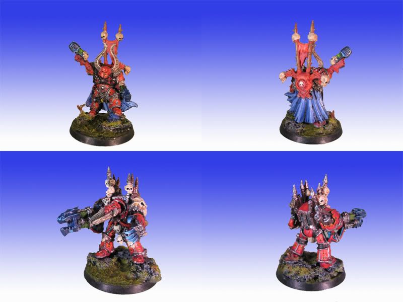
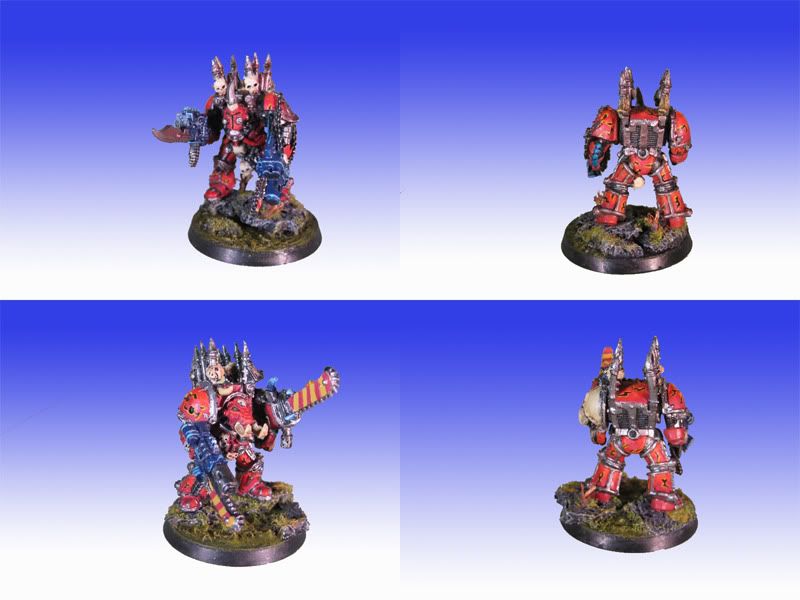
Please tell us what you think, don't spare us for being new Thanks in advance, Erinna
The unit will consist of 4 Terminators and the Lord (the 4th is WIP
). For now they are not posted for scoring yet, we wanted to see some reactions before trying that.
Please tell us what you think, don't spare us for being new
Thanks in advance, Erinna