A Workshop on Real Metallics

redarmy27

New member
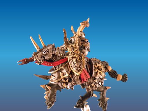
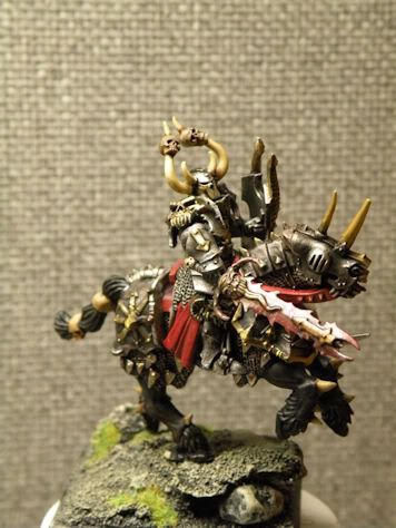
Well I caved and decided to try out \"real metallics\" on nothing better than the beautiful Chaos Knights that have just been released.

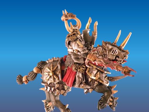
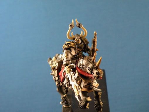
I painted this one for a friend. Let me know what you think. Normally, metallics are something I stray away from, but what the hell, I\'m giving it a shot.

General4.jpg

General5.jpg

General6.jpg


He\'s not completely done; I have some spots to finish up on him as you can see. Any C and C are greatly appreciated.

Jake
 

ScottRadom

Shogun of Saskatchewan
Stunning efforts. Looks real good to me. Nothing constructive to add, I will just be writing down and intercepting any advice thrown your way as I love metallics but am still struggling (Though getting better!).

Why do you stay away from Metals? Is it just a stylistic reason or are there other considerations?
 

freakinacage

Well-known member
metallics are easy to get a half decent effect with but very difficult to truly master.

those knights are lovely aren\'t they? cleaning mine up now
 

Starks333

New member
you need far more contrast, right now the metal is too even reflection occurs only when contrast is high

dark next to light is as high as you can get

Alex
 

redarmy27

New member
Thanks for the compliments and comments :)

Normally, I like to go for the NMM look, but after seeing these knights I really wanted to shoot for a metallics look. Metallics are easier to apply, but after this experience I\'m finding that it\'ll take a bit more getting used to get \"true\" desired affect.

Freakinacage, the models are beautiful!

I\'m going to do some more looking around for some more metallics tutorial. I know Matt had done a really nice one as well as the one in the CMON guide. Any feedback or comments would be greatly appreciated.

Jake
 

Starks333

New member
Originally posted by redarmy27
Thanks for the compliments and comments :)

Normally, I like to go for the NMM look, but after seeing these knights I really wanted to shoot for a metallics look. Metallics are easier to apply, but after this experience I\'m finding that it\'ll take a bit more getting used to get \"true\" desired affect.

Freakinacage, the models are beautiful!

I\'m going to do some more looking around for some more metallics tutorial. I know Matt had done a really nice one as well as the one in the CMON guide. Any feedback or comments would be greatly appreciated.

Jake

im not sure i understand

do you mean you are trying to paint flat metallic and let the light do the work?

or are you trying to make them look like metal? aka, has shine

if its the latter, then its the exact same as NMM, because both are \"metallics\"

the reason NMM looks metallic is because of the contrast and reflection..so is it not reasonable to say the same for metallic paint?

contrast can be softened/slowed as the pieces get larger, but the smaller the piece(28mm scale for example) has a lot more contrast than a 54mm piece, because well, they are smaller, and so your eyes place the things closer together

dont have to try it, but it does create nicer metals
 

redarmy27

New member
You hit the nail on the head with the second point. Almost anyone can use metallic paints and create metal, but darn it, I want them to look like actual pieces of metal!

I\'m going to have to work a little bit more on contrasts. I\'ll give it a whirl tonight after work.
 

Bigdennis52

New member
I think this mini turned out pretty nice

Only thing I guess I had to add was the actual metalics used. There are other options available, with other companies, such as a black metalic. I guess for chaos I like darker colors and this guy is a little too silver for me but overall this mini I think turned out fine with the metalics you chose

good work
 

redarmy27

New member
So I did a little more last night on my general. I think he looks much better after adding a few more washes. The camera makes it look much brighter than it really is; I’ll have to find a way to change that a bit.

General7.jpg

General8.jpg


While I was at it, I decided to start a Nurgle one as well.

Nurgle1.jpg

Nurgle2.jpg


Happy Friday everyone!

Jake
 

Starks333

New member
the main thing is you seem to be afraid of adding too much contrast, this is why most people fail at NMM, and highlighting in general....light really gets bright and dark..especially on metal


http://www.armsbid.com/8webpix/17.jpg

what defines this as metal is the contrast..the different between th sharp reflection highlights and the darkness that follows

you need almost black, and almost white(of course with metallics the best alternative for acrylics is vallejo air chrome for extra punch, however mithril silver is great if you use a boltgun base)

its not the brightness/darkness that defines the type of metal its the colour

http://www.allancarrasco.net/uploads/pics/buste-orc-Cyril-R-006.jpg

contrats creates reflection which creates metal :)

colours change the type of metal
 

ScottRadom

Shogun of Saskatchewan
I like the gun picture. Seems to do a good job of illustrating what you\'re speaking about Starks.

I saved it for reference, thanks!

Nice work on the Knights RedArmy, enjoying the progress. What was your color for the Barding on the Nurgle themed Knight? I likes it may consider stealing it from you.
 

redarmy27

New member
Hey there! Thanks for the compliments!

Starks333 thanks for the reference pictures for metal. On my next run of metal I\'m definately going to use that as a guide. Thanks for the helpful tips!

Well, I\'m just about done with the general as of now. I\'ll take a better picture of him once I get off work tonight. I only had enough time to get a quick pic off before heading to work.

General10.jpg

General11.jpg


Considering he\'s my first knight in a long time, let alone a metallics one, I think he turned out rather well. I\'ll post the \"display\" picture up once I\'m off of work. As always, C and C are greatly appreciated!

Jake
 

Monkeysplitters

New member
I think he looks pretty awesome in the pic so im sure it looks alot better irl. I really wanna pick up some of those knights now.

Question, since its on topic, Ive recently been playn around with real metallics and was wondering what colors (in general) are used to shade gold with? Ive been trying light and dark browns along with some dark reds. it looks ok but not great.
 

redarmy27

New member
I found that ogryn flesh wash or even a red wash works really well. It gives the gold that aged look.

Jake
 

KatieG

New member
Purple is another good one. I like to shade with a mix of purple and brown for gold metallics. Yes it sounds weird, but try it!
 

Jericho

Consummate Brushlicker
Things to mess around with metallics:

Purple glazes are great. If you\'re in a rush, mixing purple ink with chestnut ink or flesh wash as a stronger wash can be good. Then just hilight up from there.

Tamiya Clear Orange can be great for gold as well, Jakob Neilsen uses it and sometimes I do when I want a bright shiny gold (lately I prefer the darker/muted colors tho).

If you want a less vibrant gold, then using Scorched Brown and subtle green washes can be awesome. Scorched Brown is a great wash for either gold or silver, actually.
 

redarmy27

New member
I\'d never imagine using purple as a wash for gold; sounds interesting though, I\'ll try it next time I paint gold!

Thanks for the tips!

Jake
 

Dragonsreach

Super Moderator
Staff member
Originally posted by redarmy27
I\'d never imagine using purple as a wash for gold; sounds interesting though, I\'ll try it next time I paint gold!
It does give a \"Nice\" and sometime ethearal effect especially when painting Slaaneshi devotees.
Also think about Underpainting the gold with a dark brown prior to the metallics. With white primer makes a good and richer effect.
 

redarmy27

New member
Sounds good DR :). I went right from white primer to the gold, but I guess using an earthy tone over the primer would really help bring it out.

Who know painting gold and metallics could be so complex?

Jake
 

Monkeysplitters

New member
wow great response. I gonna try a brown undercoat next time. Also, i was reading an article on here a while ago, cant remember who it was by, he he suggested that the washes are dependent on the overall color scheme of the model. but in the context he was using steel (iron, silver, etc) and not gold. you guys think that still works with gold. cause imo silverish metallics are alot more neutral and gold isnt so much.
 
Back To Top
Top