Bailey03's WIP

Zab

New member
OR flip the whole thing on it's head. Make him uber grungy and war torn and make him standing in a peaceful setting like a pretty pond at night or something and it would be all surreal like: "It must be a mirage..."
 

Gino2dope

Member
Some superb idea's here; My first thought would be to make a scene out the amazing video games : Metro. That means you would need some kind of a post apo Nazi or a mutated. after thinking a bit about it, why not let the lamp lit a post of such an 50's style pin up girl, or a calender with beauties like you see a lot in gararges? Title could be : that were the days.

You'll have a hard time deciding and you even haven't paint at thing.

Whatever you choose : lot's of success and I look forward see you doing another masterpiece.

Gino(2dope)
 

Gino2dope

Member
hi Bailey,

me again. While taking a bath, one of those jobs a man need to do to please the wife :eyeroll!: I was thinking that should you find pick up girls and so a bit too nasty you can also add an interesting grafiti on the wall. Maybe the Cmon logo or something else that interests you (name of your wife, child,...) If I was doing this I would go for the Harchet man emblem without a doubt and also inserting the name of my wife and 3 dogs? You can do a bunch of graftiti's and pick one out as the most important by placing him in the light?

Have fun,

Gino(2dope)
 

Bailey03

Well-known member
Thanks for all of the great suggestions. Krule, I know... I should order some more just so I don't have to choose only one option. Gino, good call. I had thought about doing some graffiti on the wall behind him, but using that to sneak in my wife or daughter's name is a great idea.

I'm open to more ideas, so feel free to keep them coming. But, I thought I'd also post another update for Redghar. I finished off the back and arms. I used to same purple mix as before and transitioned to that one the elbows. Still need to do the hands, though I've started on the undersides. You can't really see in the photos, but I used a mix of Burgundy Wine and Terran Khaki (like on the ears) for the bottom of the hands.
R17.jpg
R18.jpg
R19.jpg
R20.jpg
R21.jpg
 

Gino2dope

Member
Redghar is really amazing! Love the smooth blending but also how one can see each muscle, wrinkles etc... A quality I can only hope to achieve one day.

Cheers,

Gino(2dope)
 

Bailey03

Well-known member
Thanks, Ritual and Gino!

One of the things I'm working on with this figure is pushing for a large contrast range. Unfortunately, sometimes it can be hard to tell from the pictures what's paint and what's photo lighting. Much easier to actually tell when you're looking at the figure in person, one of the reasons I encourage everyone trying to improve to go check out live competitions. The bigger the better! Anyway, on this figure I'm working from pure Burgundy Wine in the darkest shadows of the skin (both the green areas and the purple) and up to dots of pure Vampiric Shadow in the highlights (again, both the green and the purple). You can see how large this range is from the paint bottles below. Burgundy Wine is on the far right and Vampiric Shadow is on the left in front.
View attachment 51429
So the range isn't quite pure black to pure white, but it is from near black to near white.
 

Bailey03

Well-known member
Thanks, Digga, 10, Skel, and Andy!

Well, with the skin mostly finished, I decided to start blocking in the colors for the rest of the figure so I could get a better idea of how it might all look when I am finished. No new 'fancy' painting here, sorry, just base coating. But I thought I'd show it anyway just so you can see what I've got planned. There's a lot of leather on this guy, which I've based using Walnut Brown. I'm currently checking out texture references, both real and painted (to see how others handled it). That will be a challenge! The main splash of color will be the cloth wrapped around his mid section. For that I'm using a dull red, the same mix I used for the dwarf pirate from a little while ago. I thought that would be a nice contrast to the green skin. The pants will be striped. I'm going for an alternating black and grey. I'm still not sure about that patch on his knee. I could use something colorful (probably stick with red, purple, or green to avoid introducing something completely new), though I worry a bit about whether it will distract from the main focus (which is definitely not the knee). So as an alternative I could just go with a medium or light brown. I'll hold off on that decision for the time being... should be easier to figure out once more of the painting is complete.
View attachment 51523View attachment 51524
 
I have a fondness for Black Orcs that goes back to my AD&D days.

I agree that making the patch too colorful would be a mistake. While it seems appropriate in character sort of way, you'd have to have something to counterbalance it. So no colorful patch UNLESS you choose to stripe his pants in something other than black and gray.

The red you are using is actually red violet, and I personally love that color. Use a blue ink over the shadowy areas and it will turn the mid tones into more of a classic purple, and push the shadows towards blue. Leave the red violet as the dominant color though, and it looks very cool. See SkeletetteS' Emporer's Children Space Marine for a good version of this, but leave more violet.

Just some thoughts my brother.
 

Bailey03

Well-known member
Thanks, BAM, Fluister, Krule, and Bloodfather!

Krule, I really like that idea. Unfortunately I'm not sure how to pull it off. Since the patch is so small, you'd either get a tiny jolly roger or just a small part of the skull. Not sure they're be enough for people to know what it was supposed to be. Too bad, because it's definitely a cool idea!

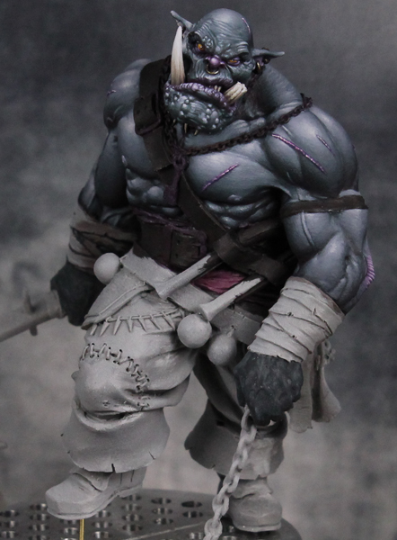
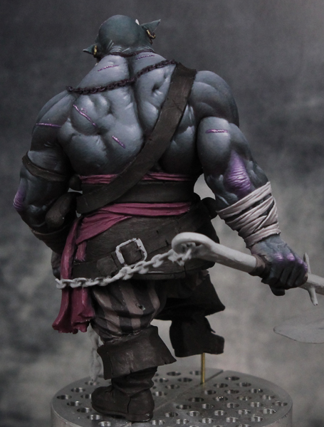
Bloodfather, yeah, I'm actually using a mix of Violet Red and Dark Elf Highlight (a cool grey). So the result isn't quite as vivid as a pure violet red, which is what I prefer for this figure.


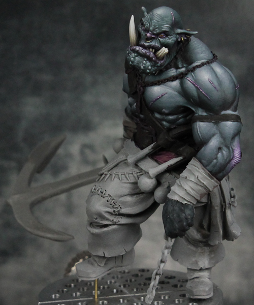
Another quick update. Over the weekend I finished off his hands and then did the cloth wraps around his forearms. Still have some stuff planned for that cloth, but didn't have time to completely finish it.
R25.jpg
R26.jpg
R27.jpg
R28.jpg


Here's a close up of the arms/hands. This should give you a better look at the color shift from green to purple on the elbows and knuckles. Of course on a normal human I'd just use red glazes for that sort of thing. Over the orc skin though, I think using purple glazes would take ages, kill the highlights, and still not produce the bright color I wanted. So I had to do this with opaque layers and then blend in the transitions back to the regular skin.
R_hands.jpg
 
Regarding your post apoc mini: He is definitely reading something. Or looking into a hole of some sorts. I think that much has been established. I was thinking of a freeway road sign, one that might say Los Angeles, 45 miles but the city is crossed out with spray paint, as well as the other towns/cities on the sign. You don't need a monster, because that is too cheap and gimmicky for a true artist of your caliber. His isolation is the monster....
 

Sicks

Active member
Orc dude is looking great, regarding the knee patch have you thought of doing it in the same pattern as the rest of the trousers but having it misaligned, like it's made from the same cloth but no effort was made to line it up when it got stitched on. I think the break in pattern will be enough for it to stick out enough that you notice it but not so much it draws too much attention.
 
Back To Top
Top