You are using an out of date browser. It may not display this or other websites correctly.
You should upgrade or use an alternative browser.
You should upgrade or use an alternative browser.
Bailey03's WIP
- Thread starter Bailey03
- Start date
BloodFather of Kharnath
Active member
Orc dude is looking great, regarding the knee patch have you thought of doing it in the same pattern as the rest of the trousers but having it misaligned, like it's made from the same cloth but no effort was made to line it up when it got stitched on. I think the break in pattern will be enough for it to stick out enough that you notice it but not so much it draws too much attention.
Hmmm nice idea there Sicks!
SaintToad
New member
You may have a post-traumatic episode after this suggestion, but... I think you should do a tiny patch of one of your samurai textiles on the knee. It works, in my opinion, with the pirate vibe (sailing the seven seas, taking a brutal evaluation of the worth of things), and it would be a subtle glance back at your own career as a painter. Just a thought.
Zab
New member
You may have a post-traumatic episode after this suggestion, but... I think you should do a tiny patch of one of your samurai textiles on the knee. It works, in my opinion, with the pirate vibe (sailing the seven seas, taking a brutal evaluation of the worth of things), and it would be a subtle glance back at your own career as a painter. Just a thought.
This! ^^^ But be careful not to reference yourself too much in your own work. You might disappear up your own asshole

Bailey03
Well-known member
Thanks, all!
Sicks, I had thought about the misaligned stripes. It could definitely work, though of course it has to be misaligned enough so that it looks intentional and not like I just make a mistake painting on the stripes!
Ha, I like the idea SaintToad. It'd be especially cool if I end up displaying them next to one another. I'm not sure the colors quite work with what I've got in mind, but I could use the same pattern and just pick colors that work for this figure. I'll have to give this one some more thought...
Krule, hmmm... that could work. I think the flag would still be kind of small if all that fit on the knee, but people might not think about it that much.
BloodFather of Kharnath
Active member
Thanks, Gandalf, Sicks, and Grayfax!
Grayfax, if it's any help, here's a bit more detail on the mix I used... For the basecoat, I used Dark Green from Badger Minitaire and Burgundy Wine from Reaper (roughly 2 parts green to 1 part burgundy). To shade, I mixed more and more Burgundy wine into the base color. To highlight, I added a 50/50 mix of Dark Elf Skin and Vampiric Shadow into the base. For the topmost highlights, I used pure Vampiric Shadow.
You can use substitutes for all those paints, just get similar colors. You can see three of those four colors below. The reason I used a 50/50 mix of the Vampiric Shadow and Dark Elf Highlight has nothing to do with those specific colors, I just wanted a grey that was lighter than the Dark Elf Highlight, but not as light as Vampiric Shadow... so I split the difference and mixed the two.
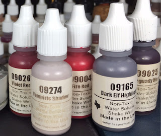
If anyone is interested in getting a similar recipe with non-reaper paints, I did some quick mixing and got very accurate results.
For Burgundy Wine, I used VMC Black Red and mixed it with a touch of GW Kantor Blue in order to cool it down, turn it towards purple.
Make Miniataire Dark Green with GW Warpstone Glow and a touch of black to darken.
Make that 50/50 mix of Vampiric Shadow and Dark Elf HL by using equal parts GW Pallid Wyche Flesh and GW Mech. Standard Gray with a touch of GW Warpfiend Gray. This will make a medium gray with a purplish undertone.
I do have to say that mixing colors comes quite naturally to me after experimenting with oils. Because there are so few colors and to expand to off hues would be cost prohibitive, you learn to color mixing as simply temperature, value, and hue. Hope this is helpful to someone and thank you DP for allowing me the opportunity to share...
Sicks
Active member
I don't think anyone would be foolish enough to think you'd messed up the trouser stripes by mistake after even a brief glance at some of your other pieces but you could do it diagonally so it would look deliberate and maybe push it a bit further and do the colours a bit more saturated as it would be newer cloth than the rest, I do like saints idea about using some of the samurai cloth too, you could help sell it by having a discarded Istana on the base somewhere too like he's pillaged it from the samurai
but you could do it diagonally so it would look deliberate and maybe push it a bit further and do the colours a bit more saturated as it would be newer cloth than the rest, I do like saints idea about using some of the samurai cloth too, you could help sell it by having a discarded Istana on the base somewhere too like he's pillaged it from the samuraiBailey03
Well-known member
Thanks for sharing the alternate mix, Bloodfather!
I made some modest progress this past weekend. I started with the stripes on his pants. These were a pain. I had to highlight and shade both colors so that everything looking similar (one stripe next to the other) while also trying for a high contrast range. Needless to say, that took a while. I then start on the red sash around his waist. Haven't done the front yet, but I'm mostly done with the back. Again, trying for a high contrast range to match the rest of the figure. Not that easy with red, but I think it turned out very well. Once that's done I'll have to move on to the leather. Looks like I can't avoid that for any longer!
View attachment 51715View attachment 51716View attachment 51717View attachment 51718View attachment 51719
Oh, and you may notice the chain is missing from his left hand. I was trying to heat it and bend it (it came a bit warped). In doing so I created a small crack in it which eventually caused it to break during painting. Not a big deal though. Now I can more easily heat it up to further bend it into the correct shape/position. It's a clean break, so should be easy enough to glue back on once I'm ready.
Bailey03
Well-known member
Thanks!
On a similar topic, I've been thinking more about the knee patch. If I decide to do a design, the partial pirate flag is still a good option (though I'd change the skull to an orc skull like the one below). I also started thinking about traditional imagery for orks from the GW world (fantasy or 40k). I was poking through info on the various GW ork clans to see what I could find. I know it's not a GW model and the setting doesn't really match GW fantasy or 40k... but I still thought it might be fun to throw in as a bit of a wink to the GW players and painters out there.
View attachment 51720
BloodASmedium
[img]http://pnp
Outstanding!!! ILL GET MY COAT NOW!!! I believe BEN KOMETS SAID ON YOUR FACEBOOK PAGE ABOUT THIS MINI "HOLY MOLY"!!! Now life's complete eh David.
BloodASmedium
[img]http://pnp
Baily you are a destroyer!! You set sights on models and simply DESTROY them. When their done they are in my opinion and shared by 1000s the "most realistic paintings ever to grace these tiny beasts we call minis. You proven over and over even perfection can be improved. I don't see you getting any better because you can't best perfect. But after all I've said this over and over and you continue to soar to heights just outside the heavens where in sure GOD himself has looked upon them!!!
SkelettetS
New member
fantastic all around, the color choices are really spot on.
Bailey03
Well-known member
Thanks, everyone!
I'm taking a short break from the orc. Up next are the leather sections and I'm taking my time to figure out the best approach. I've got to worry about texture, shading, and the color palette of this piece. In the meantime, I started playing around with a new bust I just got. The figure is Count Melenth from Polaris Minor. It's a new company and they've got some interesting pieces, but this one really caught my eye. I wanted to experiment a bit on this piece, so I decided to try some more OSL. I know I've done OSL in the past, but it's still a tough technique and I continue to struggle with it. So that's another good reason to get in some more practice! For this piece, I'm doing two light sources. The primary light will be above the figure and slightly off to his left. The secondary light source will be below and to his right. There are a couple different ways I can think of to approach this sort of project. To make things easier on me, I took photos of the figure under each of these lighting conditions. Here you can see a collage of the two...

From there I started to sketch on the colors along with the main shadows and highlights. Everything is still very very rough, but I'm starting to see how things are going to look. I'm still playing around with the OSL... but I'm generally content with how it looks. I feel like there's something about it that's not quite right, but I'm not sure exactly what. I'm hoping as I go back in and clean everything up, I'll be able to figure out what's bothering me. And of course I'll do plenty of refinement as I go. On top of all that, I'll add in color variation and other details to bring out the fantasy nature of the sculpt.


I'm taking a short break from the orc. Up next are the leather sections and I'm taking my time to figure out the best approach. I've got to worry about texture, shading, and the color palette of this piece. In the meantime, I started playing around with a new bust I just got. The figure is Count Melenth from Polaris Minor. It's a new company and they've got some interesting pieces, but this one really caught my eye. I wanted to experiment a bit on this piece, so I decided to try some more OSL. I know I've done OSL in the past, but it's still a tough technique and I continue to struggle with it. So that's another good reason to get in some more practice! For this piece, I'm doing two light sources. The primary light will be above the figure and slightly off to his left. The secondary light source will be below and to his right. There are a couple different ways I can think of to approach this sort of project. To make things easier on me, I took photos of the figure under each of these lighting conditions. Here you can see a collage of the two...
From there I started to sketch on the colors along with the main shadows and highlights. Everything is still very very rough, but I'm starting to see how things are going to look. I'm still playing around with the OSL... but I'm generally content with how it looks. I feel like there's something about it that's not quite right, but I'm not sure exactly what. I'm hoping as I go back in and clean everything up, I'll be able to figure out what's bothering me. And of course I'll do plenty of refinement as I go. On top of all that, I'll add in color variation and other details to bring out the fantasy nature of the sculpt.
MagmaPainter
Member
Wow that's cool, you call that very rough? I'd say keep it as is, looks so cool, like a three dimensional oil painting. Every time I look at your WiP i'm blown away.
Bailey03
Well-known member
Thanks, Magma. I often sketch in shadows before blending, but this is the most extension 'sketch' I've done.
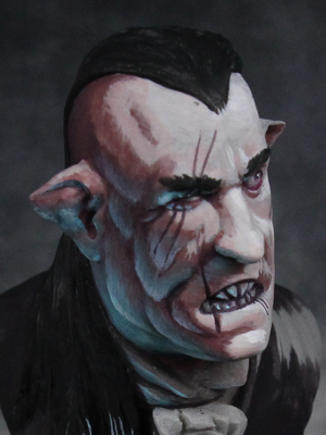
I did some work on the undamaged eye, here's a close up
View attachment 51888
I did some work on the undamaged eye, here's a close up
View attachment 51888
